FabCon is coming to Atlanta
Join us at FabCon Atlanta from March 16 - 20, 2026, for the ultimate Fabric, Power BI, AI and SQL community-led event. Save $200 with code FABCOMM.
Register now!- Power BI forums
- Get Help with Power BI
- Desktop
- Service
- Report Server
- Power Query
- Mobile Apps
- Developer
- DAX Commands and Tips
- Custom Visuals Development Discussion
- Health and Life Sciences
- Power BI Spanish forums
- Translated Spanish Desktop
- Training and Consulting
- Instructor Led Training
- Dashboard in a Day for Women, by Women
- Galleries
- Data Stories Gallery
- Themes Gallery
- Contests Gallery
- QuickViz Gallery
- Quick Measures Gallery
- Visual Calculations Gallery
- Notebook Gallery
- Translytical Task Flow Gallery
- TMDL Gallery
- R Script Showcase
- Webinars and Video Gallery
- Ideas
- Custom Visuals Ideas (read-only)
- Issues
- Issues
- Events
- Upcoming Events
The Power BI Data Visualization World Championships is back! Get ahead of the game and start preparing now! Learn more
- Power BI forums
- Forums
- Get Help with Power BI
- Desktop
- Power BI - Clustered Column Chart Spacing & Width
- Subscribe to RSS Feed
- Mark Topic as New
- Mark Topic as Read
- Float this Topic for Current User
- Bookmark
- Subscribe
- Printer Friendly Page
- Mark as New
- Bookmark
- Subscribe
- Mute
- Subscribe to RSS Feed
- Permalink
- Report Inappropriate Content
Power BI - Clustered Column Chart Spacing & Width
I have a Clustered Column Chart and I'm having lots of trouble getting a decent display. I have a bunch of teams (Team), each of which has up to five (5) members (Owner). So I drag the Teams field onto the chart and then the Owner field. What I get is the attached (the big red vertical line is my manual add in an image editor, just to split the two teams' columns for this post.
There are a couple of issues with this:
- the columns are so skinny. How can I widen them? I've messed about with the 'Minimum category width', 'Maximum size' and 'Inner padding' but cannot get anything that looks half decent.
- why are the gaps between the columns so irregular? For example, on the attachment to this post, in Team 5, why the large gap between the 642 column and the 305 column? They're both users in the group, the same as the 166 and the 642 columns - so why a different gaps? And how can that be fixed/changed?
- Mark as New
- Bookmark
- Subscribe
- Mute
- Subscribe to RSS Feed
- Permalink
- Report Inappropriate Content
No response(s) to this problem? I'm also seeing random white space being insterted in my visualization(s). Only cure I've been able to find - is to re-create the entire visualization from scratch . . . . . . . problem is that the problem recurs after several months of updating.
- Mark as New
- Bookmark
- Subscribe
- Mute
- Subscribe to RSS Feed
- Permalink
- Report Inappropriate Content
Hi @Budfudder ,
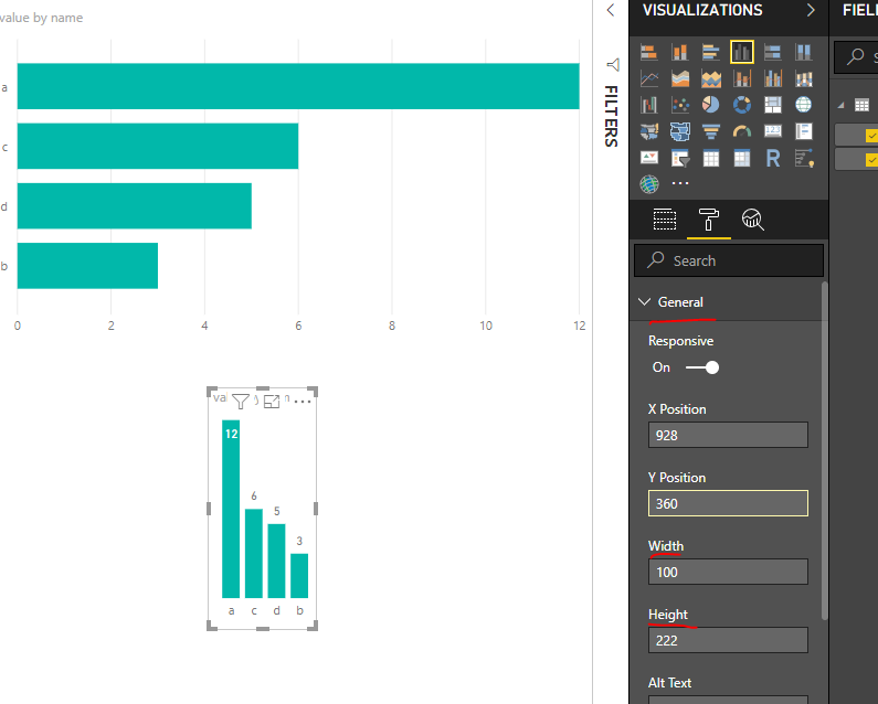
1. We can change the width and height of the columns in the chart by this way.
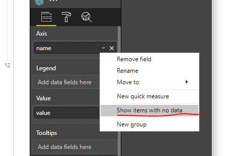
2. For the 2rd question, I think that should be the issue of your blank value. You can disable the option "Show items with no data" to work on it.
If it doesn't meet your requirementn. Could you please share your sample data and excepted result to me if you don't have any Confidential Information.Please upload your files to One Drive and share the link here.
Regards,
Frank
If this post helps, then please consider Accept it as the solution to help the others find it more quickly.
- Mark as New
- Bookmark
- Subscribe
- Mute
- Subscribe to RSS Feed
- Permalink
- Report Inappropriate Content
Thanks for your reply. As far as I can see, your first comment on changing the width of the columns - those settings control the width and height of the entire visual, not specific columns within it. My visual is already the size of the entire page. Within it, the various columns are extremely thin.
Your second point - unfortunately changing the value of the 'Show items with no data' makes no change at all to the visual.
I've put a Test Power BI.zip in OneDrive here. It's a pbx and xlsx with dummy data illustrating the problem.
Helpful resources

Power BI Dataviz World Championships
The Power BI Data Visualization World Championships is back! Get ahead of the game and start preparing now!

Power BI Monthly Update - November 2025
Check out the November 2025 Power BI update to learn about new features.

| User | Count |
|---|---|
| 59 | |
| 46 | |
| 42 | |
| 23 | |
| 18 |
| User | Count |
|---|---|
| 193 | |
| 124 | |
| 101 | |
| 67 | |
| 49 |


