Join us at the 2025 Microsoft Fabric Community Conference
March 31 - April 2, 2025, in Las Vegas, Nevada. Use code MSCUST for a $150 discount! Early bird discount ends December 31.
Register Now- Power BI forums
- Get Help with Power BI
- Desktop
- Service
- Report Server
- Power Query
- Mobile Apps
- Developer
- DAX Commands and Tips
- Custom Visuals Development Discussion
- Health and Life Sciences
- Power BI Spanish forums
- Translated Spanish Desktop
- Training and Consulting
- Instructor Led Training
- Dashboard in a Day for Women, by Women
- Galleries
- Community Connections & How-To Videos
- COVID-19 Data Stories Gallery
- Themes Gallery
- Data Stories Gallery
- R Script Showcase
- Webinars and Video Gallery
- Quick Measures Gallery
- 2021 MSBizAppsSummit Gallery
- 2020 MSBizAppsSummit Gallery
- 2019 MSBizAppsSummit Gallery
- Events
- Ideas
- Custom Visuals Ideas
- Issues
- Issues
- Events
- Upcoming Events
Be one of the first to start using Fabric Databases. View on-demand sessions with database experts and the Microsoft product team to learn just how easy it is to get started. Watch now
- Power BI forums
- Forums
- Get Help with Power BI
- Desktop
- Power BI Challenge 4 - Delivery App Review
- Subscribe to RSS Feed
- Mark Topic as New
- Mark Topic as Read
- Float this Topic for Current User
- Bookmark
- Subscribe
- Printer Friendly Page
- Mark as New
- Bookmark
- Subscribe
- Mute
- Subscribe to RSS Feed
- Permalink
- Report Inappropriate Content
Power BI Challenge 4 - Delivery App Review
Hi everyone!
Here is the 4th installment of the Enterprise DNA Power BI Challenge.
Remember it's open to everyone so don’t be afraid to get stuck in.
To learn more about the challenge and how it works be sure to check out the link below!
Remember: The weekly winner will receive a complimentary Enterprise DNA membership that they can use or share with anyone. Plus, an opportunity for the work to be showcased across our channels.
THE BRIEF
You are working at a consultancy that implemented an app for a client to help them improve their delivery process and fulfillment from warehouses to store.
The app was created so that drivers could scan the label as opposed to entering it manually while also recording the time of arrival, the time they left the store, and some other variables that the management was interested in improving.
The management is now looking to evaluate how the business has reacted and how effective the app is.
The senior consultant has extracted all data from the app and placed it into the file as below.
He now wants you to use this data and create a report or dashboard to help management visualize what is happening so that we can decide what the next stage of the transformation is.
The management is particularly interested in any warehouse store combination that it’s not working well for.
- The time being spent at a store.
- The number of times manual entry was still used.
- The number of damaged labels
- If returns are being collected
A 1 in the data represents true
A 0 represents false
The ball is now in your court and you need to find a way to present this data here.
Objective: Produce a report which can help review the effectiveness of the app.
The data set can be downloaded below.
SUBMISSION DUE DATE - Sunday, 26th July 2020 (PST)
How to join:
1. Post your report in this thread.
2. Submit your PBIX files to powerbichallenge@enterprisedna.co
Use this subject: Power BI Challenge 4 - Name (Member) if you are an Enterprise DNA member and Power BI Challenge 4 - Name (Non-member) if not an Enterprise DNA member
3. If you're currently NOT an Enterprise DNA Member, additional steps are required for you to follow to increase your probability of winning.
a. Post on your social media accounts this caption: I accepted Enterprise DNA's Power BI Challenge
Make sure to hyperlink this post - https://community.powerbi.com/t5/Desktop/Power-bI-Challenge-4-Delivery-App-Review/m-p/1229835#
b. Use these hashtags on your social media post - #EnterpriseDNA #EnterpriseDNAPowerBIChallenge #PowerBIChallenge #PowerBIChallengeAccepted
c. Change your profile pic for the 2 weeks duration of the challenge to this image.
***Please note that not following these 3 steps may decrease your probability of winning.
Best of luck!
Any issues or questions please reach out.
Sam
- Mark as New
- Bookmark
- Subscribe
- Mute
- Subscribe to RSS Feed
- Permalink
- Report Inappropriate Content
Hi Sam,
I took already challenge 3 and think it is really good that you opened the competition for challenge 4. Thanks!
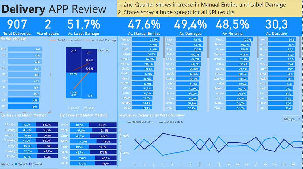
Main point for both challenges is that you can show some change and best some improvements between start and end. For this challenge "my consultancy" has a problem as the app usage since implemantation
- has no visible positive effects on the time being spent at a store
- has not increased (low acceptance: difficult to use?)
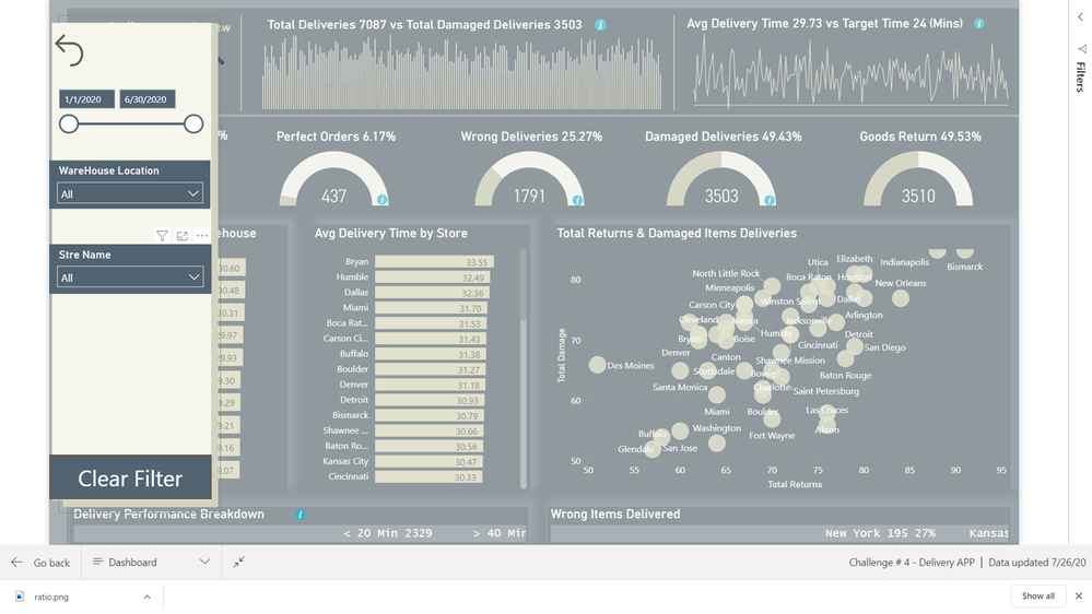
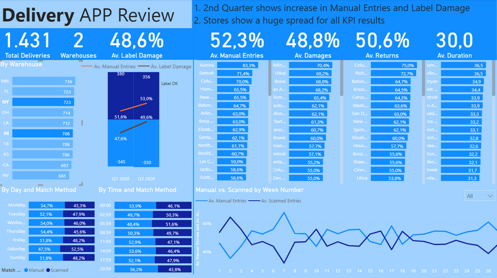
=> Demonstrate that the Label Damage has increased as well! I used quarter to avoid any outliers. In the beginning people, will pay extra attention, so it makes sense to regard bigger time frames, but you can also select 2 months or just 1 month in the first and second period [filter in the lower right visual - s. second screenshot].
The data is quite evenly distributed, I assume that is because the data was created with some random function. E.g. a histogram of the duration in 5 min bins does not show a realistic distribution, which could be used to generate meaningful insights. Even the number of issues (label damage, damage, returns) does not seem to negatively impact the time being spent at a store: A perfect delivery takes more time than deliveries with issues. Weird.
=> I concentrated on the main requirements and added two visuals showing the influence of day of the week plus time of the day.
I found with decomposition trees that the biggest impact on the time being spent at a store and other KPI is the store itself.
=> The required KPI are shown on store level. You can select one or more warehouses to check warehouse store combinations.
I wanted to create a one pager and tried to keep it as simple as possible. Simple includes also the colour scheme [if there were more interesting findings, I could have used probably a more high-lightening colour for them - s. second screenshot].
Please let me know if you have any questions or feedback and suggestions.
Thanks again!
- Mark as New
- Bookmark
- Subscribe
- Mute
- Subscribe to RSS Feed
- Permalink
- Report Inappropriate Content
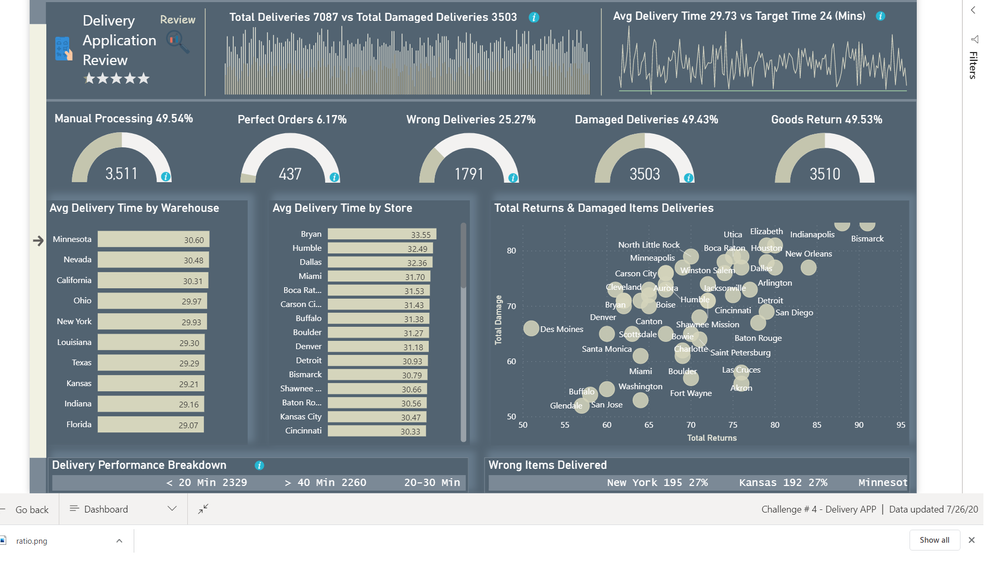
This is one of the entries we received for this challenge:
Mudassir Syed Rashid Ali
https://app.powerbi.com/groups/me/reports/d4da36cc-0035-4f4f-9b3a-8ba6f6a16ff9?ctid=2342efc5-e1b1-4f...
- Mark as New
- Bookmark
- Subscribe
- Mute
- Subscribe to RSS Feed
- Permalink
- Report Inappropriate Content
Where did the "Wrong Deliveries" Data [Mudassir Syed Rashid Ali] come from? Was it added to the data at a later point?
- Mark as New
- Bookmark
- Subscribe
- Mute
- Subscribe to RSS Feed
- Permalink
- Report Inappropriate Content
Hi Everyone,
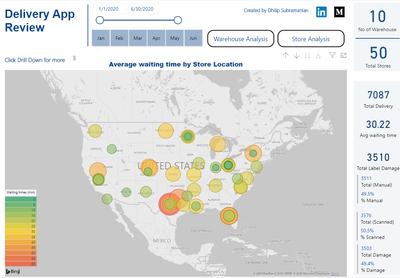
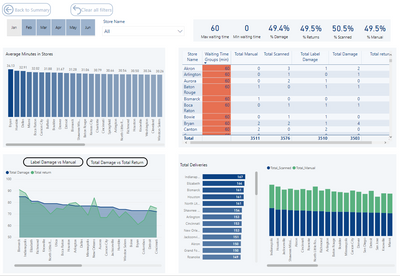
Please find the snapshot for my submission for Challenge 4.
Looking for any type of feedback on the report will help me to learn and improve more.
Thanks, SAM and team EnterpriseDNA for giving this opportunity
- Mark as New
- Bookmark
- Subscribe
- Mute
- Subscribe to RSS Feed
- Permalink
- Report Inappropriate Content
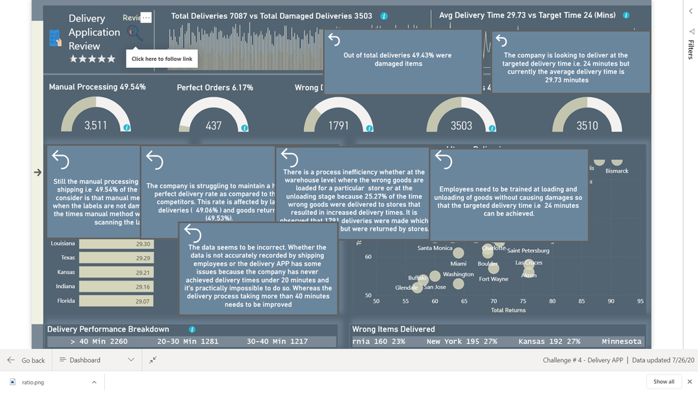
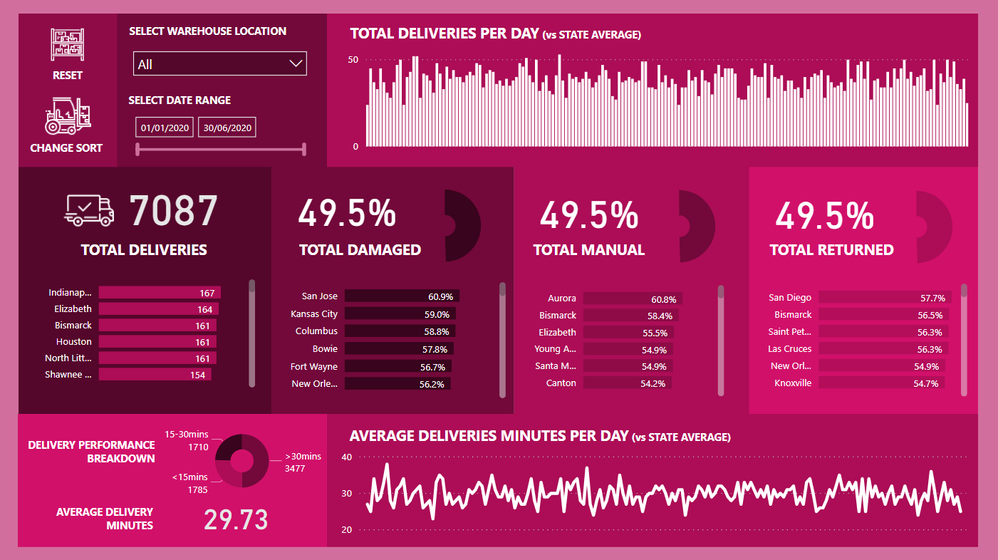
I’m done. Here’s my submission:
I’ve really gone out there with my visualization and challenged myself to do something different. The visual part of the challenge took me the longest time, just working out what would look good together.
I took inspiration for the report design inspiration section of our knowledge base.
https://info.enterprisedna.co/report-design-inspiration/
You can have a play around with the report here:
I’ve embedded a few navigation additions to the report with the icons which makes it easier to find certain insights.
Let me know what you think!
I’ll do a bigger run down in the project updates section early next week.
I’ve also recorded most of the development so will be placing that on youtube shortly also.
Sam
- Mark as New
- Bookmark
- Subscribe
- Mute
- Subscribe to RSS Feed
- Permalink
- Report Inappropriate Content
Hi @EnterpriseDNA ,
Thanks for sharing the activity.
Xue Ding
If this post helps, then please consider Accept it as the solution to help the other members find it more quickly.
Helpful resources

Join us at the Microsoft Fabric Community Conference
March 31 - April 2, 2025, in Las Vegas, Nevada. Use code MSCUST for a $150 discount!

Microsoft Fabric Community Conference 2025
Arun Ulag shares exciting details about the Microsoft Fabric Conference 2025, which will be held in Las Vegas, NV.

| User | Count |
|---|---|
| 113 | |
| 79 | |
| 56 | |
| 55 | |
| 44 |
| User | Count |
|---|---|
| 176 | |
| 116 | |
| 77 | |
| 62 | |
| 54 |


