Join the #PBI10 DataViz contest
Power BI is turning 10, and we’re marking the occasion with a special community challenge. Use your creativity to tell a story, uncover trends, or highlight something unexpected.
Get started- Power BI forums
- Get Help with Power BI
- Desktop
- Service
- Report Server
- Power Query
- Mobile Apps
- Developer
- DAX Commands and Tips
- Custom Visuals Development Discussion
- Health and Life Sciences
- Power BI Spanish forums
- Translated Spanish Desktop
- Training and Consulting
- Instructor Led Training
- Dashboard in a Day for Women, by Women
- Galleries
- Webinars and Video Gallery
- Data Stories Gallery
- Themes Gallery
- Contests Gallery
- Quick Measures Gallery
- Notebook Gallery
- Translytical Task Flow Gallery
- R Script Showcase
- Ideas
- Custom Visuals Ideas (read-only)
- Issues
- Issues
- Events
- Upcoming Events
Join us for an expert-led overview of the tools and concepts you'll need to become a Certified Power BI Data Analyst and pass exam PL-300. Register now.
- Power BI forums
- Forums
- Get Help with Power BI
- Desktop
- Plotting data on week numbers in a graph over year...
- Subscribe to RSS Feed
- Mark Topic as New
- Mark Topic as Read
- Float this Topic for Current User
- Bookmark
- Subscribe
- Printer Friendly Page
- Mark as New
- Bookmark
- Subscribe
- Mute
- Subscribe to RSS Feed
- Permalink
- Report Inappropriate Content
Plotting data on week numbers in a graph over years
Hi guys,
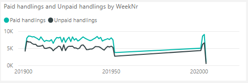
I'm working with a fact table and a date table to build my dashboard. My fact table has data by the week over several years. It contains a column with week numbers (actually it's year-week, so 201901, 201902, etc)
Is there any way to prevent Power BI filling in the "blanks" when making a graph based on week numbers?
Right now my slicer goes up to 201999, while there is only data up until 201952 and then continues with 202001.
Thanks in advance for your help!
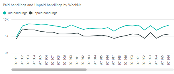
EDIT: When I change the x-axis to categorical, it doesn't really solve my problem as I get a huge scrollbar.
- Mark as New
- Bookmark
- Subscribe
- Mute
- Subscribe to RSS Feed
- Permalink
- Report Inappropriate Content
Hi @Anonymous ,
We can try to create a calculated column using following Dax as the x-axis to meet your requirment:
DateColumn =
DATE ( ROUNDDOWN ( [WeekNr] / 100, 0 ), 1, 1 ) + [WeekNr]
    - ROUNDDOWN ( [WeekNr] / 100, 0 ) - 1
Best regards,
If this post helps, then please consider Accept it as the solution to help the other members find it more quickly.
- Mark as New
- Bookmark
- Subscribe
- Mute
- Subscribe to RSS Feed
- Permalink
- Report Inappropriate Content
@v-lid-msftThank you for your insight. What would the result of that calculated column be? I'm getting a sequence of dates in the year 2563, so 19-9-2563, 20-9-2563, 21-9-2563, etc.
Using the formula:
- Mark as New
- Bookmark
- Subscribe
- Mute
- Subscribe to RSS Feed
- Permalink
- Report Inappropriate Content
Hi @Anonymous ,
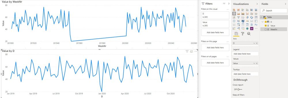
Sorry for our incorrect DAX formula, we want to get the date of each weeknr, but after read your requirement again, it seems like you want to keep show week number in the axis, we are trying to find the solution and will update here if we find it.
D = DATE ( ROUNDDOWN ( 'Table'[WeekNr] / 100 , 0 ),1, 1) + 7*('Table'[WeekNr] - ROUNDDOWN ( 'Table'[WeekNr] / 100, 0 )*100 - 1)
Best regards,
If this post helps, then please consider Accept it as the solution to help the other members find it more quickly.
- Mark as New
- Bookmark
- Subscribe
- Mute
- Subscribe to RSS Feed
- Permalink
- Report Inappropriate Content
@v-lid-msftYes, that's correct - I want to keep showing the weeknumbers (I do have the dates per week already, but my end-users will mostly work in weeks, not days)
Thank you, please let me know if you found a solution.
- Mark as New
- Bookmark
- Subscribe
- Mute
- Subscribe to RSS Feed
- Permalink
- Report Inappropriate Content
You could create a column of proper datetimes from your year and week number:
# %U assumes Monday as first day of the week. Use %W for Sundaycats['week_yr'] = pd.to_datetime(cats['year'].astype(str) + ' ' + cats['week'].astype(str) + ' 1', format='%Y %U %w')
Then you can do:
cats.plot.line(x='week_yr', y='transactions')
- Mark as New
- Bookmark
- Subscribe
- Mute
- Subscribe to RSS Feed
- Permalink
- Report Inappropriate Content
- Mark as New
- Bookmark
- Subscribe
- Mute
- Subscribe to RSS Feed
- Permalink
- Report Inappropriate Content
Helpful resources

Join our Fabric User Panel
This is your chance to engage directly with the engineering team behind Fabric and Power BI. Share your experiences and shape the future.

Power BI Monthly Update - June 2025
Check out the June 2025 Power BI update to learn about new features.

| User | Count |
|---|---|
| 80 | |
| 79 | |
| 60 | |
| 36 | |
| 33 |
| User | Count |
|---|---|
| 91 | |
| 59 | |
| 59 | |
| 49 | |
| 42 |


