Huge last-minute discounts for FabCon Vienna from September 15-18, 2025
Supplies are limited. Contact info@espc.tech right away to save your spot before the conference sells out.
Get your discount- Power BI forums
- Get Help with Power BI
- Desktop
- Service
- Report Server
- Power Query
- Mobile Apps
- Developer
- DAX Commands and Tips
- Custom Visuals Development Discussion
- Health and Life Sciences
- Power BI Spanish forums
- Translated Spanish Desktop
- Training and Consulting
- Instructor Led Training
- Dashboard in a Day for Women, by Women
- Galleries
- Data Stories Gallery
- Themes Gallery
- Contests Gallery
- Quick Measures Gallery
- Notebook Gallery
- Translytical Task Flow Gallery
- TMDL Gallery
- R Script Showcase
- Webinars and Video Gallery
- Ideas
- Custom Visuals Ideas (read-only)
- Issues
- Issues
- Events
- Upcoming Events
Score big with last-minute savings on the final tickets to FabCon Vienna. Secure your discount
- Power BI forums
- Forums
- Get Help with Power BI
- Desktop
- Plotting 2 dates from same data table on a line an...
- Subscribe to RSS Feed
- Mark Topic as New
- Mark Topic as Read
- Float this Topic for Current User
- Bookmark
- Subscribe
- Printer Friendly Page
- Mark as New
- Bookmark
- Subscribe
- Mute
- Subscribe to RSS Feed
- Permalink
- Report Inappropriate Content
Plotting 2 dates from same data table on a line and stacked column chart
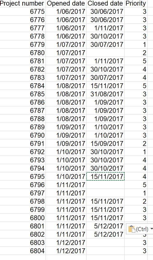
How do I plot this on a line and stacked column chart, so the closed date is accurately represented?
When I create it with the open date as the 'shared axis', the prioirty as the 'column series' and the closed date as the 'line value'; the closed date is not being plotted against the month it actually closed because the axis is based on the open date. How do I get around this?
I almsot need to have two axis with some data plotting against the open date and some against the closed.
Here is what the graph currently looks like using my full report but the line series isnt correct.
Thanks
Solved! Go to Solution.
- Mark as New
- Bookmark
- Subscribe
- Mute
- Subscribe to RSS Feed
- Permalink
- Report Inappropriate Content
Hi @SEliza86
I have created a PBIX file using your data here
https://1drv.ms/u/s!AtDlC2rep7a-oDq7OZESviMpetzu
Basically it uses the data you provided in a table. I then create two relationships to a separate date table. One relationship handles the Opened Date (the default active relationship), while the 2nd relationship handles the count of the Closed date
I use a Month column from the Date table in my axis and plot as per my PBIX file. I hope it makes sense.
- Mark as New
- Bookmark
- Subscribe
- Mute
- Subscribe to RSS Feed
- Permalink
- Report Inappropriate Content
- Mark as New
- Bookmark
- Subscribe
- Mute
- Subscribe to RSS Feed
- Permalink
- Report Inappropriate Content
| Project number | Opened date | Closed date | Priority |
| 6775 | 1/06/2017 | 30/06/2017 | 3 |
| 6776 | 1/06/2017 | 30/06/2017 | 3 |
| 6777 | 1/06/2017 | 1/11/2017 | 3 |
| 6778 | 1/06/2017 | 30/10/2017 | 3 |
| 6779 | 1/07/2017 | 30/07/2017 | 1 |
| 6780 | 1/07/2017 | 2 | |
| 6781 | 1/07/2017 | 1/11/2017 | 5 |
| 6782 | 1/07/2017 | 30/10/2017 | 4 |
| 6783 | 1/07/2017 | 30/07/2017 | 4 |
| 6784 | 1/08/2017 | 15/11/2017 | 5 |
| 6785 | 1/08/2017 | 31/08/2017 | 3 |
| 6786 | 1/08/2017 | 1/09/2017 | 3 |
| 6787 | 1/08/2017 | 1/09/2017 | 3 |
| 6788 | 1/08/2017 | 1/09/2017 | 3 |
| 6789 | 1/09/2017 | 1/10/2017 | 3 |
| 6790 | 1/09/2017 | 1/10/2017 | 3 |
| 6791 | 1/09/2017 | 15/09/2017 | 2 |
| 6792 | 1/10/2017 | 30/10/2017 | 1 |
| 6793 | 1/10/2017 | 30/10/2017 | 4 |
| 6794 | 1/10/2017 | 30/10/2017 | 4 |
| 6795 | 1/10/2017 | 15/11/2017 | 4 |
| 6796 | 1/11/2017 | 5 | |
| 6797 | 1/11/2017 | 1 | |
| 6798 | 1/11/2017 | 15/11/2017 | 2 |
| 6799 | 1/11/2017 | 15/11/2017 | 3 |
| 6800 | 1/11/2017 | 15/11/2017 | 3 |
| 6801 | 1/11/2017 | 5/12/2017 | 3 |
| 6802 | 1/11/2017 | 5/12/2017 | 3 |
| 6803 | 1/12/2017 | 3 | |
| 6804 | 1/12/2017 | 3 |
- Mark as New
- Bookmark
- Subscribe
- Mute
- Subscribe to RSS Feed
- Permalink
- Report Inappropriate Content
Hi @SEliza86
I have created a PBIX file using your data here
https://1drv.ms/u/s!AtDlC2rep7a-oDq7OZESviMpetzu
Basically it uses the data you provided in a table. I then create two relationships to a separate date table. One relationship handles the Opened Date (the default active relationship), while the 2nd relationship handles the count of the Closed date
I use a Month column from the Date table in my axis and plot as per my PBIX file. I hope it makes sense.
- Mark as New
- Bookmark
- Subscribe
- Mute
- Subscribe to RSS Feed
- Permalink
- Report Inappropriate Content
Thank you so much, I have been looking for hours for this solution!!
- Mark as New
- Bookmark
- Subscribe
- Mute
- Subscribe to RSS Feed
- Permalink
- Report Inappropriate Content
Hi Phil,
I used your formula to create a Date table
- Mark as New
- Bookmark
- Subscribe
- Mute
- Subscribe to RSS Feed
- Permalink
- Report Inappropriate Content
Thanks a lot for this solution. I was looking for it from a long time.
- Mark as New
- Bookmark
- Subscribe
- Mute
- Subscribe to RSS Feed
- Permalink
- Report Inappropriate Content
That's awesome, thanks!
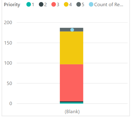
However, when I apply this logic to a different but similar data set I dont get the historic monthly view, just one big column:
The only difference I can see is the open date in my new data set are second specific. Here's an example of the dates in my new data set (could the relationships in the table no longer be working cause the new open dates are so random?):
| Open Date |
| 3-Dec-2017 12:35:44 PM |
| 3-Dec-2017 5:03:25 AM |
| 29-Nov-2017 10:48:19 AM |
| 28-Nov-2017 11:14:53 AM |
| 28-Nov-2017 9:29:32 AM |
| 27-Nov-2017 10:02:21 AM |
| 22-Nov-2017 5:00:21 PM |
| 22-Nov-2017 10:49:02 AM |
| 21-Nov-2017 4:39:51 PM |
| 20-Nov-2017 12:35:07 PM |
| 15-Nov-2017 2:45:40 PM |
| 13-Nov-2017 4:17:59 PM |
| 13-Nov-2017 3:23:45 PM |
| 13-Nov-2017 12:25:54 PM |
| 10-Nov-2017 2:18:24 PM |
| 10-Nov-2017 1:48:33 PM |
| 10-Nov-2017 11:31:30 AM |
| 10-Nov-2017 10:42:30 AM |
| 10-Nov-2017 10:40:20 AM |
| 9-Nov-2017 2:43:12 PM |
| 9-Nov-2017 10:18:25 AM |
Thanks
- Mark as New
- Bookmark
- Subscribe
- Mute
- Subscribe to RSS Feed
- Permalink
- Report Inappropriate Content
Are the hours/minutes important? Otherwise convert the column to be using DATE instead of DateTime.
- Mark as New
- Bookmark
- Subscribe
- Mute
- Subscribe to RSS Feed
- Permalink
- Report Inappropriate Content
They're not important.
What's the quickest way to convert the column to just DATE?
Thanks!
- Mark as New
- Bookmark
- Subscribe
- Mute
- Subscribe to RSS Feed
- Permalink
- Report Inappropriate Content
In the Query Editor, you can transform the column to be Date rather than DateTime. There should be a button called "Date" where you can choose a "Date only" option. This will strip away the hours, mins and seconds
- Mark as New
- Bookmark
- Subscribe
- Mute
- Subscribe to RSS Feed
- Permalink
- Report Inappropriate Content
Thanks Phil. I've learned heaps and all my reports are now working as intended.
- Mark as New
- Bookmark
- Subscribe
- Mute
- Subscribe to RSS Feed
- Permalink
- Report Inappropriate Content
I should add, that changing the format of the dates to just DATE from DATETIME in modelling hasnt changed the output of the graph. Its still just one big column not showing movement over the previous months.


