Party with Power BI’s own Guy in a Cube
Power BI is turning 10! Tune in for a special live episode on July 24 with behind-the-scenes stories, product evolution highlights, and a sneak peek at what’s in store for the future.
Save the date- Power BI forums
- Get Help with Power BI
- Desktop
- Service
- Report Server
- Power Query
- Mobile Apps
- Developer
- DAX Commands and Tips
- Custom Visuals Development Discussion
- Health and Life Sciences
- Power BI Spanish forums
- Translated Spanish Desktop
- Training and Consulting
- Instructor Led Training
- Dashboard in a Day for Women, by Women
- Galleries
- Data Stories Gallery
- Themes Gallery
- Contests Gallery
- Quick Measures Gallery
- Notebook Gallery
- Translytical Task Flow Gallery
- TMDL Gallery
- R Script Showcase
- Webinars and Video Gallery
- Ideas
- Custom Visuals Ideas (read-only)
- Issues
- Issues
- Events
- Upcoming Events
Enhance your career with this limited time 50% discount on Fabric and Power BI exams. Ends August 31st. Request your voucher.
- Power BI forums
- Forums
- Get Help with Power BI
- Desktop
- Plot dataset with x-axis dates
- Subscribe to RSS Feed
- Mark Topic as New
- Mark Topic as Read
- Float this Topic for Current User
- Bookmark
- Subscribe
- Printer Friendly Page
- Mark as New
- Bookmark
- Subscribe
- Mute
- Subscribe to RSS Feed
- Permalink
- Report Inappropriate Content
Plot dataset with x-axis dates
Dear all.
I am working with a dataset with which I am creating a dashboard. My dataset is very simple, a first column of [yyyy-mm-dd-hh-mm], and a second column with many values.
I read in many threads and forum about the difficulty to plot dates on x-axis (including hours and minuts).
As reference I am using this dashboard built in PowerBi https://www.terna.it/it/sistema-elettrico/transparency-report/total-load .(Public data of Italian electric energy generation)
This is exactly the outcome I would like to obtain, but by now I cannot display the hours and minuts. I used their data to reproduce the dashboard.
I tried to switch from a "dates" x-axis to a "text" x-axis, but the result is not the same, and furthermore the plot does not occupy the whole page but I have to move to the right.
I really cannot understand how the linked dashboard was built.
Any idea?
Thanks.
Solved! Go to Solution.
- Mark as New
- Bookmark
- Subscribe
- Mute
- Subscribe to RSS Feed
- Permalink
- Report Inappropriate Content
Hi @niccolo_guazz ,
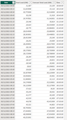
To get this visualization working properly you need to extract the time to another column making your table look like this:
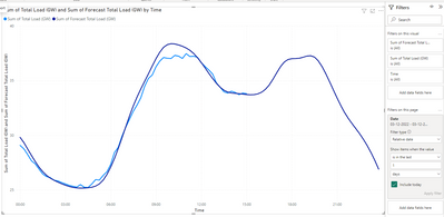
Then use the Time column on your axis and filter for the last relative day
This should give expected result.
If you want to keep the datetime stamp when you donwload it you need to do a different option:
- Duplicate the date column
- Format with hours format hh:mm
- Use this column on your axis
- Filter for the relative date
Has you can see below both charts are the same:
For the more than one day option they only used the date column with the format of date.
See attach PBIX file.
Regards
Miguel Félix
Did I answer your question? Mark my post as a solution!
Proud to be a Super User!
Check out my blog: Power BI em Português- Mark as New
- Bookmark
- Subscribe
- Mute
- Subscribe to RSS Feed
- Permalink
- Report Inappropriate Content
The last field of the values is the tooltip you can add more fields to the tooltip, in this case add the original date column.
Regards
Miguel Félix
Did I answer your question? Mark my post as a solution!
Proud to be a Super User!
Check out my blog: Power BI em Português- Mark as New
- Bookmark
- Subscribe
- Mute
- Subscribe to RSS Feed
- Permalink
- Report Inappropriate Content
Thanks @MFelix .
Do you know how I could show wven the day in the black-box below (in addition to the hour)?
And in general do you know how to modify the aspect of the box?
thank you.
- Mark as New
- Bookmark
- Subscribe
- Mute
- Subscribe to RSS Feed
- Permalink
- Report Inappropriate Content
The last field of the values is the tooltip you can add more fields to the tooltip, in this case add the original date column.
Regards
Miguel Félix
Did I answer your question? Mark my post as a solution!
Proud to be a Super User!
Check out my blog: Power BI em Português- Mark as New
- Bookmark
- Subscribe
- Mute
- Subscribe to RSS Feed
- Permalink
- Report Inappropriate Content
Hi @niccolo_guazz ,
To get this visualization working properly you need to extract the time to another column making your table look like this:
Then use the Time column on your axis and filter for the last relative day
This should give expected result.
If you want to keep the datetime stamp when you donwload it you need to do a different option:
- Duplicate the date column
- Format with hours format hh:mm
- Use this column on your axis
- Filter for the relative date
Has you can see below both charts are the same:
For the more than one day option they only used the date column with the format of date.
See attach PBIX file.
Regards
Miguel Félix
Did I answer your question? Mark my post as a solution!
Proud to be a Super User!
Check out my blog: Power BI em PortuguêsHelpful resources
| User | Count |
|---|---|
| 77 | |
| 76 | |
| 45 | |
| 31 | |
| 26 |
| User | Count |
|---|---|
| 98 | |
| 89 | |
| 52 | |
| 48 | |
| 46 |


