Join us at FabCon Vienna from September 15-18, 2025
The ultimate Fabric, Power BI, SQL, and AI community-led learning event. Save €200 with code FABCOMM.
Get registered- Power BI forums
- Get Help with Power BI
- Desktop
- Service
- Report Server
- Power Query
- Mobile Apps
- Developer
- DAX Commands and Tips
- Custom Visuals Development Discussion
- Health and Life Sciences
- Power BI Spanish forums
- Translated Spanish Desktop
- Training and Consulting
- Instructor Led Training
- Dashboard in a Day for Women, by Women
- Galleries
- Data Stories Gallery
- Themes Gallery
- Contests Gallery
- Quick Measures Gallery
- Notebook Gallery
- Translytical Task Flow Gallery
- TMDL Gallery
- R Script Showcase
- Webinars and Video Gallery
- Ideas
- Custom Visuals Ideas (read-only)
- Issues
- Issues
- Events
- Upcoming Events
Compete to become Power BI Data Viz World Champion! First round ends August 18th. Get started.
- Power BI forums
- Forums
- Get Help with Power BI
- Desktop
- Plot columns of indirectly related tables
- Subscribe to RSS Feed
- Mark Topic as New
- Mark Topic as Read
- Float this Topic for Current User
- Bookmark
- Subscribe
- Printer Friendly Page
- Mark as New
- Bookmark
- Subscribe
- Mute
- Subscribe to RSS Feed
- Permalink
- Report Inappropriate Content
Plot columns of indirectly related tables
Hi,
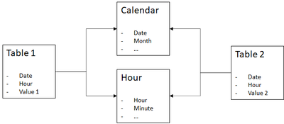
I have two tables that are indirectly related by another two tables. See picture below
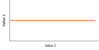
I need to plot Table1[Value 1] against Table2[Value 2] with no Date/Hour Context explicitly. But what I am getting is a constant relation.
I may have the date filter applied in the page filters but not showing in the graph.
So, what am I missing? Any advice?
Thanks in advance.
- Mark as New
- Bookmark
- Subscribe
- Mute
- Subscribe to RSS Feed
- Permalink
- Report Inappropriate Content
Hi, @paularl
Are the values 1 and 2 any text types, I also seem to be getting some incorrect values. What is the output you are expecting?
Could you please consider sharing more details about it and posting expected result so it is clear on what needs to be implemented? And It would be great if there is a sample file without any sesentive information here.
It makes it easier to give you a solution.
- Sample (dummy dataset) data as text, use the table tool in the editing bar
- Expected output from sample data
- Explanation in words of how to get from 1. to 2.
Best Regards,
Community Support Team _ Zeon Zheng
If this post helps, then please consider Accept it as the solution to help the other members find it more quickly.
- Mark as New
- Bookmark
- Subscribe
- Mute
- Subscribe to RSS Feed
- Permalink
- Report Inappropriate Content
Sorry,@lbendlin , I couldn't reply on your message.
I want to plot a line with an axis being BINS of value 1 and the other axis being mean of value 2 inside that bin.
I have the following (sample):
Sample of table 1
| Date | hour | value 1 |
| 01/01/2022 0:00 | 7:15 | 38.367 |
| 01/01/2022 0:00 | 7:30 | 125.975 |
| 01/01/2022 0:00 | 7:45 | 247.726 |
| 01/01/2022 0:00 | 8:00 | 395.018 |
| 01/01/2022 0:00 | 8:15 | 510.206 |
| 01/01/2022 0:00 | 8:30 | 656.429 |
| 01/01/2022 0:00 | 8:45 | 790.837 |
| 01/01/2022 0:00 | 9:00 | 924.607 |
| 01/01/2022 0:00 | 9:15 | 982.875 |
| 01/01/2022 0:00 | 9:30 | 1.010.803 |
| 01/01/2022 0:00 | 9:45 | 1.033.616 |
| 01/01/2022 0:00 | 10:00 | 1.051.701 |
| 01/01/2022 0:00 | 10:15 | 1066.54 |
Sample of table 2
| Date | hour | value 2 |
| 01/01/2022 0:00 | 7:15 | |
| 01/01/2022 0:00 | 7:30 | |
| 01/01/2022 0:00 | 7:45 | |
| 01/01/2022 0:00 | 8:00 | |
| 01/01/2022 0:00 | 8:15 | 0,345 |
| 01/01/2022 0:00 | 8:30 | 0,345 |
| 01/01/2022 0:00 | 8:45 | 0,439 |
| 01/01/2022 0:00 | 9:00 | 0,49 |
| 01/01/2022 0:00 | 9:15 | 0,542 |
| 01/01/2022 0:00 | 9:30 | 0,542 |
| 01/01/2022 0:00 | 9:45 | 0,542 |
| 01/01/2022 0:00 | 10:00 | 0,566 |
| 01/01/2022 0:00 | 10:15 | 0,641 |
| 01/01/2022 0:00 | 10:30 | 0,641 |
| 01/01/2022 0:00 | 10:45 | 0,641 |
So I made some bins with the group option for value 1, but I keep getting the overall average of value 2. What I want is the average by bin.
| value 1 groups | value 2 average |
| 0,619 | |
| 10.026 | 0,619 |
| 13.227.349.999.999.900 | 0,619 |
| 254.521 | 0,619 |
| 376.76849999999996 | 0,619 |
| 499.01599999999996 | 0,619 |
| 621.2634999999999 | 0,619 |
| 743.5109999999999 | 0,619 |
| 865.7584999999999 | 0,619 |
| 988.0059999999999 | 0,619 |
| 1110.2535 | 0,619 |
So, is there a direct way of doing that without having to create measures or whatever?
thanks
- Mark as New
- Bookmark
- Subscribe
- Mute
- Subscribe to RSS Feed
- Permalink
- Report Inappropriate Content
"I want to plot a line with an axis being BINS of value 1 "
what are the rules for the binning?
- Mark as New
- Bookmark
- Subscribe
- Mute
- Subscribe to RSS Feed
- Permalink
- Report Inappropriate Content
When you say "plot" do you mean a scatter plot?
Please provide sanitized sample data that fully covers your issue.
Please show the expected outcome based on the sample data you provided.


