FabCon is coming to Atlanta
Join us at FabCon Atlanta from March 16 - 20, 2026, for the ultimate Fabric, Power BI, AI and SQL community-led event. Save $200 with code FABCOMM.
Register now!- Power BI forums
- Get Help with Power BI
- Desktop
- Service
- Report Server
- Power Query
- Mobile Apps
- Developer
- DAX Commands and Tips
- Custom Visuals Development Discussion
- Health and Life Sciences
- Power BI Spanish forums
- Translated Spanish Desktop
- Training and Consulting
- Instructor Led Training
- Dashboard in a Day for Women, by Women
- Galleries
- Data Stories Gallery
- Themes Gallery
- Contests Gallery
- Quick Measures Gallery
- Notebook Gallery
- Translytical Task Flow Gallery
- TMDL Gallery
- R Script Showcase
- Webinars and Video Gallery
- Ideas
- Custom Visuals Ideas (read-only)
- Issues
- Issues
- Events
- Upcoming Events
To celebrate FabCon Vienna, we are offering 50% off select exams. Ends October 3rd. Request your discount now.
- Power BI forums
- Forums
- Get Help with Power BI
- Desktop
- Please Help - How do I create a graph with data la...
- Subscribe to RSS Feed
- Mark Topic as New
- Mark Topic as Read
- Float this Topic for Current User
- Bookmark
- Subscribe
- Printer Friendly Page
- Mark as New
- Bookmark
- Subscribe
- Mute
- Subscribe to RSS Feed
- Permalink
- Report Inappropriate Content
Please Help - How do I create a graph with data labels on line ends?
Hi,
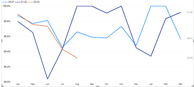
New to power bi, currently transfering a number of reports from one system to another. How do i add data labels to line ends on power BI? I've used similar visualisation tools and this is usually an easy feature to add to a visualisation.
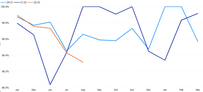
An example of what my graph looks like is below:
Thanks!
Solved! Go to Solution.
- Mark as New
- Bookmark
- Subscribe
- Mute
- Subscribe to RSS Feed
- Permalink
- Report Inappropriate Content
Here are a couple of options to complement the suggestions provided.
If you add a legend, currently you cannot add more than one measure as values (which you need currently to show the labels for the max month value by year - though I think I've seen this feature demoed in conferences for future releases).
So the options are:
1) Create measure for each of the values per year and add them to the y-axis values. The measures follow this pattern:
Sales Current Year =
CALCULATE([Sum sales], 'Date Table'[Year] = YEAR(TODAY()))
and
Max month PY Year =
VAR _MXmonth = CALCULATE(MAX('Date Table'[Month]), FILTER(ALL('Date Table'), NOT ISBLANK([Sum sales]) && 'Date Table'[Year] = YEAR(TODAY())-1))
RETURN
CALCULATE([Sum sales], FILTER('Date Table', 'Date Table'[Month] = _MXMonth && 'Date Table'[Year] = YEAR(TODAY())-1))
You can now add all the measures to the y-axis bucket, and format each measure to show the corresponding colour
Two caveats here:
- Since the measure names aren't dynamic, you are stuck with whichever name you give them (so not future proof)
- The visual will not fully respond to a slicer
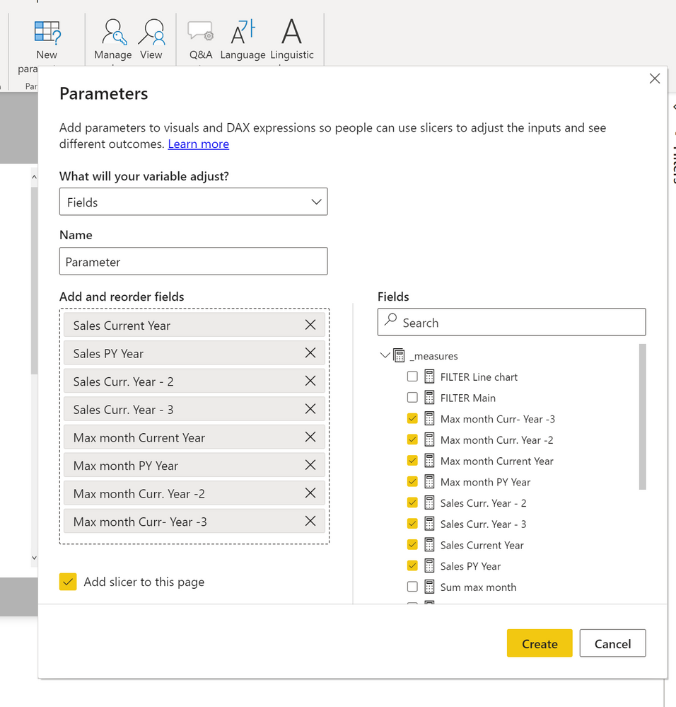
2) Create a fields parameter table with all the measures to use in the visual. Add a Year field to this table.
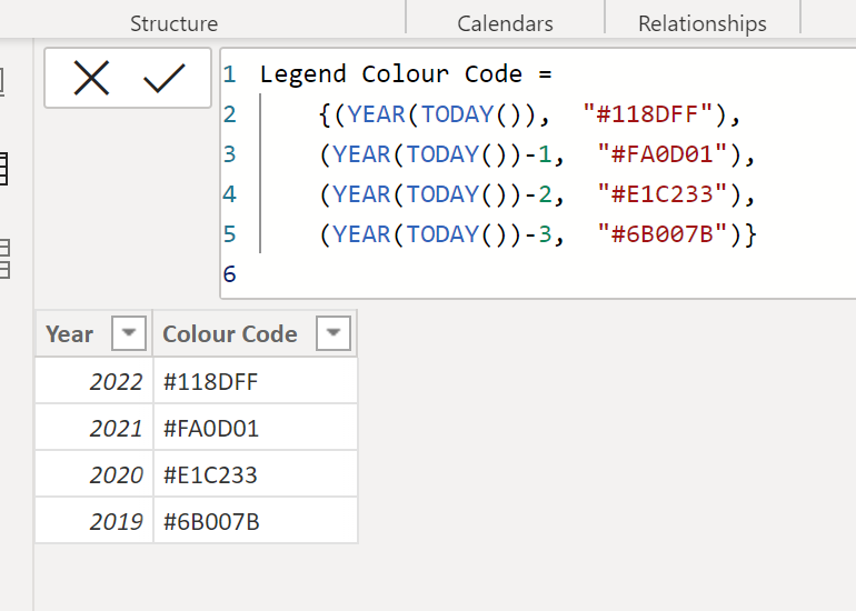
Create a new table including the periods and the colour codes:
Create a one-to-many relationship between the year field in this legend table and the year field in the parameter table. The model looks like this:
Create the line visual with the measure from the parameter field table and format each measure using the codes from the legend table. Turn on the data labels only for the max month by year values.
Create a matrix visual with the fields from the Legend table: Year as columns; year as values.
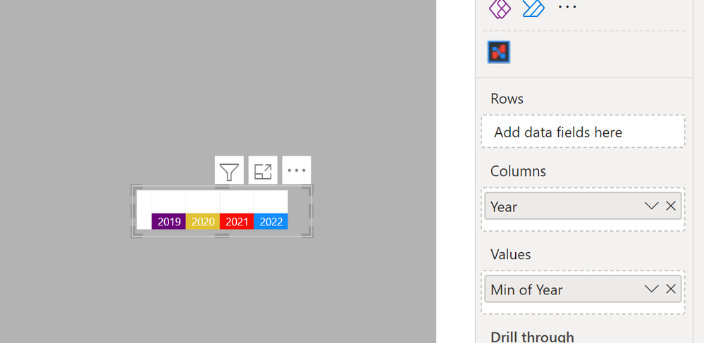
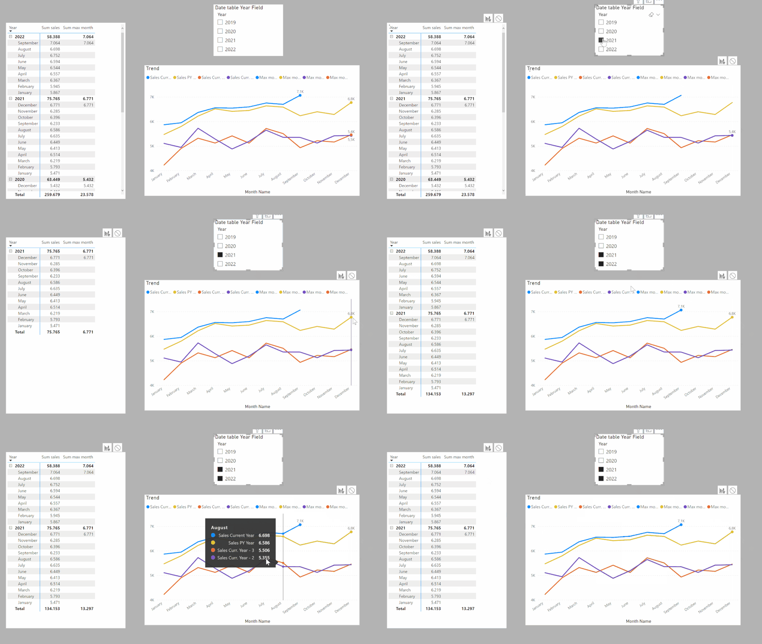
If you need to slice by year, create a new dimension table for Year as a bridge table and create the relatiohsips between this Year Table and the Legend and Date table:
and you will get
Sample PBIX attached
Did I answer your question? Mark my post as a solution!
In doing so, you are also helping me. Thank you!
Proud to be a Super User!
Paul on Linkedin.
- Mark as New
- Bookmark
- Subscribe
- Mute
- Subscribe to RSS Feed
- Permalink
- Report Inappropriate Content
Here are a couple of options to complement the suggestions provided.
If you add a legend, currently you cannot add more than one measure as values (which you need currently to show the labels for the max month value by year - though I think I've seen this feature demoed in conferences for future releases).
So the options are:
1) Create measure for each of the values per year and add them to the y-axis values. The measures follow this pattern:
Sales Current Year =
CALCULATE([Sum sales], 'Date Table'[Year] = YEAR(TODAY()))
and
Max month PY Year =
VAR _MXmonth = CALCULATE(MAX('Date Table'[Month]), FILTER(ALL('Date Table'), NOT ISBLANK([Sum sales]) && 'Date Table'[Year] = YEAR(TODAY())-1))
RETURN
CALCULATE([Sum sales], FILTER('Date Table', 'Date Table'[Month] = _MXMonth && 'Date Table'[Year] = YEAR(TODAY())-1))
You can now add all the measures to the y-axis bucket, and format each measure to show the corresponding colour
Two caveats here:
- Since the measure names aren't dynamic, you are stuck with whichever name you give them (so not future proof)
- The visual will not fully respond to a slicer
2) Create a fields parameter table with all the measures to use in the visual. Add a Year field to this table.
Create a new table including the periods and the colour codes:
Create a one-to-many relationship between the year field in this legend table and the year field in the parameter table. The model looks like this:
Create the line visual with the measure from the parameter field table and format each measure using the codes from the legend table. Turn on the data labels only for the max month by year values.
Create a matrix visual with the fields from the Legend table: Year as columns; year as values.

If you need to slice by year, create a new dimension table for Year as a bridge table and create the relatiohsips between this Year Table and the Legend and Date table:
and you will get
Sample PBIX attached
Did I answer your question? Mark my post as a solution!
In doing so, you are also helping me. Thank you!
Proud to be a Super User!
Paul on Linkedin.
- Mark as New
- Bookmark
- Subscribe
- Mute
- Subscribe to RSS Feed
- Permalink
- Report Inappropriate Content
Hi, Cheers for the quick response.
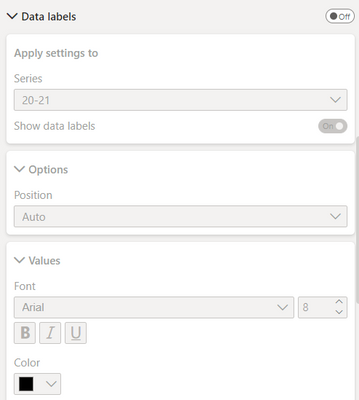
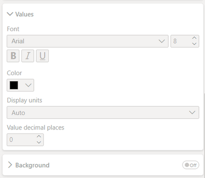
The issue i have with this is that i have two choices in the data labels section. I have to either have all the data labels on or none for each line. I want just data label ends for each line and there is no option for this?
- Mark as New
- Bookmark
- Subscribe
- Mute
- Subscribe to RSS Feed
- Permalink
- Report Inappropriate Content
Hi,
I think you are seeing Data labels option.
Please try to find Series labels option.
If this post helps, then please consider accepting it as the solution to help other members find it faster, and give a big thumbs up.
Click here to visit my LinkedIn page
Click here to schedule a short Teams meeting to discuss your question.
- Mark as New
- Bookmark
- Subscribe
- Mute
- Subscribe to RSS Feed
- Permalink
- Report Inappropriate Content
Hi,
Again, thanks for the quick response!
I've used the series labels however this shows which financial year each line is rather than the value of the last point:
I'm looking to add the first and last value for each financial year.
- Mark as New
- Bookmark
- Subscribe
- Mute
- Subscribe to RSS Feed
- Permalink
- Report Inappropriate Content
Hi,
Please share your sample pbix file's link, and then I can try to look into it to come up with a more accurate solution.
Thank you.
If this post helps, then please consider accepting it as the solution to help other members find it faster, and give a big thumbs up.
Click here to visit my LinkedIn page
Click here to schedule a short Teams meeting to discuss your question.
- Mark as New
- Bookmark
- Subscribe
- Mute
- Subscribe to RSS Feed
- Permalink
- Report Inappropriate Content
Hi,
Under the Format visual pane, try to find Series labels feature, and turn it on.
If this post helps, then please consider accepting it as the solution to help other members find it faster, and give a big thumbs up.
Click here to visit my LinkedIn page
Click here to schedule a short Teams meeting to discuss your question.
- Mark as New
- Bookmark
- Subscribe
- Mute
- Subscribe to RSS Feed
- Permalink
- Report Inappropriate Content
Hi,
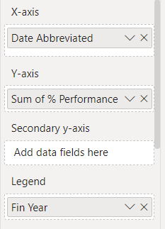
Use the visualization panel like on this example
Helpful resources
| User | Count |
|---|---|
| 98 | |
| 75 | |
| 74 | |
| 49 | |
| 26 |
