FabCon is coming to Atlanta
Join us at FabCon Atlanta from March 16 - 20, 2026, for the ultimate Fabric, Power BI, AI and SQL community-led event. Save $200 with code FABCOMM.
Register now!- Power BI forums
- Get Help with Power BI
- Desktop
- Service
- Report Server
- Power Query
- Mobile Apps
- Developer
- DAX Commands and Tips
- Custom Visuals Development Discussion
- Health and Life Sciences
- Power BI Spanish forums
- Translated Spanish Desktop
- Training and Consulting
- Instructor Led Training
- Dashboard in a Day for Women, by Women
- Galleries
- Data Stories Gallery
- Themes Gallery
- Contests Gallery
- QuickViz Gallery
- Quick Measures Gallery
- Visual Calculations Gallery
- Notebook Gallery
- Translytical Task Flow Gallery
- TMDL Gallery
- R Script Showcase
- Webinars and Video Gallery
- Ideas
- Custom Visuals Ideas (read-only)
- Issues
- Issues
- Events
- Upcoming Events
Get Fabric Certified for FREE during Fabric Data Days. Don't miss your chance! Request now
- Power BI forums
- Forums
- Get Help with Power BI
- Desktop
- Re: Pie Chart with 100% values
- Subscribe to RSS Feed
- Mark Topic as New
- Mark Topic as Read
- Float this Topic for Current User
- Bookmark
- Subscribe
- Printer Friendly Page
- Mark as New
- Bookmark
- Subscribe
- Mute
- Subscribe to RSS Feed
- Permalink
- Report Inappropriate Content
Pie Chart with 100% values
Hi Everyone,
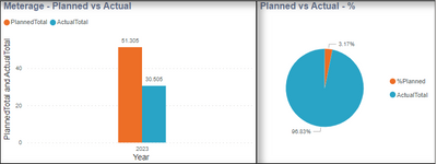
I have below 2 visuals, bar chart and Pie chart. In pie chart I would like to show Planned as always 100% and show on top of Actual%.
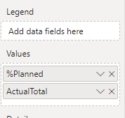
Data in Bar chart is correct but obvisually Pie chart has incorrect data. The dax I used below (i am sure i used incorrect logic)
1.
2. 
Any help would be greatly appriciated.
Solved! Go to Solution.
- Mark as New
- Bookmark
- Subscribe
- Mute
- Subscribe to RSS Feed
- Permalink
- Report Inappropriate Content
Percentages are used to illustrate the gap between the target and the actual.
You can put the number on the toltip once you have "drawn" it.
My embarrassment is that I cannot find the file in the post.
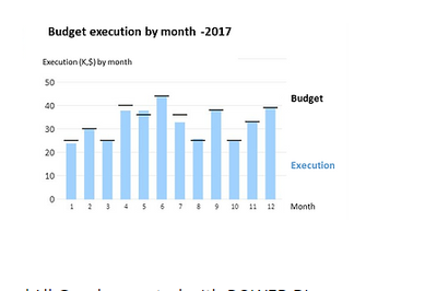
If you would like, I can create a new one with bullet charts by months, like the picture on the right, and insert
Percentage in the tooltip.
Rita Fainshtein | Microsoft MVP
https://www.linkedin.com/in/rita-fainshtein/
Blog : https://www.madeiradata.com/profile/ritaf/profile
- Mark as New
- Bookmark
- Subscribe
- Mute
- Subscribe to RSS Feed
- Permalink
- Report Inappropriate Content
Hi @kanwal
There are four different visuals that can be used to display the scenario of a target versus an actual in the following file.
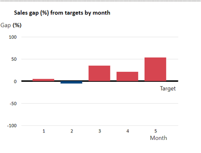
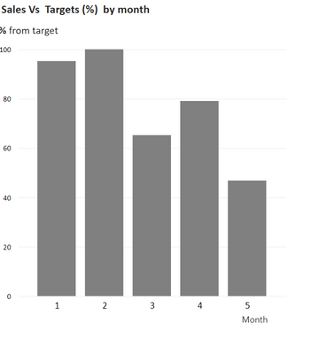
1. Simply presenting the gap by months.
2.On the second graph, you can see the percentage of completions
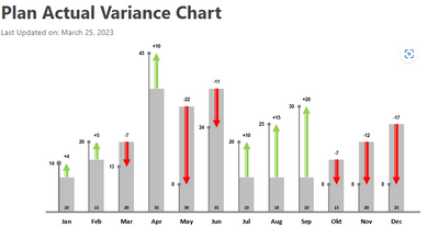
3. The third graph shows the performance and target in nominal terms.
Based on the distance between the bar and the target line, the gap can be estimated.
As a supporting figure, the gap percentage itself is on the tooltip
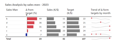
4. "Table graph" that shows the gap, performance, target, and trend of the gap for each category.
Here is the link to download the PBIX
https://github.com/MadeiraData/MadeiraToolbox/blob/master/Power%20bi/Various%20visualizations%20for%...
If this post helps, then please consider Accept it as the solution to help the other members find it more quickly.
Rita Fainshtein | Microsoft MVP
https://www.linkedin.com/in/rita-fainshtein/
Blog : https://www.madeiradata.com/profile/ritaf/profile
- Mark as New
- Bookmark
- Subscribe
- Mute
- Subscribe to RSS Feed
- Permalink
- Report Inappropriate Content
It is the right type of graph if you want to convey a trend about the gap, but its design is less effective.
I've already attached a file with examples.
The accuracy of the design is of utmost importance 🙂
Wishing you good luck
Rita Fainshtein | Microsoft MVP
https://www.linkedin.com/in/rita-fainshtein/
Blog : https://www.madeiradata.com/profile/ritaf/profile
- Mark as New
- Bookmark
- Subscribe
- Mute
- Subscribe to RSS Feed
- Permalink
- Report Inappropriate Content
Hi @kanwal
Logic of a whole is a maximum of 100%, so you cannot show a pie graph with more than 100%.
In a pie graph, the parts are not compared by size, but rather by what percentage they make up of the whole, so it is always a percentage difference.
The reason is that they don't fit the target vs execution scenario, so you're better off going with a bullet chart/ bar chart...
If this post helps, then please consider Accept it as the solution to help the other members find it more quickly.
Rita Fainshtein | Microsoft MVP
https://www.linkedin.com/in/rita-fainshtein/
Blog : https://www.madeiradata.com/profile/ritaf/profile
- Mark as New
- Bookmark
- Subscribe
- Mute
- Subscribe to RSS Feed
- Permalink
- Report Inappropriate Content
Thank you for your reply, I believe something below would be better to show?
But have no idea how to create this type of chart?
- Mark as New
- Bookmark
- Subscribe
- Mute
- Subscribe to RSS Feed
- Permalink
- Report Inappropriate Content
A lot of non-necessary elements are in this graphic, making it very difficult to create and understand.
You can refer to the post I wrote about the scenario you need and if you would like, I can share a PBIX.
This is a link to a post , please refer to examples
Why Tornado is a disaster even as a graph? (madeiradata.com)
If this post helps, then please consider Accept it as the solution to help the other members find it more quickly.
Rita Fainshtein | Microsoft MVP
https://www.linkedin.com/in/rita-fainshtein/
Blog : https://www.madeiradata.com/profile/ritaf/profile
- Mark as New
- Bookmark
- Subscribe
- Mute
- Subscribe to RSS Feed
- Permalink
- Report Inappropriate Content
I have gone through your post that you shared. The challenge I can see is we would like to see in % and my planned data will be vary.
- Mark as New
- Bookmark
- Subscribe
- Mute
- Subscribe to RSS Feed
- Permalink
- Report Inappropriate Content
Yes please PBIX will be a BIG Help.
- Mark as New
- Bookmark
- Subscribe
- Mute
- Subscribe to RSS Feed
- Permalink
- Report Inappropriate Content
Hi @kanwal
There are four different visuals that can be used to display the scenario of a target versus an actual in the following file.
1. Simply presenting the gap by months.
2.On the second graph, you can see the percentage of completions
3. The third graph shows the performance and target in nominal terms.
Based on the distance between the bar and the target line, the gap can be estimated.
As a supporting figure, the gap percentage itself is on the tooltip
4. "Table graph" that shows the gap, performance, target, and trend of the gap for each category.
Here is the link to download the PBIX
https://github.com/MadeiraData/MadeiraToolbox/blob/master/Power%20bi/Various%20visualizations%20for%...
If this post helps, then please consider Accept it as the solution to help the other members find it more quickly.
Rita Fainshtein | Microsoft MVP
https://www.linkedin.com/in/rita-fainshtein/
Blog : https://www.madeiradata.com/profile/ritaf/profile
- Mark as New
- Bookmark
- Subscribe
- Mute
- Subscribe to RSS Feed
- Permalink
- Report Inappropriate Content
Percentages are used to illustrate the gap between the target and the actual.
You can put the number on the toltip once you have "drawn" it.
My embarrassment is that I cannot find the file in the post.
If you would like, I can create a new one with bullet charts by months, like the picture on the right, and insert
Percentage in the tooltip.
Rita Fainshtein | Microsoft MVP
https://www.linkedin.com/in/rita-fainshtein/
Blog : https://www.madeiradata.com/profile/ritaf/profile
- Mark as New
- Bookmark
- Subscribe
- Mute
- Subscribe to RSS Feed
- Permalink
- Report Inappropriate Content
"Percentages are used to illustrate the gap between the target and the actual."
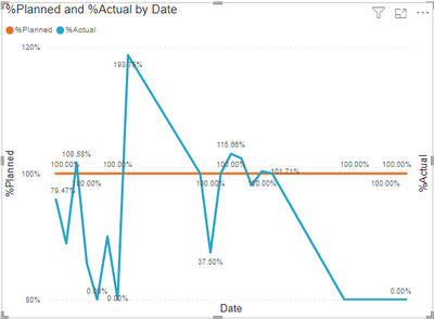
This is exactly what I am trying to show as per the request from customer. Below what I have come up with. Your thoughts?
- Mark as New
- Bookmark
- Subscribe
- Mute
- Subscribe to RSS Feed
- Permalink
- Report Inappropriate Content
It is the right type of graph if you want to convey a trend about the gap, but its design is less effective.
I've already attached a file with examples.
The accuracy of the design is of utmost importance 🙂
Wishing you good luck
Rita Fainshtein | Microsoft MVP
https://www.linkedin.com/in/rita-fainshtein/
Blog : https://www.madeiradata.com/profile/ritaf/profile
Helpful resources

Power BI Monthly Update - November 2025
Check out the November 2025 Power BI update to learn about new features.

Fabric Data Days
Advance your Data & AI career with 50 days of live learning, contests, hands-on challenges, study groups & certifications and more!

