Join us at the 2025 Microsoft Fabric Community Conference
March 31 - April 2, 2025, in Las Vegas, Nevada. Use code MSCUST for a $150 discount! Early bird discount ends December 31.
Register Now- Power BI forums
- Get Help with Power BI
- Desktop
- Service
- Report Server
- Power Query
- Mobile Apps
- Developer
- DAX Commands and Tips
- Custom Visuals Development Discussion
- Health and Life Sciences
- Power BI Spanish forums
- Translated Spanish Desktop
- Training and Consulting
- Instructor Led Training
- Dashboard in a Day for Women, by Women
- Galleries
- Community Connections & How-To Videos
- COVID-19 Data Stories Gallery
- Themes Gallery
- Data Stories Gallery
- R Script Showcase
- Webinars and Video Gallery
- Quick Measures Gallery
- 2021 MSBizAppsSummit Gallery
- 2020 MSBizAppsSummit Gallery
- 2019 MSBizAppsSummit Gallery
- Events
- Ideas
- Custom Visuals Ideas
- Issues
- Issues
- Events
- Upcoming Events
Be one of the first to start using Fabric Databases. View on-demand sessions with database experts and the Microsoft product team to learn just how easy it is to get started. Watch now
- Power BI forums
- Forums
- Get Help with Power BI
- Desktop
- Re: Percentile chart : Best way?
- Subscribe to RSS Feed
- Mark Topic as New
- Mark Topic as Read
- Float this Topic for Current User
- Bookmark
- Subscribe
- Printer Friendly Page
- Mark as New
- Bookmark
- Subscribe
- Mute
- Subscribe to RSS Feed
- Permalink
- Report Inappropriate Content
Percentile chart : Best way?
Hi
There was percentile chart available in Power BI earlier:
https://powerbi.microsoft.com/en-us/blog/visual-awesomeness-unlocked-percentile-chart/
But this was removed for IDK reasons. Now I want to create the same chart for visualizing the distribution of certain numerical data.
What is the best way to achieve that?
I tried writing custom logic where I calculated percentile for each and every data point(after sorting and indexing) and then plot it against the data. (Too much calculation and processing)
Also, when I want to filter this data and see percentile distribution of the selected sample, it gives wrong output (Since for example: Data was for all the cities of USA and if I want to drill down and see it for a particular state, then indexing and sorting will need to be done again)
Please suggest the best possible way to generate a percentile chart in Power BI
Or if I can import the same from anywhere?
- Mark as New
- Bookmark
- Subscribe
- Mute
- Subscribe to RSS Feed
- Permalink
- Report Inappropriate Content
Hi @shreyyyyy,
Currently, percentile chart is not an available custom visual that can be downloaded from Office Store, but you could make the same percentile calculation via DAX, please refer to below links for details:
Create a dynamic BI distribution Chart in PowerPivot using DAX
Best regards,
Yuliana Gu
If this post helps, then please consider Accept it as the solution to help the other members find it more quickly.
- Mark as New
- Bookmark
- Subscribe
- Mute
- Subscribe to RSS Feed
- Permalink
- Report Inappropriate Content
Hi,
Thanks for the response.
I tried the DAX queries and percentile function available in Power BI, but it returns single "k" value for the percentile we want. I dont know how to create a loop and store values so that I can run it on any data set and plot the graph.
I have attached sample data along. I need to create percentile chart for a data set like this where in I can see the values P50, P80 etc.
where in P values(0 to 100) would be plotted on y axis and corresponding values will be plotted on x axis.
Please suggest further.
| Value |
| 11399 |
| 12265 |
| 14187 |
| 11007 |
| 10157 |
| 10436 |
| 12392 |
| 13121 |
| 10134 |
| 14030 |
| 11284 |
| 12342 |
| 12162 |
| 11255 |
| 10496 |
| 13219 |
| 14138 |
| 13764 |
| 11029 |
| 11234 |
| 10153 |
| 12961 |
| 14217 |
| 10008 |
| 10751 |
| 12654 |
| 11026 |
| 12077 |
| 14786 |
| 12847 |
| 12825 |
| 10424 |
| 12060 |
| 12761 |
| 10040 |
| 13166 |
| 13175 |
| 14116 |
| 11384 |
| 12736 |
| 14083 |
| 13856 |
| 10310 |
| 10781 |
| 10284 |
| 14618 |
| 10279 |
| 12726 |
| 10171 |
| 13017 |
| 11188 |
| 10177 |
| 12820 |
| 11059 |
| 10698 |
| 12245 |
| 13277 |
| 14280 |
| 14743 |
| 13741 |
| 10983 |
| 11616 |
| 11587 |
| 11084 |
| 12339 |
| 14988 |
| 11131 |
| 12177 |
| 12449 |
| 11492 |
| 12042 |
| 17790 |
| 16370 |
| 16661 |
| 16279 |
| 17423 |
| 15365 |
| 10583 |
| 12508 |
| 10904 |
| 16944 |
| 18890 |
| 16083 |
| 19303 |
| 18711 |
| 14147 |
| 17115 |
| 16004 |
| 15230 |
| 15812 |
| 15711 |
| 15106 |
| 15092 |
| 10264 |
| 17185 |
| 10510 |
| 12026 |
| 18389 |
| 10738 |
| 17841 |
| 16604 |
| 17676 |
| 18571 |
| 17716 |
| 16433 |
| 12965 |
| 16413 |
| 13015 |
| 19635 |
| 11732 |
| 16203 |
| 19310 |
| 18054 |
| 19894 |
| 15966 |
| 10257 |
| 11757 |
| 13995 |
| 18047 |
| 17887 |
| 18635 |
| 18370 |
| 11474 |
| 14826 |
| 17062 |
| 17145 |
| 15683 |
| 12350 |
| 12549 |
| 15994 |
| 14448 |
| 15604 |
| 15010 |
| 13702 |
| 12267 |
| 10677 |
| 10551 |
| 15899 |
| 18344 |
| 10386 |
| 17967 |
| 17918 |
| 14517 |
| 19399 |
| 18953 |
| 16036 |
| 12476 |
| 10329 |
| 14871 |
| 19462 |
| 17718 |
| 15134 |
| 17243 |
| 16763 |
| 18113 |
| 14885 |
| 11234 |
| 17191 |
| 11449 |
| 18388 |
| 17232 |
| 19385 |
| 17308 |
| 14903 |
| 15566 |
| 10537 |
| 11796 |
| 18873 |
| 15147 |
| 18328 |
| 18905 |
| 11748 |
| 14047 |
| 11133 |
| 16149 |
| 17055 |
| 16579 |
| 12091 |
| 13203 |
| 15479 |
- Mark as New
- Bookmark
- Subscribe
- Mute
- Subscribe to RSS Feed
- Permalink
- Report Inappropriate Content
Hi @shreyyyyy,
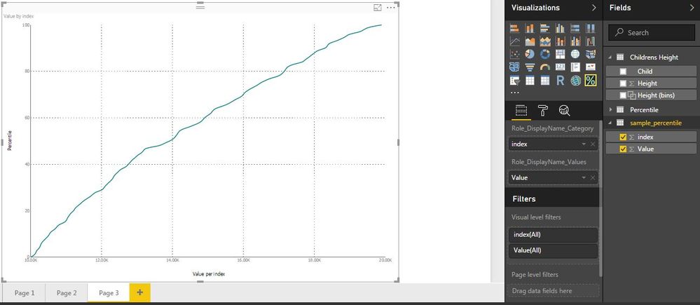
I got below result referring to Simon-Hou's suggestion in above link. Does this meet your desired output?
If not, what is your expected result? Coud you post an image to illustrate? Also, what do you mean 'I dont know how to create a loop and store values so that I can run it on any data set and plot the graph.'?
Regards,
Yuliana Gu
If this post helps, then please consider Accept it as the solution to help the other members find it more quickly.
- Mark as New
- Bookmark
- Subscribe
- Mute
- Subscribe to RSS Feed
- Permalink
- Report Inappropriate Content
There is an old pbix file which contains Percentile Chart:
http://blog.pragmaticworks.com/power-bi-custom-visuals-percentile-chart
Applying the same on the sample data which I shared above:
This is the desired output that I am looking for.
- Mark as New
- Bookmark
- Subscribe
- Mute
- Subscribe to RSS Feed
- Permalink
- Report Inappropriate Content
Hi @shreyyyyy
Try the following
1. Load your data as RawData table
2. Using Edit Query sort the data from lowest to highest.
3. Add an Index column from 1
You RawData Table will have two columns Index and Value after the above steps.
4. Create a Table called Percentile with column name PIndex. This will have 100 records starting from 1 to 100.
5. Create a calculated column in this as
IndexNumber = ROUND( ('Percentile'[PIndex]/100)*Countrows(RawData),0)
What this does is finds the row in the RawData that corresponds to the %tile .
6. Create a calculated column
ActualValue= LOOKUPVALUE(RawData[Value ],RawData[Index],Percentile[IndexNumber])
This loads the actual value for the %tile from the RawData matching the index with the number found at step 5.
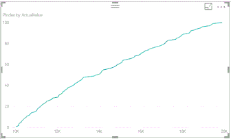
7. Now plot a line graph with ActualValue as x-Axis and P-Index as values . And set Pindex to sum.
You should get a chart like this.
Pbix file link https://drive.google.com/file/d/0B-CruXqyozMQdUI3eWhLaVFZSHc/view?usp=sharing
If this works for you please accept it as a solution and also give KUDOS.
Cheers
CheenuSing
Proud to be a Datanaut!
- Mark as New
- Bookmark
- Subscribe
- Mute
- Subscribe to RSS Feed
- Permalink
- Report Inappropriate Content
Looking for the same visual. Not sure how to plot my data 😞
- Mark as New
- Bookmark
- Subscribe
- Mute
- Subscribe to RSS Feed
- Permalink
- Report Inappropriate Content
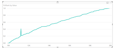
Hey,
Thanks for the prompt response.
A spike can never come in a percentile chart, since for percentile calculation, the data is always sorted.
Also, it looks from first view that you have calculated the percentiles for each data point and then plotted it. Whereas, I am looking for a graph exactly similar to this:
https://www.youtube.com/watch?v=SwZh7jz_tgI&t=338s
So that I can see P50, P80 etc values for any data set.
Helpful resources

Join us at the Microsoft Fabric Community Conference
March 31 - April 2, 2025, in Las Vegas, Nevada. Use code MSCUST for a $150 discount!

Microsoft Fabric Community Conference 2025
Arun Ulag shares exciting details about the Microsoft Fabric Conference 2025, which will be held in Las Vegas, NV.

| User | Count |
|---|---|
| 114 | |
| 76 | |
| 57 | |
| 52 | |
| 44 |
| User | Count |
|---|---|
| 165 | |
| 116 | |
| 63 | |
| 57 | |
| 50 |


