Join us at the 2025 Microsoft Fabric Community Conference
March 31 - April 2, 2025, in Las Vegas, Nevada. Use code MSCUST for a $150 discount! Early bird discount ends December 31.
Register Now- Power BI forums
- Get Help with Power BI
- Desktop
- Service
- Report Server
- Power Query
- Mobile Apps
- Developer
- DAX Commands and Tips
- Custom Visuals Development Discussion
- Health and Life Sciences
- Power BI Spanish forums
- Translated Spanish Desktop
- Training and Consulting
- Instructor Led Training
- Dashboard in a Day for Women, by Women
- Galleries
- Community Connections & How-To Videos
- COVID-19 Data Stories Gallery
- Themes Gallery
- Data Stories Gallery
- R Script Showcase
- Webinars and Video Gallery
- Quick Measures Gallery
- 2021 MSBizAppsSummit Gallery
- 2020 MSBizAppsSummit Gallery
- 2019 MSBizAppsSummit Gallery
- Events
- Ideas
- Custom Visuals Ideas
- Issues
- Issues
- Events
- Upcoming Events
Be one of the first to start using Fabric Databases. View on-demand sessions with database experts and the Microsoft product team to learn just how easy it is to get started. Watch now
- Power BI forums
- Forums
- Get Help with Power BI
- Desktop
- Percentage of text values
- Subscribe to RSS Feed
- Mark Topic as New
- Mark Topic as Read
- Float this Topic for Current User
- Bookmark
- Subscribe
- Printer Friendly Page
- Mark as New
- Bookmark
- Subscribe
- Mute
- Subscribe to RSS Feed
- Permalink
- Report Inappropriate Content
Percentage of text values
Hi,
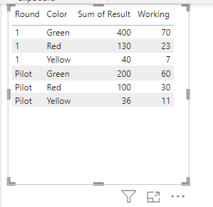
I need to find the percentage of survey having rounds "pilot" and "1" with values Green, Red and Yellow. for example, in Round "Pilot" - Green = 200, Yellow - 100, Red = 36 and In round "1" - Green =400, Yellow =130, Red = 40. Result should be like for Round Pilot - Green = 60%, Yellow = 30%, Red = 10%
Round "1" - Green = 70%, Yellow = 23%, Red = 7%
need to represent this data in a line graph.
Kindly advise.
- Mark as New
- Bookmark
- Subscribe
- Mute
- Subscribe to RSS Feed
- Permalink
- Report Inappropriate Content
Hi @hhari
If I understood correctly, your sample is like below and you need to see result 'working' as below:
Possibly you can use formula as below:
Here in the visual we are using two columns, Round and color, so as a row context we are filtering individual values and then in denominator we are removing filter of all colors.
Hope it helps!
- Mark as New
- Bookmark
- Subscribe
- Mute
- Subscribe to RSS Feed
- Permalink
- Report Inappropriate Content
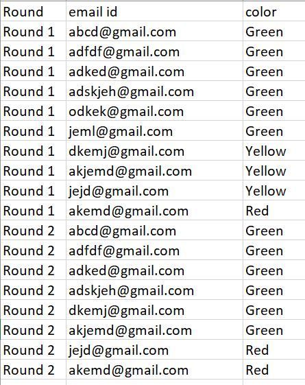
Apologies for the inaccurate information. Kindly refer to the provided screenshot displaying the raw data. Our objective is to present this data in the form of a line graph, as shown below. We aim to determine the frequency of values in the raw data and visualize it using a line graph. Your assistance in this matter would be greatly appreciated.
Raw data
Result
Helpful resources

Join us at the Microsoft Fabric Community Conference
March 31 - April 2, 2025, in Las Vegas, Nevada. Use code MSCUST for a $150 discount!

Microsoft Fabric Community Conference 2025
Arun Ulag shares exciting details about the Microsoft Fabric Conference 2025, which will be held in Las Vegas, NV.

| User | Count |
|---|---|
| 114 | |
| 76 | |
| 57 | |
| 52 | |
| 44 |
| User | Count |
|---|---|
| 168 | |
| 116 | |
| 63 | |
| 57 | |
| 50 |


