- Power BI forums
- Updates
- News & Announcements
- Get Help with Power BI
- Desktop
- Service
- Report Server
- Power Query
- Mobile Apps
- Developer
- DAX Commands and Tips
- Custom Visuals Development Discussion
- Health and Life Sciences
- Power BI Spanish forums
- Translated Spanish Desktop
- Power Platform Integration - Better Together!
- Power Platform Integrations (Read-only)
- Power Platform and Dynamics 365 Integrations (Read-only)
- Training and Consulting
- Instructor Led Training
- Dashboard in a Day for Women, by Women
- Galleries
- Community Connections & How-To Videos
- COVID-19 Data Stories Gallery
- Themes Gallery
- Data Stories Gallery
- R Script Showcase
- Webinars and Video Gallery
- Quick Measures Gallery
- 2021 MSBizAppsSummit Gallery
- 2020 MSBizAppsSummit Gallery
- 2019 MSBizAppsSummit Gallery
- Events
- Ideas
- Custom Visuals Ideas
- Issues
- Issues
- Events
- Upcoming Events
- Community Blog
- Power BI Community Blog
- Custom Visuals Community Blog
- Community Support
- Community Accounts & Registration
- Using the Community
- Community Feedback
Register now to learn Fabric in free live sessions led by the best Microsoft experts. From Apr 16 to May 9, in English and Spanish.
- Power BI forums
- Forums
- Get Help with Power BI
- Desktop
- Re: Percentage Value shows twice in Donut Chart
- Subscribe to RSS Feed
- Mark Topic as New
- Mark Topic as Read
- Float this Topic for Current User
- Bookmark
- Subscribe
- Printer Friendly Page
- Mark as New
- Bookmark
- Subscribe
- Mute
- Subscribe to RSS Feed
- Permalink
- Report Inappropriate Content
Percentage Value shows twice in Donut Chart
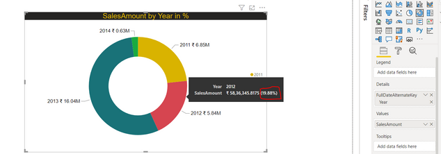
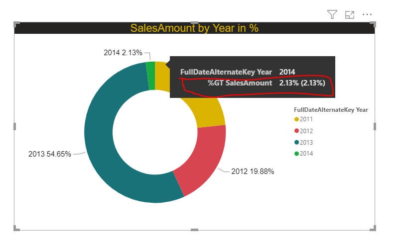
Please find the below attached visual for reference and the one which is highlighted in red color is the issue. Actually I have to show "SalesAmount" in Percentgae.So, in my case i am getting percentage but the problem is when I hover on the visual tooltip is showing percentage's value twice and this is only showing for visuals like Pie Chart and Donut Chart. Is there any way to get only one percentgae value instead of two?

Best Regards,
Srihari
- Mark as New
- Bookmark
- Subscribe
- Mute
- Subscribe to RSS Feed
- Permalink
- Report Inappropriate Content
HI @Anonymous ,
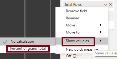
This is happening because you are using a summarisation quick measure moved on to this Donut chart as "Percentage of Grand total":
Is this correct?
What you can do is rather than creating this as a calculation within this chart, you can create a measure for this calculation. Then move this calculation to your donut chart.
In order to further assist you with this, I will need to know further details like what values you are moving to donut chart, a screenshot of sample data.
Thanks,
Pragati
- Mark as New
- Bookmark
- Subscribe
- Mute
- Subscribe to RSS Feed
- Permalink
- Report Inappropriate Content
Hi @Pragati11, Thank You! Eventhough I have created a measure to get the percentage value, but still it is showing the same.
As you said earlier, "This is happening because you are using a summarisation quick measure moved on to this Donut chart as "Percentage of Grand total":. and "Yes". I have taken summarisation quick measure on to this Donut chart.
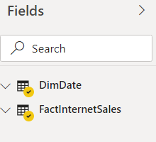
Please find the attached screenshots for your reference. First screenshot is for Values which are moving on the Donut chart and second one is for sample data (AdventureWorksDW2017).
If you see in first screenshot, In this I haven't applied any summarisation quick measure as "Percentage of Grand Total" and have taken only the "SUM". But still it is showing Percentage value which is highlighted in Red Color in First Screenshot.
I hope you have solution for this
Best Regards,
Srihari
- Mark as New
- Bookmark
- Subscribe
- Mute
- Subscribe to RSS Feed
- Permalink
- Report Inappropriate Content
Hi @Anonymous ,
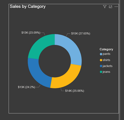
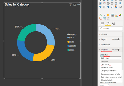
Consider the following example:
Now go to format options for this Donut chart as shown below --> Detail Labels --> Label Style --> Data Value:
This will remove the %-age value as a label.
Thanks,
Pragati
- Mark as New
- Bookmark
- Subscribe
- Mute
- Subscribe to RSS Feed
- Permalink
- Report Inappropriate Content
Hi @Pragati11, Thanks for the solution but I want to remove % in Tooltip.
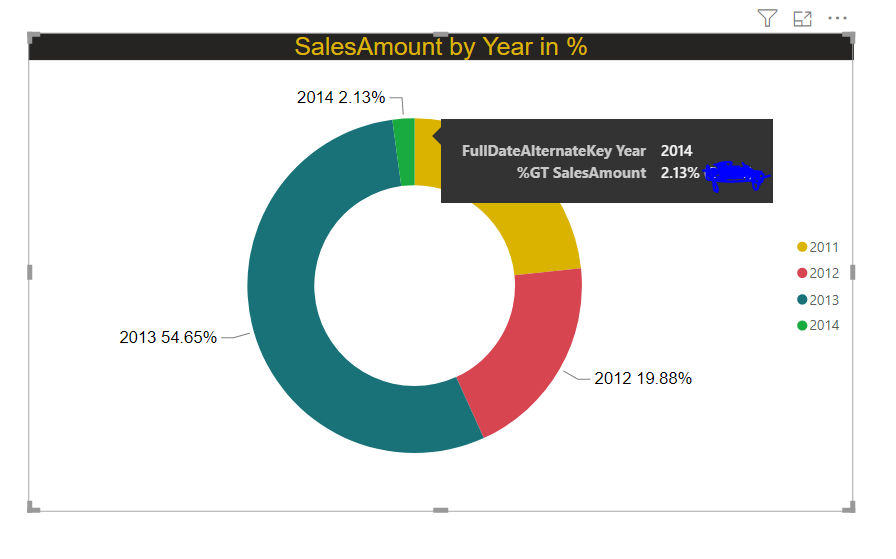
Let's say If I hover on the year 2014 then it should show "Year" and "Salesamount" in %. So, in my case I have got the salesamount in % but the problem is "Salesamount Percentage is showing twice. So,here I want to remove the Percent value which is (2.13%) in brackets not on the donut chart visual. Please find the attached visual below as this one is the final output visual.
Best Regards,
Srihari
- Mark as New
- Bookmark
- Subscribe
- Mute
- Subscribe to RSS Feed
- Permalink
- Report Inappropriate Content
Hi @Anonymous ,
You can't remove this percentage value within brackets.
This is the default view for the toolotip on a Donut chart or a Pie-chart.
Thanks,
Pragati
- Mark as New
- Bookmark
- Subscribe
- Mute
- Subscribe to RSS Feed
- Permalink
- Report Inappropriate Content
In 2024, is there still no solution for this?
Helpful resources

Microsoft Fabric Learn Together
Covering the world! 9:00-10:30 AM Sydney, 4:00-5:30 PM CET (Paris/Berlin), 7:00-8:30 PM Mexico City

Power BI Monthly Update - April 2024
Check out the April 2024 Power BI update to learn about new features.

| User | Count |
|---|---|
| 110 | |
| 108 | |
| 88 | |
| 76 | |
| 66 |
| User | Count |
|---|---|
| 126 | |
| 112 | |
| 99 | |
| 82 | |
| 73 |
