- Power BI forums
- Get Help with Power BI
- Desktop
- Service
- Report Server
- Power Query
- Mobile Apps
- Developer
- DAX Commands and Tips
- Custom Visuals Development Discussion
- Health and Life Sciences
- Power BI Spanish forums
- Translated Spanish Desktop
- Training and Consulting
- Instructor Led Training
- Dashboard in a Day for Women, by Women
- Galleries
- Data Stories Gallery
- Themes Gallery
- Contests Gallery
- Quick Measures Gallery
- Notebook Gallery
- Translytical Task Flow Gallery
- TMDL Gallery
- R Script Showcase
- Webinars and Video Gallery
- Ideas
- Custom Visuals Ideas (read-only)
- Issues
- Issues
- Events
- Upcoming Events
To celebrate FabCon Vienna, we are offering 50% off select exams. Ends October 3rd. Request your discount now.
- Power BI forums
- Forums
- Get Help with Power BI
- Desktop
- Pass single parameter in visual to visual filter (...
- Subscribe to RSS Feed
- Mark Topic as New
- Mark Topic as Read
- Float this Topic for Current User
- Bookmark
- Subscribe
- Printer Friendly Page
- Mark as New
- Bookmark
- Subscribe
- Mute
- Subscribe to RSS Feed
- Permalink
- Report Inappropriate Content
Pass single parameter in visual to visual filter (or hide columns in visual no filter)
Thank You for looking...
So the overarching goal is I want different individuals to visit a page monthly and view that months forecast vs actual numbers by group in a matrix...and then trending information for accuracy,difference and total volume of forecast and actual of their forecast in a line chart.
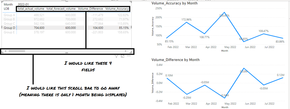
I set the matrix up with Month as the column and LOB as the row...problem is that there are MANY months of data...so the matrix data runs outside the visual. So I want to filter that visual so that it only shows a single month (the most recent).
When I do that, if I click on a LOB in the matrix, when it filters the other line chart visuals it now filters them by both LOB and Month (effectively creating a single dot).
I hope my goal is clear. End of story is I would like a matrix showing a single month of data and when you click on a LOB cell it only sends the LOB parameter to the other visuals.
Attached is a play PBIX. No Filter is the matrix with no filter...so when you click on the LOB...the line charts filter like I would like them to. With Filter has the filter to the Matrix to limit it to showing a single month...so when you click on teh LOB the line charts get filtered by LOB and Month.
Thank you again for looking!!
-John
- Mark as New
- Bookmark
- Subscribe
- Mute
- Subscribe to RSS Feed
- Permalink
- Report Inappropriate Content
@Gusdate2 you can have matrix filter for one month or then one month the core functionality is going to work. If you just simply follow my pbix and work at your end, you will get all the answers.
Subscribe to the @PowerBIHowTo YT channel for an upcoming video on List and Record functions in Power Query!!
Learn Power BI and Fabric - subscribe to our YT channel - Click here: @PowerBIHowTo
If my solution proved useful, I'd be delighted to receive Kudos. When you put effort into asking a question, it's equally thoughtful to acknowledge and give Kudos to the individual who helped you solve the problem. It's a small gesture that shows appreciation and encouragement! ❤
Did I answer your question? Mark my post as a solution. Proud to be a Super User! Appreciate your Kudos 🙂
Feel free to email me with any of your BI needs.
- Mark as New
- Bookmark
- Subscribe
- Mute
- Subscribe to RSS Feed
- Permalink
- Report Inappropriate Content
@parry2k While I very much appreciate your responses, unfortunately I am either not following what you are suggesting be done or I don't think you understand the aesthetics of what I am asking...either way...I am not accomplishing my goal. I am not sure if I can open this question up for additional responses or if I need to repost it. But I do thank you for your responses.
- Mark as New
- Bookmark
- Subscribe
- Mute
- Subscribe to RSS Feed
- Permalink
- Report Inappropriate Content
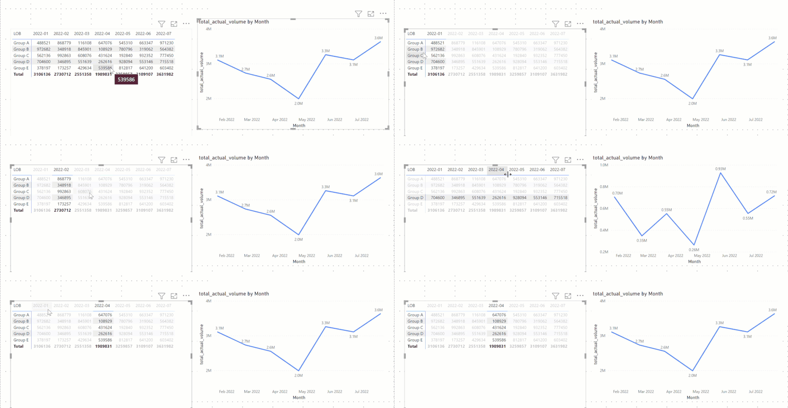
@Gusdate2 I don't think you followed all the steps that I provided in the pbix file, see the attached video, which is just showing the actual volume, and in the matrix, if I select a month, nothing happens in the line chart and when I select a group (or anything on rows) it filters the line graph for that particular group.
In nutshell, anything selected on the columns (which is month), doesn't filter the line chart and selection of the row, filters the line chart and I think that is what you are looking for.
✨ Follow us on LinkedIn and  to our YouTube channel
I would ❤ Kudos if my solution helped. 👉 If you can spend time posting the question, you can also make effort to give Kudos to whoever helped to solve your problem. It is a token of appreciation!
⚡ Visit us at https://perytus.com, your one-stop shop for Power BI-related projects/training/consultancy.
Subscribe to the @PowerBIHowTo YT channel for an upcoming video on List and Record functions in Power Query!!
Learn Power BI and Fabric - subscribe to our YT channel - Click here: @PowerBIHowTo
If my solution proved useful, I'd be delighted to receive Kudos. When you put effort into asking a question, it's equally thoughtful to acknowledge and give Kudos to the individual who helped you solve the problem. It's a small gesture that shows appreciation and encouragement! ❤
Did I answer your question? Mark my post as a solution. Proud to be a Super User! Appreciate your Kudos 🙂
Feel free to email me with any of your BI needs.
- Mark as New
- Bookmark
- Subscribe
- Mute
- Subscribe to RSS Feed
- Permalink
- Report Inappropriate Content
@parry2k actually...what I want is the matrix filtered to a single month (your gif has all months)
- Mark as New
- Bookmark
- Subscribe
- Mute
- Subscribe to RSS Feed
- Permalink
- Report Inappropriate Content
@Gusdate2 check the attached file, you need a disconnected table for the matrix visual. In the attached pbix file I just did it for one visual and one measure, you can take it from there.
✨ Follow us on LinkedIn and  to our YouTube channel
I would ❤ Kudos if my solution helped. 👉 If you can spend time posting the question, you can also make effort to give Kudos to whoever helped to solve your problem. It is a token of appreciation!
⚡ Visit us at https://perytus.com, your one-stop shop for Power BI-related projects/training/consultancy.
Subscribe to the @PowerBIHowTo YT channel for an upcoming video on List and Record functions in Power Query!!
Learn Power BI and Fabric - subscribe to our YT channel - Click here: @PowerBIHowTo
If my solution proved useful, I'd be delighted to receive Kudos. When you put effort into asking a question, it's equally thoughtful to acknowledge and give Kudos to the individual who helped you solve the problem. It's a small gesture that shows appreciation and encouragement! ❤
Did I answer your question? Mark my post as a solution. Proud to be a Super User! Appreciate your Kudos 🙂
Feel free to email me with any of your BI needs.
- Mark as New
- Bookmark
- Subscribe
- Mute
- Subscribe to RSS Feed
- Permalink
- Report Inappropriate Content
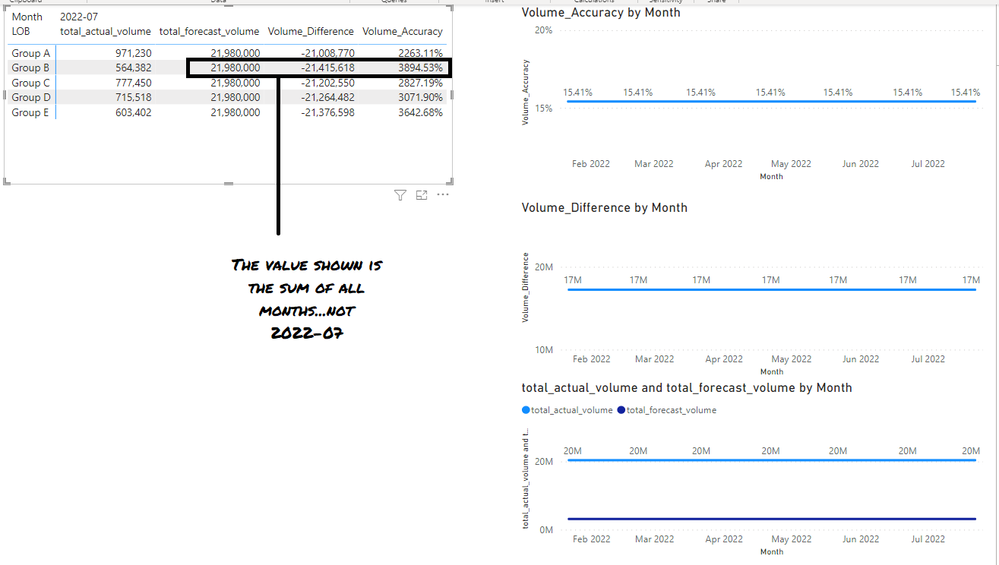
@parry2k Thank you for replying. In re-reading your response. I have re-read your reply a few times and looked at your attached .pbix and I think I didn't make what I was looking to do clear. If I disconnect the table the formulas break. The formulas are the sum of all months, not the latest month. Total Actuals is correct, and I can switch thet to total forecast being correct (but then total actuals breaks).
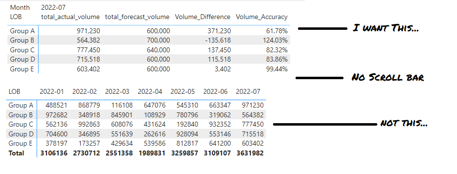
I figured I would graphically try and show what I am hoping to accomplish. If I am just missing something from the solution could you enlighten me. Again, thank you very much for the reply, and you gave me a few things to think about, but right now I am still looking for a solution.
Goal (Taken from my example .pbix No Filter Page)
Taken from @parry2k solution with filter page


