Become a Certified Power BI Data Analyst!
Join us for an expert-led overview of the tools and concepts you'll need to pass exam PL-300. The first session starts on June 11th. See you there!
Get registered- Power BI forums
- Get Help with Power BI
- Desktop
- Service
- Report Server
- Power Query
- Mobile Apps
- Developer
- DAX Commands and Tips
- Custom Visuals Development Discussion
- Health and Life Sciences
- Power BI Spanish forums
- Translated Spanish Desktop
- Training and Consulting
- Instructor Led Training
- Dashboard in a Day for Women, by Women
- Galleries
- Webinars and Video Gallery
- Data Stories Gallery
- Themes Gallery
- Contests Gallery
- Quick Measures Gallery
- Notebook Gallery
- Translytical Task Flow Gallery
- R Script Showcase
- Ideas
- Custom Visuals Ideas (read-only)
- Issues
- Issues
- Events
- Upcoming Events
Power BI is turning 10! Let’s celebrate together with dataviz contests, interactive sessions, and giveaways. Register now.
- Power BI forums
- Forums
- Get Help with Power BI
- Desktop
- Overall Average % based on what month it is
- Subscribe to RSS Feed
- Mark Topic as New
- Mark Topic as Read
- Float this Topic for Current User
- Bookmark
- Subscribe
- Printer Friendly Page
- Mark as New
- Bookmark
- Subscribe
- Mute
- Subscribe to RSS Feed
- Permalink
- Report Inappropriate Content
Overall Average % based on what month it is
Hi all!
I have a question that is puzzling me.
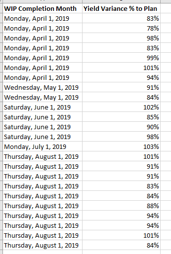
So I have data that looks like the following:
And I have created a column chart visual that has WIP Completion Month in the x axis and Average % in the y axis.
What I am trying to do is conditionally format the columns so that if the overall average each month is >= 95%, the column will be green, and if it is below 95% it will be yellow.
So is there a way to write a code/new column that says:
If the overall average % of X month is >= 95%, "#32a852", if it is below 95%, "#e4eb60"
(random green/yellow color HEX's I found, to then use conditional formatting Field Value setting)
I tried using the conditional formatting tool and setting Rules, but since Yield % can sometimes be higher than 100% the rules are not working the way I would like.
I'm hoping there is a simple solution that I just am not thinking of, so any help will help!!
Thank you!
Solved! Go to Solution.
- Mark as New
- Bookmark
- Subscribe
- Mute
- Subscribe to RSS Feed
- Permalink
- Report Inappropriate Content
Yes, its not too hard. Here is a simple example.
Step 1: Create a measure that calculate the average. I.e.
Average Percent = AVERAGE('YourTable'[Yield Variance % to Plan])
Step 2: Create a measure that checks the result and provides the hex value based on the answer. Use a switch statement if you need more than 2 outcomes. Here is an example
Color Percent = VAR result = [Average Percent]
VAR output = IF(
	result >= 0.95,
	"#32a852",
	"#e4eb60"
)
RETURN
output
Step 3: Place the Color Percent into your conditional formatting and then make sure your "month" is part of your visual axis. This will ensure the monthly context is passed into the measure.
- Mark as New
- Bookmark
- Subscribe
- Mute
- Subscribe to RSS Feed
- Permalink
- Report Inappropriate Content
Thank you so much @Anonymous !! That worked perfectly!!!! 🙂
Helpful resources
| User | Count |
|---|---|
| 84 | |
| 80 | |
| 70 | |
| 47 | |
| 43 |
| User | Count |
|---|---|
| 108 | |
| 54 | |
| 50 | |
| 40 | |
| 40 |


