Join us at the 2025 Microsoft Fabric Community Conference
March 31 - April 2, 2025, in Las Vegas, Nevada. Use code MSCUST for a $150 discount! Early bird discount ends December 31.
Register Now- Power BI forums
- Get Help with Power BI
- Desktop
- Service
- Report Server
- Power Query
- Mobile Apps
- Developer
- DAX Commands and Tips
- Custom Visuals Development Discussion
- Health and Life Sciences
- Power BI Spanish forums
- Translated Spanish Desktop
- Training and Consulting
- Instructor Led Training
- Dashboard in a Day for Women, by Women
- Galleries
- Community Connections & How-To Videos
- COVID-19 Data Stories Gallery
- Themes Gallery
- Data Stories Gallery
- R Script Showcase
- Webinars and Video Gallery
- Quick Measures Gallery
- 2021 MSBizAppsSummit Gallery
- 2020 MSBizAppsSummit Gallery
- 2019 MSBizAppsSummit Gallery
- Events
- Ideas
- Custom Visuals Ideas
- Issues
- Issues
- Events
- Upcoming Events
Be one of the first to start using Fabric Databases. View on-demand sessions with database experts and the Microsoft product team to learn just how easy it is to get started. Watch now
- Power BI forums
- Forums
- Get Help with Power BI
- Desktop
- Re: Option to choose "Don't Summarize" Missing. "...
- Subscribe to RSS Feed
- Mark Topic as New
- Mark Topic as Read
- Float this Topic for Current User
- Bookmark
- Subscribe
- Printer Friendly Page
- Mark as New
- Bookmark
- Subscribe
- Mute
- Subscribe to RSS Feed
- Permalink
- Report Inappropriate Content
Option to choose "Don't Summarize" Missing. "Do not summarize" is not honored.
I'm trying to create a line chart or scatter plot
I have a column which is numerical and contains the (varying values) data I wish to plot
I have that column set to
Data Type: Whole Number
Format: Whole Number
Default Summarization: Do Not Summarize
My other column is an ID column containing mostly sequential integers
I have that set the same way as above.
I want to plot along the horizontal axis, the ID numbers, and then have a line showing the varying values.
I cannot get the values I have to show up. It insists on choosing Sum, or Count, and does NOT give me the option for "Don't Summarize".
Please help me get this working.
Solved! Go to Solution.
- Mark as New
- Bookmark
- Subscribe
- Mute
- Subscribe to RSS Feed
- Permalink
- Report Inappropriate Content
If you have just one metric per ticket number, then SUM doesn't matter. You are SUMMING 1 data point. Your example data showed a column of distinct ticket numbers and their hours open, so if you put that distinct list of ticket numbers on your axis, SUMMING the hours open will not show incorrect data. If you have multiple records for ticket numbers, then you need to choose an aggregation or duplicate numbers on the axis.
I think where you are getting confused is that the SUM operation applies to the metric for each point on the X axis, not across the whole data set.
- Mark as New
- Bookmark
- Subscribe
- Mute
- Subscribe to RSS Feed
- Permalink
- Report Inappropriate Content
Hi @AndrewP,
The line chart visual is used for displaying summarize data. You can image the line chart Axis property is the column group of the matrix, Legend property is the Row group of the matrix. If there were more than one record for the same intersection of the column and row groups, we need to aggregate the values. So there are many aggregate functions for summarize the data instead of "Do not Summarize".
The "Default Summarization: Do Not Summarize" option apply to the field itself. Once we place the filed into visuals, it will depend on the visual design to use this. In chart visual, "Do Not Summarize" is not available but in a table visual, it can support.
In your scenario, as your sample data contain one record for each Axis values, use the SUM() function will also display the raw data. But if there are duplicate record for each Axis, SUM will aggregate the values.
Best Regards,
Qiuyun Yu
If this post helps, then please consider Accept it as the solution to help the other members find it more quickly.
- Mark as New
- Bookmark
- Subscribe
- Mute
- Subscribe to RSS Feed
- Permalink
- Report Inappropriate Content
Greetings, I have analytical data that I wish to trend and there will be more than one data point per x axis item, many actually. Sum, Average, Median, Min, Max, Variance, etc. does me exactly ZERO good. I need the ACTUAL VALUES displayed in a trend for each data type. What must I do to accomplish this? Create new measures for each item? Would that even help with the "must summarize" nonsense?
I get it regarding data with one datapoint. The sum of 1 item is the 1 item's value. But when wanting to trend a list of variables, where the actual variable values are critical, summarization isn't a viable option.
Any assistance would be appreciated.
- Mark as New
- Bookmark
- Subscribe
- Mute
- Subscribe to RSS Feed
- Permalink
- Report Inappropriate Content
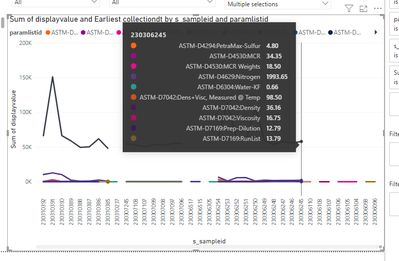
Here's that same sample in a graphing situation. I get different values shown for the different summary types. I need the actual values, not summaries of values.
And yes, I have already set the column for "Don't Summarize" but when building the visual, it still doesn't offer the "Don't Summarize" option.
Again, any help would be greatly appreciated. Thanks.
- Mark as New
- Bookmark
- Subscribe
- Mute
- Subscribe to RSS Feed
- Permalink
- Report Inappropriate Content
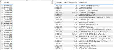
Here's an example of a sample that was ran with various tests in a table format. In my matrix I have it so I can break it down per sample, test method, etc. But as you can see from the data, getting summarizations of the data for a TREND does zero good. We must have the actual values of all the differing parameters for trending. The data on the right of the sample picture below is only ONE sample's data. Some samples have 1 line item of data, some are like the one shown with many, and then everything in between number of items wise.
- Mark as New
- Bookmark
- Subscribe
- Mute
- Subscribe to RSS Feed
- Permalink
- Report Inappropriate Content
I just post exactly the same case. The issue with Microsoft products, including Power BI is that is forcing you to do something you don't want to do. If I just want to show the raw value, why I can't just show the values as is ! Why is forcing COUNT, than I have to fix the mistakes the software is doing. I need to remove the COUNT and add SUM. Than I need to fix the legend. For each one of the column names !! I mean I will spend more time fixing the issue than creating the plot.
For every single column I need to change to "Don't summarize", than change the summary type on the plot, than change the legend. I need to do 3 changes per column name, becasue the software can't show the values as is.
Easy fix to have some configuration file. You could choose what you want to do, summary or not, reading the file or on the plot.
Amazying how this issue is not being fixed in 5 years....
- Mark as New
- Bookmark
- Subscribe
- Mute
- Subscribe to RSS Feed
- Permalink
- Report Inappropriate Content
Even i got the same problem. I set Don't summarize in table but visuals->values pane it is automatically taking count. I dont want to count my tickets.
- Mark as New
- Bookmark
- Subscribe
- Mute
- Subscribe to RSS Feed
- Permalink
- Report Inappropriate Content
Just in case someone else comes across this, the original question was never answered correctly.
A lot of users think that setting the table column in the Fields section to "Don't Summarize" should address the issue, but there are 2 layers of possible summarization:
- At the table level
- At the visual level
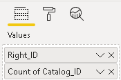
The table/column setting is seen here:
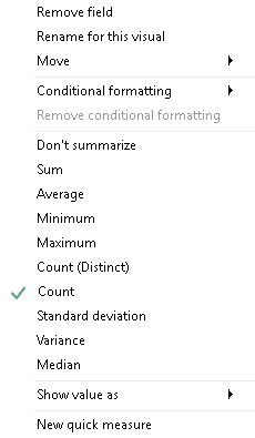
...buy you also need to check for summarization on each visual here:
I've seen this trip up a lot of novice report designers.
- Mark as New
- Bookmark
- Subscribe
- Mute
- Subscribe to RSS Feed
- Permalink
- Report Inappropriate Content
Thank you Sean for your inputs. In my case, since its individual visual level, the 2nd image helps. However I could find all options like Sum, Average etc except 'Don't summarize'. I am not sure what's the issue with my data that it doesn't show that. Also I miss the conditional formatting option in context menu although I feel it's not shown because the data type of the field is number
The Visual I use is Line chart visual if that is the reason I could not see 'dont summarize' I don't know.
- Mark as New
- Bookmark
- Subscribe
- Mute
- Subscribe to RSS Feed
- Permalink
- Report Inappropriate Content
I don't think you can do Don't Summarize on graphs.
As per my understanding, "Don't Summarize" in modelling helps when you drop the filed on canvas what should be the default behaviour, like count or sum, but if you are using it on graph, it is going to use one of aggregation method.
Could you elaborate why you don't want to summarize? There might be other way to do so like you can use max or min.
Subscribe to the @PowerBIHowTo YT channel for an upcoming video on List and Record functions in Power Query!!
Learn Power BI and Fabric - subscribe to our YT channel - Click here: @PowerBIHowTo
If my solution proved useful, I'd be delighted to receive Kudos. When you put effort into asking a question, it's equally thoughtful to acknowledge and give Kudos to the individual who helped you solve the problem. It's a small gesture that shows appreciation and encouragement! ❤
Did I answer your question? Mark my post as a solution. Proud to be a Super User! Appreciate your Kudos 🙂
Feel free to email me with any of your BI needs.
- Mark as New
- Bookmark
- Subscribe
- Mute
- Subscribe to RSS Feed
- Permalink
- Report Inappropriate Content
I'm failing to see how a graph is useful then.
For example, I want to get a line chart showing how long it takes tickets to be closes based on their start and close time.
How is an average useful for a line graph of this data in the least?
- Mark as New
- Bookmark
- Subscribe
- Mute
- Subscribe to RSS Feed
- Permalink
- Report Inappropriate Content
Can you share the example data?
I'm still not sure what you want to show on axis? How you want to measure? In terms of number of days/hours/minutes? What is the unit?
Can you share what output you like to see?
Subscribe to the @PowerBIHowTo YT channel for an upcoming video on List and Record functions in Power Query!!
Learn Power BI and Fabric - subscribe to our YT channel - Click here: @PowerBIHowTo
If my solution proved useful, I'd be delighted to receive Kudos. When you put effort into asking a question, it's equally thoughtful to acknowledge and give Kudos to the individual who helped you solve the problem. It's a small gesture that shows appreciation and encouragement! ❤
Did I answer your question? Mark my post as a solution. Proud to be a Super User! Appreciate your Kudos 🙂
Feel free to email me with any of your BI needs.
- Mark as New
- Bookmark
- Subscribe
- Mute
- Subscribe to RSS Feed
- Permalink
- Report Inappropriate Content
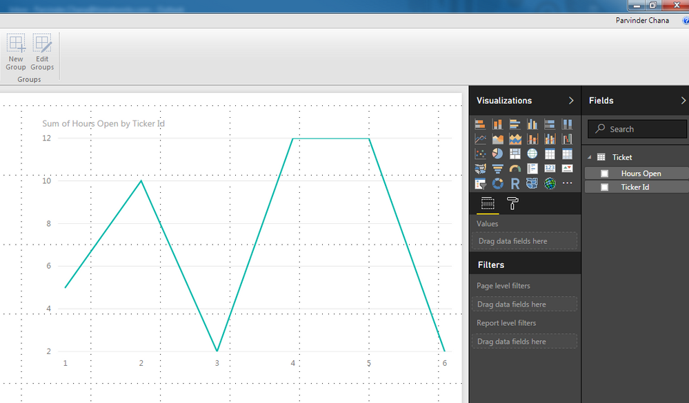
Ticket ID, Hours Open
1,5
2,10
3,2
4,12
5,12
6,2
I want something like this showing the time open over the course of the date range I'm using.
EDIT: picture isn't uploading here, so http://i.imgur.com/CQHX66j.png
- Mark as New
- Bookmark
- Subscribe
- Mute
- Subscribe to RSS Feed
- Permalink
- Report Inappropriate Content
You want to achieve within a date range how many tickets were open by "Open hours", in your example,
2 tickets opens for 12 hours
2 tickets open for 2 hours
1 ticket open for 5 and 10 hours,
Is this what you expect as a result on graph?
Subscribe to the @PowerBIHowTo YT channel for an upcoming video on List and Record functions in Power Query!!
Learn Power BI and Fabric - subscribe to our YT channel - Click here: @PowerBIHowTo
If my solution proved useful, I'd be delighted to receive Kudos. When you put effort into asking a question, it's equally thoughtful to acknowledge and give Kudos to the individual who helped you solve the problem. It's a small gesture that shows appreciation and encouragement! ❤
Did I answer your question? Mark my post as a solution. Proud to be a Super User! Appreciate your Kudos 🙂
Feel free to email me with any of your BI needs.
- Mark as New
- Bookmark
- Subscribe
- Mute
- Subscribe to RSS Feed
- Permalink
- Report Inappropriate Content
That says Sum of hours...I don't want to sum anything at all. I want to use the raw numbers.
- Mark as New
- Bookmark
- Subscribe
- Mute
- Subscribe to RSS Feed
- Permalink
- Report Inappropriate Content
Ok, let me ask you this, apart from saying "Sum of hours", can you confirm if graph is showing what you are looking for?
Subscribe to the @PowerBIHowTo YT channel for an upcoming video on List and Record functions in Power Query!!
Learn Power BI and Fabric - subscribe to our YT channel - Click here: @PowerBIHowTo
If my solution proved useful, I'd be delighted to receive Kudos. When you put effort into asking a question, it's equally thoughtful to acknowledge and give Kudos to the individual who helped you solve the problem. It's a small gesture that shows appreciation and encouragement! ❤
Did I answer your question? Mark my post as a solution. Proud to be a Super User! Appreciate your Kudos 🙂
Feel free to email me with any of your BI needs.
- Mark as New
- Bookmark
- Subscribe
- Mute
- Subscribe to RSS Feed
- Permalink
- Report Inappropriate Content
The graph looks like it's showing what I'd expect, but wouldn't that mean 'sum' isn't working correctly then, if not what exaclty IS the difference between sum and no summarizing?
- Mark as New
- Bookmark
- Subscribe
- Mute
- Subscribe to RSS Feed
- Permalink
- Report Inappropriate Content
As i mentioned the summarization method you set for a field is to set up default behaviour. In graphs, you are measuring your data and measure should have some aggregation, like sum/avg/min/max etc...
Subscribe to the @PowerBIHowTo YT channel for an upcoming video on List and Record functions in Power Query!!
Learn Power BI and Fabric - subscribe to our YT channel - Click here: @PowerBIHowTo
If my solution proved useful, I'd be delighted to receive Kudos. When you put effort into asking a question, it's equally thoughtful to acknowledge and give Kudos to the individual who helped you solve the problem. It's a small gesture that shows appreciation and encouragement! ❤
Did I answer your question? Mark my post as a solution. Proud to be a Super User! Appreciate your Kudos 🙂
Feel free to email me with any of your BI needs.
- Mark as New
- Bookmark
- Subscribe
- Mute
- Subscribe to RSS Feed
- Permalink
- Report Inappropriate Content
I'm not sure I follow.
From my example, isn't that a perfect example of when I would NOT want this behavior?
I have other sections where the behavior makes perfect sense, such as amount of tickets opened per top 30 users.
- Mark as New
- Bookmark
- Subscribe
- Mute
- Subscribe to RSS Feed
- Permalink
- Report Inappropriate Content
I believe amount of tickets you mean total count of tickets and total hour spent by user, correct?
So in this case, you are counting ticket and doing the sum on hours, you need to use COUNT and SUM to summarize data by user.
I'm still fully not sure what exactly you are after? May be someone else can better understand and explain.
Subscribe to the @PowerBIHowTo YT channel for an upcoming video on List and Record functions in Power Query!!
Learn Power BI and Fabric - subscribe to our YT channel - Click here: @PowerBIHowTo
If my solution proved useful, I'd be delighted to receive Kudos. When you put effort into asking a question, it's equally thoughtful to acknowledge and give Kudos to the individual who helped you solve the problem. It's a small gesture that shows appreciation and encouragement! ❤
Did I answer your question? Mark my post as a solution. Proud to be a Super User! Appreciate your Kudos 🙂
Feel free to email me with any of your BI needs.
- Mark as New
- Bookmark
- Subscribe
- Mute
- Subscribe to RSS Feed
- Permalink
- Report Inappropriate Content
I did mean count in that case.
I was saying I understand the need to aggregate in graphs.
But the case I'm asking about, with the hours, should not be aggregated, no? Why would I want to sum the values, when I'm looking for a line graph that shows fluctuations.
(Those were two separate examples)
Helpful resources

Join us at the Microsoft Fabric Community Conference
March 31 - April 2, 2025, in Las Vegas, Nevada. Use code MSCUST for a $150 discount!

We want your feedback!
Your insights matter. That’s why we created a quick survey to learn about your experience finding answers to technical questions.

Microsoft Fabric Community Conference 2025
Arun Ulag shares exciting details about the Microsoft Fabric Conference 2025, which will be held in Las Vegas, NV.

| User | Count |
|---|---|
| 123 | |
| 85 | |
| 85 | |
| 70 | |
| 51 |
| User | Count |
|---|---|
| 205 | |
| 153 | |
| 97 | |
| 79 | |
| 69 |
