Join us at FabCon Vienna from September 15-18, 2025
The ultimate Fabric, Power BI, SQL, and AI community-led learning event. Save €200 with code FABCOMM.
Get registered- Power BI forums
- Get Help with Power BI
- Desktop
- Service
- Report Server
- Power Query
- Mobile Apps
- Developer
- DAX Commands and Tips
- Custom Visuals Development Discussion
- Health and Life Sciences
- Power BI Spanish forums
- Translated Spanish Desktop
- Training and Consulting
- Instructor Led Training
- Dashboard in a Day for Women, by Women
- Galleries
- Data Stories Gallery
- Themes Gallery
- Contests Gallery
- Quick Measures Gallery
- Notebook Gallery
- Translytical Task Flow Gallery
- TMDL Gallery
- R Script Showcase
- Webinars and Video Gallery
- Ideas
- Custom Visuals Ideas (read-only)
- Issues
- Issues
- Events
- Upcoming Events
Enhance your career with this limited time 50% discount on Fabric and Power BI exams. Ends September 15. Request your voucher.
- Power BI forums
- Forums
- Get Help with Power BI
- Desktop
- One visual, multiple filters but only one active a...
- Subscribe to RSS Feed
- Mark Topic as New
- Mark Topic as Read
- Float this Topic for Current User
- Bookmark
- Subscribe
- Printer Friendly Page
- Mark as New
- Bookmark
- Subscribe
- Mute
- Subscribe to RSS Feed
- Permalink
- Report Inappropriate Content
One visual, multiple filters but only one active at a time
A feature in ClickView (non-Power BI) is that you can have only ONE visual, to which you throw in all your data, but then you have a filter section that shapes that visual's data based on the filter you choose.
Example:
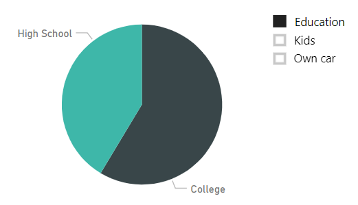
I want to have ONE pie-chart. In my dataset, I have the columns "Education" (Highschool or College), "Kids" (0 through 4) and If they own a car or not ("Yes", "No"). The pie-chart should only show one of these filters at a time.
To illustrate, here you see the pie-chart being filtered on Education:
Now I want to see how many kids all my representatives have, so by click Kids, the Education-filter is removed. It's not drilling in, it's simply re-shaping the visual based on the filter.
Is this do-able in Power-BI? These visualisations were made in Paint.
Solved! Go to Solution.
- Mark as New
- Bookmark
- Subscribe
- Mute
- Subscribe to RSS Feed
- Permalink
- Report Inappropriate Content
I believe this might solve the issue. Posting here while while attempting it before someone spends time answering this post.
https://www.kasperonbi.com/dynamically-switching-axis-on-visuals-with-power-bi/
- Mark as New
- Bookmark
- Subscribe
- Mute
- Subscribe to RSS Feed
- Permalink
- Report Inappropriate Content
Hi @Anonymous ,
It seems that you have found the solution. I will mark your reply as an answer to close this thread.
Best Regards,
Cherry
If this post helps, then please consider Accept it as the solution to help the other members find it more quickly.
Helpful resources
| User | Count |
|---|---|
| 65 | |
| 62 | |
| 60 | |
| 53 | |
| 30 |
| User | Count |
|---|---|
| 181 | |
| 83 | |
| 68 | |
| 49 | |
| 46 |


