Huge last-minute discounts for FabCon Vienna from September 15-18, 2025
Supplies are limited. Contact info@espc.tech right away to save your spot before the conference sells out.
Get your discount- Power BI forums
- Get Help with Power BI
- Desktop
- Service
- Report Server
- Power Query
- Mobile Apps
- Developer
- DAX Commands and Tips
- Custom Visuals Development Discussion
- Health and Life Sciences
- Power BI Spanish forums
- Translated Spanish Desktop
- Training and Consulting
- Instructor Led Training
- Dashboard in a Day for Women, by Women
- Galleries
- Data Stories Gallery
- Themes Gallery
- Contests Gallery
- Quick Measures Gallery
- Notebook Gallery
- Translytical Task Flow Gallery
- TMDL Gallery
- R Script Showcase
- Webinars and Video Gallery
- Ideas
- Custom Visuals Ideas (read-only)
- Issues
- Issues
- Events
- Upcoming Events
Score big with last-minute savings on the final tickets to FabCon Vienna. Secure your discount
- Power BI forums
- Forums
- Get Help with Power BI
- Desktop
- (Newbie) Cumulative graphs with dates as columns
- Subscribe to RSS Feed
- Mark Topic as New
- Mark Topic as Read
- Float this Topic for Current User
- Bookmark
- Subscribe
- Printer Friendly Page
- Mark as New
- Bookmark
- Subscribe
- Mute
- Subscribe to RSS Feed
- Permalink
- Report Inappropriate Content
(Newbie) Cumulative graphs with dates as columns
Hi,
Hi there
I've a task to work with a given excel spreadsheet which structure I can't change. It has distributed data as follows:
| Name | type | july | august | september | october | november |
| name 1 | actual | 2,345 | 6,789 | 6,789 | 7,891 | 4,456 |
| name 1 | budget | 1,234 | 5,678 | 9,123 | 3,234 | 7,789 |
| name 2 | actual | 4,567 | 1,234 | 2,234 | 5,678 | 4,456 |
| name 2 | budget | 7,891 | 2,345 | 4,567 | 6,789 | 3,345 |
It has a Line and clustered column chart (cumulative), but I wonder how can I show the same charts with Power Bi. I've tried different methods without success.
Any help/ideas?
Thank you.
Solved! Go to Solution.
- Mark as New
- Bookmark
- Subscribe
- Mute
- Subscribe to RSS Feed
- Permalink
- Report Inappropriate Content
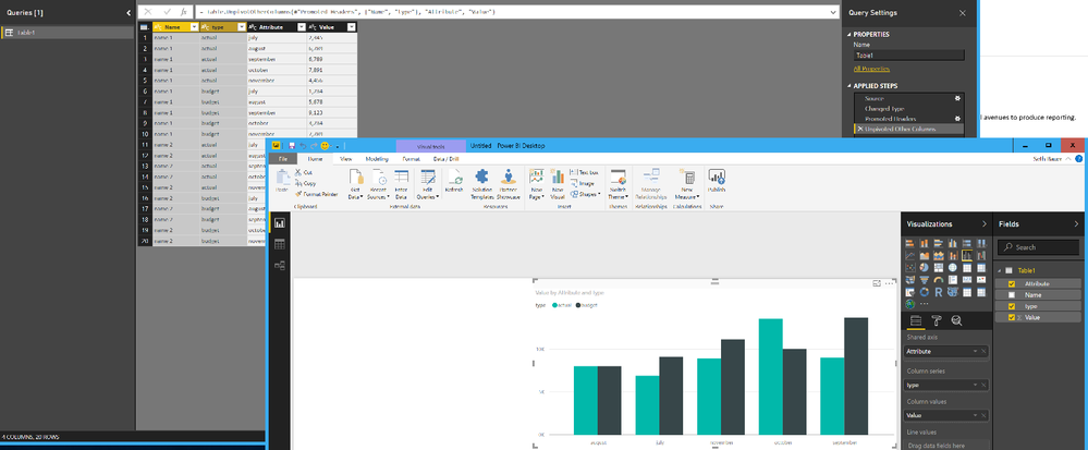
@j_acnail All you need to do is import the Excel file, select the columns to unpivot the months by (Name, Type) right click, unpivot other columns and this will pull things into rows that you can use.
Looking for more Power BI tips, tricks & tools? Check out PowerBI.tips the site I co-own with Mike Carlo. Also, if you are near SE WI? Join our PUG Milwaukee Brew City PUG
- Mark as New
- Bookmark
- Subscribe
- Mute
- Subscribe to RSS Feed
- Permalink
- Report Inappropriate Content
Thanks, that's what I needed.


