Join us at the 2025 Microsoft Fabric Community Conference
Microsoft Fabric Community Conference 2025, March 31 - April 2, Las Vegas, Nevada. Use code FABINSIDER for a $400 discount.
Register now- Power BI forums
- Get Help with Power BI
- Desktop
- Service
- Report Server
- Power Query
- Mobile Apps
- Developer
- DAX Commands and Tips
- Custom Visuals Development Discussion
- Health and Life Sciences
- Power BI Spanish forums
- Translated Spanish Desktop
- Training and Consulting
- Instructor Led Training
- Dashboard in a Day for Women, by Women
- Galleries
- Webinars and Video Gallery
- Data Stories Gallery
- Themes Gallery
- Power BI DataViz World Championships Gallery
- Quick Measures Gallery
- R Script Showcase
- COVID-19 Data Stories Gallery
- Community Connections & How-To Videos
- 2021 MSBizAppsSummit Gallery
- 2020 MSBizAppsSummit Gallery
- 2019 MSBizAppsSummit Gallery
- Events
- Ideas
- Custom Visuals Ideas (read-only)
- Issues
- Issues
- Events
- Upcoming Events
The Power BI DataViz World Championships are on! With four chances to enter, you could win a spot in the LIVE Grand Finale in Las Vegas. Show off your skills.
- Power BI forums
- Forums
- Get Help with Power BI
- Desktop
- Re: Need help with really hard task. Same Date and...
- Subscribe to RSS Feed
- Mark Topic as New
- Mark Topic as Read
- Float this Topic for Current User
- Bookmark
- Subscribe
- Printer Friendly Page
- Mark as New
- Bookmark
- Subscribe
- Mute
- Subscribe to RSS Feed
- Permalink
- Report Inappropriate Content
Need help with really hard task. Same Date and ID Relationship
Hello everyone, i have 2 data tables. One of them including month, id, status and sales. The other data table includes month, id and Transaction.
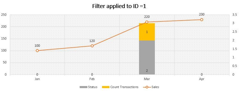
What i desire is to show in a clustered stacked column chart the amount of sales, count transtions and status after i have filtered these by the ID number.
Example:
Is it possible???
Data Info:
https://docs.google.com/spreadsheets/d/1oFMtGZHqbupQrCwnVdfM0UomFkG3EzwAub027AWr5kE/edit#gid=0
| First Data Table | |||
| Month | ID | Sales | Status |
| Jan | 1 | 100 | 0 |
| Feb | 1 | 120 | 0 |
| Mar | 1 | 220 | 2 |
| Apr | 1 | 230 | 0 |
| Jan | 2 | 180 | 0 |
| Feb | 2 | 220 | 2 |
| Mar | 2 | 230 | 0 |
| Apr | 2 | 190 | 0 |
| Jan | 3 | 195 | 5 |
| Feb | 3 | 240 | 2 |
| Mar | 3 | 230 | 0 |
| Apr | 3 | 220 | 2 |
| 2nd Data Table | ||
| Month | ID | Transaction |
| Feb | 2 | A1 |
| Feb | 3 | B3 |
| Mar | 1 | C2 |
Solved! Go to Solution.
- Mark as New
- Bookmark
- Subscribe
- Mute
- Subscribe to RSS Feed
- Permalink
- Report Inappropriate Content
hi, @hgzelaya
You could use this way:
Step1:
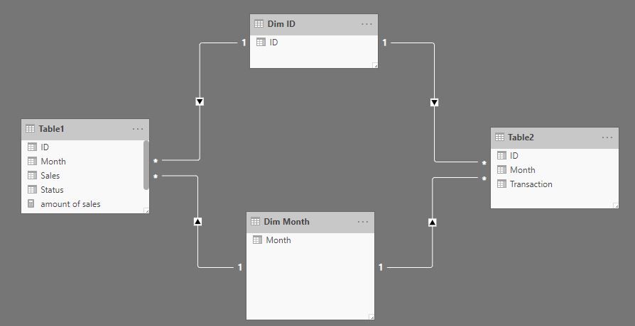
Add two dim tables: Dim Month table and Dim ID table
Step2:
Then create the relationship as below:
Step3:
Create three measure for "amount of sales, count transtions and status"
amount of sales = CALCULATE(SUM(Table1[Sales]))

count transtions = CALCULATE(COUNTA(Table2[Transaction]))

Status measure = CALCULATE(SUM(Table1[Status]))
From your screenshot, if it is sum(status)? if not just replace SUM(Table1[Status]) with COUNTA(Table1[Status])
Step4:
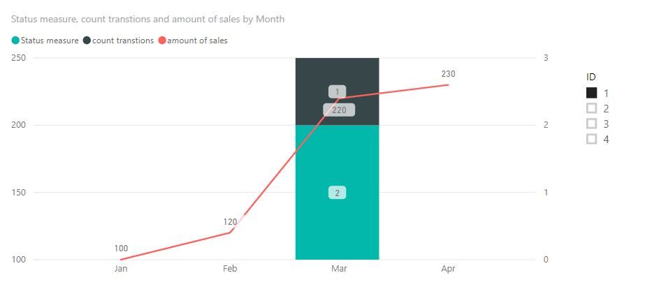
Then use Combo Chart in Power BI, use Month field from Dim Month table as X-axis, ID field from DIm ID table as a slicer.
https://docs.microsoft.com/en-us/power-bi/visuals/power-bi-visualization-combo-chart
Result:
here is sample pbix file, please try it.
Best Regards,
Lin
If this post helps, then please consider Accept it as the solution to help the other members find it more quickly.
- Mark as New
- Bookmark
- Subscribe
- Mute
- Subscribe to RSS Feed
- Permalink
- Report Inappropriate Content
Thank you so much it worked as i needed!
Helpful resources

Join us at the Microsoft Fabric Community Conference
March 31 - April 2, 2025, in Las Vegas, Nevada. Use code MSCUST for a $150 discount!

Power BI Monthly Update - February 2025
Check out the February 2025 Power BI update to learn about new features.

| User | Count |
|---|---|
| 82 | |
| 78 | |
| 52 | |
| 39 | |
| 35 |
| User | Count |
|---|---|
| 94 | |
| 79 | |
| 51 | |
| 47 | |
| 47 |


