- Power BI forums
- Updates
- News & Announcements
- Get Help with Power BI
- Desktop
- Service
- Report Server
- Power Query
- Mobile Apps
- Developer
- DAX Commands and Tips
- Custom Visuals Development Discussion
- Health and Life Sciences
- Power BI Spanish forums
- Translated Spanish Desktop
- Power Platform Integration - Better Together!
- Power Platform Integrations (Read-only)
- Power Platform and Dynamics 365 Integrations (Read-only)
- Training and Consulting
- Instructor Led Training
- Dashboard in a Day for Women, by Women
- Galleries
- Community Connections & How-To Videos
- COVID-19 Data Stories Gallery
- Themes Gallery
- Data Stories Gallery
- R Script Showcase
- Webinars and Video Gallery
- Quick Measures Gallery
- 2021 MSBizAppsSummit Gallery
- 2020 MSBizAppsSummit Gallery
- 2019 MSBizAppsSummit Gallery
- Events
- Ideas
- Custom Visuals Ideas
- Issues
- Issues
- Events
- Upcoming Events
- Community Blog
- Power BI Community Blog
- Custom Visuals Community Blog
- Community Support
- Community Accounts & Registration
- Using the Community
- Community Feedback
Earn a 50% discount on the DP-600 certification exam by completing the Fabric 30 Days to Learn It challenge.
- Power BI forums
- Forums
- Get Help with Power BI
- Desktop
- Re: Need help with YOY line chart
- Subscribe to RSS Feed
- Mark Topic as New
- Mark Topic as Read
- Float this Topic for Current User
- Bookmark
- Subscribe
- Printer Friendly Page
- Mark as New
- Bookmark
- Subscribe
- Mute
- Subscribe to RSS Feed
- Permalink
- Report Inappropriate Content
Need help with YOY line chart
Hello Community!
I'm very new to the Power BI and I need your help creating a year over yer comparision line chart.
At the moment I have created a line chart however for the PY it shows full year whereas I only want it to display same yearweek as current.
Another thing I need help with is creating a calculation field 'Change' which calculates the difference beween CY sales vs LY sales YTD (LY should only go upto max this years week. ). My data shows weekly and end of last week. I want the YTD total to display CY, and LY should be end of prior week LY(08/13/2022)
Below is how somewhat my data displays
Id really appreciate any help. Thank you!
Solved! Go to Solution.
- Mark as New
- Bookmark
- Subscribe
- Mute
- Subscribe to RSS Feed
- Permalink
- Report Inappropriate Content
you can create a scope column, then only do the calculation when scope is y
pls see the attachment below
Did I answer your question? Mark my post as a solution!
Proud to be a Super User!
- Mark as New
- Bookmark
- Subscribe
- Mute
- Subscribe to RSS Feed
- Permalink
- Report Inappropriate Content
- Mark as New
- Bookmark
- Subscribe
- Mute
- Subscribe to RSS Feed
- Permalink
- Report Inappropriate Content
you are welcome
Did I answer your question? Mark my post as a solution!
Proud to be a Super User!
- Mark as New
- Bookmark
- Subscribe
- Mute
- Subscribe to RSS Feed
- Permalink
- Report Inappropriate Content
@ryan_mayu Sorry for the late reply. This is exactly the format I was looking for. I need one additional thing changed and need your help with. My current data is looking YTD and ends last Sat. So for the current report, it should have data from 1/1/23 - 9/2/23. I want the PY to be compare the same time period(Week) so itd be 1/2/22 - 9/3/22 if that makes sense.
- Mark as New
- Bookmark
- Subscribe
- Mute
- Subscribe to RSS Feed
- Permalink
- Report Inappropriate Content
you can create a scope column, then only do the calculation when scope is y
pls see the attachment below
Did I answer your question? Mark my post as a solution!
Proud to be a Super User!
- Mark as New
- Bookmark
- Subscribe
- Mute
- Subscribe to RSS Feed
- Permalink
- Report Inappropriate Content
@ryan_mayu Hello I have one more question. Similar to here where you helped me get yoy data for same date time. How would the forumla change if I'm bringing one more year(2021) I'm looking to compare same timeframe for current year, Previous year and PPY.
'
I'm struggling to add the forumla for the PPY
- Mark as New
- Bookmark
- Subscribe
- Mute
- Subscribe to RSS Feed
- Permalink
- Report Inappropriate Content
maybe you can try this
Did I answer your question? Mark my post as a solution!
Proud to be a Super User!
- Mark as New
- Bookmark
- Subscribe
- Mute
- Subscribe to RSS Feed
- Permalink
- Report Inappropriate Content
@ryan_mayu Excellent!! This is exactly what I was looking to do. Thanks a lot for all your help!
- Mark as New
- Bookmark
- Subscribe
- Mute
- Subscribe to RSS Feed
- Permalink
- Report Inappropriate Content
you are welcome
Did I answer your question? Mark my post as a solution!
Proud to be a Super User!
- Mark as New
- Bookmark
- Subscribe
- Mute
- Subscribe to RSS Feed
- Permalink
- Report Inappropriate Content
@ryan_mayu Sorry to bother you again, I have one more question.
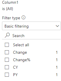
Mine doesnt show up in this order. it show up Change, PY, CY, Change% or like below
I tried dragging it or rearranging but its not working. How do I get these in the order like yours?
Also how do I get rid of the decimals and round up?
- Mark as New
- Bookmark
- Subscribe
- Mute
- Subscribe to RSS Feed
- Permalink
- Report Inappropriate Content
i have another order table which set up the orders. you can check the attachment i provided.
Did I answer your question? Mark my post as a solution!
Proud to be a Super User!
- Mark as New
- Bookmark
- Subscribe
- Mute
- Subscribe to RSS Feed
- Permalink
- Report Inappropriate Content
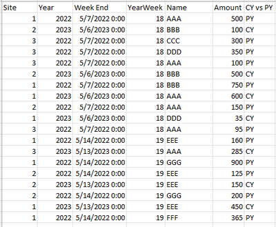
| Site | Year | Week End | YearWeek | Name | Amount | CY vs PY |
| 1 | 2022 | 5/7/2022 | 18 | AAA | 500 | PY |
| 2 | 2023 | 5/6/2023 | 18 | BBB | 100 | CY |
| 3 | 2022 | 5/7/2022 | 18 | CCC | 300 | PY |
| 3 | 2022 | 5/7/2022 | 18 | EEE | 350 | PY |
| 3 | 2022 | 5/7/2022 | 18 | AAA | 100 | PY |
| 2 | 2023 | 5/6/2023 | 18 | BBB | 500 | CY |
| 1 | 2022 | 5/7/2022 | 18 | BBB | 750 | PY |
| 1 | 2023 | 5/6/2023 | 18 | AAA | 600 | CY |
| 2 | 2022 | 5/7/2022 | 18 | AAA | 150 | PY |
| 1 | 2023 | 5/6/2023 | 18 | EEE | 35 | CY |
| 3 | 2022 | 5/7/2022 | 18 | AAA | 95 | PY |
| 1 | 2022 | 5/14/2022 | 19 | EEE | 160 | PY |
| 3 | 2023 | 5/13/2023 | 19 | AAA | 285 | CY |
| 2 | 2022 | 5/14/2022 | 19 | EEE | 125 | PY |
| 2 | 2023 | 5/13/2023 | 19 | EEE | 150 | CY |
| 2 | 2022 | 5/14/2022 | 19 | CCC | 200 | PY |
| 1 | 2023 | 5/13/2023 | 19 | EEE | 450 | CY |
| 1 | 2022 | 5/14/2022 | 19 | CCC | 365 | PY |
| 1 | 2022 | 5/14/2022 | 19 | AAA | 250 | PY |
| 2 | 2023 | 5/13/2023 | 19 | BBB | 950 | CY |
| 2 | 2022 | 5/14/2022 | 19 | BBB | 1000 | PY |
| 3 | 2023 | 5/6/2023 | 18 | CCC | 350 | CY |
| 2 | 2023 | 5/13/2023 | 19 | CCC | 625 | CY |
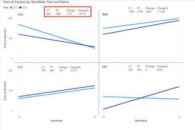
Heres my sample data. I already have this dashboard on Tableau and I'm trying to recreate it on PowerBI. Below is a snip of what I'm trying to get
At the moment I have the line chart created however I'm unsure on how to create the red boxed section which displays current year total(YTD), PY total(YTD total as same yearweek as CY), Change in $ and change%.
- Mark as New
- Bookmark
- Subscribe
- Mute
- Subscribe to RSS Feed
- Permalink
- Report Inappropriate Content
here is a wordaround for you
you just need to change the name filter to create the box for other names.
Did I answer your question? Mark my post as a solution!
Proud to be a Super User!
- Mark as New
- Bookmark
- Subscribe
- Mute
- Subscribe to RSS Feed
- Permalink
- Report Inappropriate Content
could you pls paste the sample data (not the screenshot) and also provide the expected output?
Did I answer your question? Mark my post as a solution!
Proud to be a Super User!
Helpful resources
| User | Count |
|---|---|
| 98 | |
| 90 | |
| 77 | |
| 71 | |
| 64 |
| User | Count |
|---|---|
| 115 | |
| 102 | |
| 98 | |
| 71 | |
| 67 |


