- Power BI forums
- Updates
- News & Announcements
- Get Help with Power BI
- Desktop
- Service
- Report Server
- Power Query
- Mobile Apps
- Developer
- DAX Commands and Tips
- Custom Visuals Development Discussion
- Health and Life Sciences
- Power BI Spanish forums
- Translated Spanish Desktop
- Power Platform Integration - Better Together!
- Power Platform Integrations (Read-only)
- Power Platform and Dynamics 365 Integrations (Read-only)
- Training and Consulting
- Instructor Led Training
- Dashboard in a Day for Women, by Women
- Galleries
- Community Connections & How-To Videos
- COVID-19 Data Stories Gallery
- Themes Gallery
- Data Stories Gallery
- R Script Showcase
- Webinars and Video Gallery
- Quick Measures Gallery
- 2021 MSBizAppsSummit Gallery
- 2020 MSBizAppsSummit Gallery
- 2019 MSBizAppsSummit Gallery
- Events
- Ideas
- Custom Visuals Ideas
- Issues
- Issues
- Events
- Upcoming Events
- Community Blog
- Power BI Community Blog
- Custom Visuals Community Blog
- Community Support
- Community Accounts & Registration
- Using the Community
- Community Feedback
Register now to learn Fabric in free live sessions led by the best Microsoft experts. From Apr 16 to May 9, in English and Spanish.
- Power BI forums
- Forums
- Get Help with Power BI
- Desktop
- Re: Need help in creating a report
- Subscribe to RSS Feed
- Mark Topic as New
- Mark Topic as Read
- Float this Topic for Current User
- Bookmark
- Subscribe
- Printer Friendly Page
- Mark as New
- Bookmark
- Subscribe
- Mute
- Subscribe to RSS Feed
- Permalink
- Report Inappropriate Content
Need help in creating a report
Hello Experts,
Hope everyone is doing good.
I have a requriement to create a visualization as explained below.
Here is my sample dummy data:
| Category | Project | Budget |
| ABC | P1 | 100 |
| DEF | P2 | 200 |
| GHI | P3 | 400 |
| ABC | P4 | 350 |
| ABC | P5 | 500 |
| DEF | P6 | 150 |
| GHI | P7 | 280 |
| GHI | P8 | 600 |
| GHI | P9 | 360 |
| DEF | P10 | 800 |
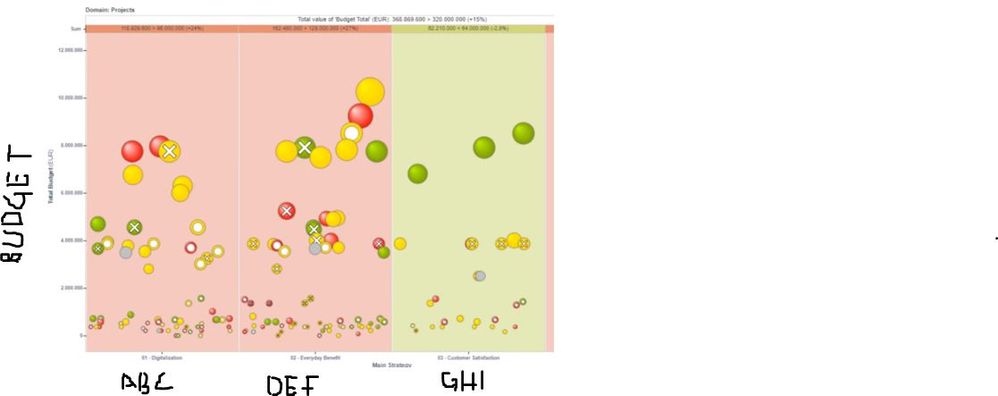
I want to create a visualization as shown below:
Expectation: In X-axis display categories and Y-axis display Budget and each project is displayed as bubble where size is proportional to budget. A representational image is attached in the reply section for reference.
Question 2: Is it possible to plot this kind of visualization in excel?
I would appreciate your response.
Thanks in advance.
Solved! Go to Solution.
- Mark as New
- Bookmark
- Subscribe
- Mute
- Subscribe to RSS Feed
- Permalink
- Report Inappropriate Content
Hi @Pratz203 ,
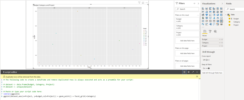
How about creating a R visual?
library(ggplot2)
ggplot(dataset,aes(x=Project, y=Budget,col=Project))+ geom_point() + facet_grid(~Category)
BTW, .pbix file attached.
Best Regards,
Icey
If this post helps, then please consider Accept it as the solution to help the other members find it more quickly.
- Mark as New
- Bookmark
- Subscribe
- Mute
- Subscribe to RSS Feed
- Permalink
- Report Inappropriate Content
Attaching the expected visuaization
- Mark as New
- Bookmark
- Subscribe
- Mute
- Subscribe to RSS Feed
- Permalink
- Report Inappropriate Content
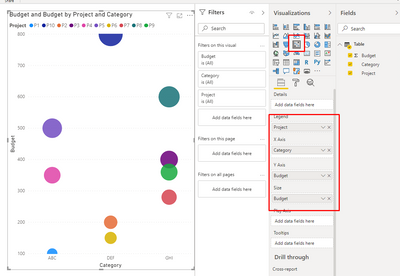
try the following set up
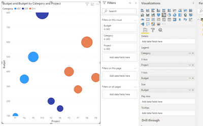
I realised I made a mistake, the setup should be
Legend = Category
X-Axis = Project
y Axis = Budget
Size = Budget
- Mark as New
- Bookmark
- Subscribe
- Mute
- Subscribe to RSS Feed
- Permalink
- Report Inappropriate Content
@Pratz203 , I doubt this kind of visual -
refer - https://docs.microsoft.com/en-us/power-bi/visuals/power-bi-visualization-scatter
Other you have
https://appsource.microsoft.com/en-us/product/power-bi-visuals/WA104381703?src=office&tab=Overview
https://appsource.microsoft.com/en-us/product/power-bi-visuals/WA104380762?tab=Overview
https://blog.pragmaticworks.com/power-bi-custom-visuals-enhanced-scatter
Microsoft Power BI Learning Resources, 2023 !!
Learn Power BI - Full Course with Dec-2022, with Window, Index, Offset, 100+ Topics !!
Did I answer your question? Mark my post as a solution! Appreciate your Kudos !! Proud to be a Super User! !!
Helpful resources

Microsoft Fabric Learn Together
Covering the world! 9:00-10:30 AM Sydney, 4:00-5:30 PM CET (Paris/Berlin), 7:00-8:30 PM Mexico City

Power BI Monthly Update - April 2024
Check out the April 2024 Power BI update to learn about new features.

| User | Count |
|---|---|
| 106 | |
| 105 | |
| 79 | |
| 69 | |
| 62 |
| User | Count |
|---|---|
| 142 | |
| 105 | |
| 103 | |
| 85 | |
| 70 |


