FabCon is coming to Atlanta
Join us at FabCon Atlanta from March 16 - 20, 2026, for the ultimate Fabric, Power BI, AI and SQL community-led event. Save $200 with code FABCOMM.
Register now!- Power BI forums
- Get Help with Power BI
- Desktop
- Service
- Report Server
- Power Query
- Mobile Apps
- Developer
- DAX Commands and Tips
- Custom Visuals Development Discussion
- Health and Life Sciences
- Power BI Spanish forums
- Translated Spanish Desktop
- Training and Consulting
- Instructor Led Training
- Dashboard in a Day for Women, by Women
- Galleries
- Data Stories Gallery
- Themes Gallery
- Contests Gallery
- QuickViz Gallery
- Quick Measures Gallery
- Visual Calculations Gallery
- Notebook Gallery
- Translytical Task Flow Gallery
- TMDL Gallery
- R Script Showcase
- Webinars and Video Gallery
- Ideas
- Custom Visuals Ideas (read-only)
- Issues
- Issues
- Events
- Upcoming Events
Get Fabric Certified for FREE during Fabric Data Days. Don't miss your chance! Request now
- Power BI forums
- Forums
- Get Help with Power BI
- Desktop
- Need help in creating Histogram chart in power BI
- Subscribe to RSS Feed
- Mark Topic as New
- Mark Topic as Read
- Float this Topic for Current User
- Bookmark
- Subscribe
- Printer Friendly Page
- Mark as New
- Bookmark
- Subscribe
- Mute
- Subscribe to RSS Feed
- Permalink
- Report Inappropriate Content
Need help in creating Histogram chart in power BI
Hi Guys,
I am new to power BI !!!
I have below data and I want to prepare histogram chart as shown below.
I also like to slice and dice the histogram with filter like week range and segment.
| Order Created Time | Week Range | Dealer | Segment |
| 7/25/2018 15:47 | 07/20/2018 - 07/26/2018 | YC PowerSports Columbia | Powersports |
| 7/23/2018 20:48 | 07/20/2018 - 07/26/2018 | Bright Powersports | Powersports |
| 7/23/2018 15:25 | 07/20/2018 - 07/26/2018 | Bright Powersports | Powersports |
| 7/22/2018 1:44 | 07/20/2018 - 07/26/2018 | YC PowerSports Columbia | Other |
| 7/20/2018 16:41 | 07/20/2018 - 07/26/2018 | Love Motorsports | Boats |
| 7/20/2018 15:24 | 07/20/2018 - 07/26/2018 | Love Motorsports | Boats |
| 7/19/2018 14:54 | 07/13/2018 - 07/19/2018 | YC PowerSports Columbia | Other |
| 7/19/2018 14:54 | 07/13/2018 - 07/19/2018 | Love Motorsports | Boats |
| 7/18/2018 9:56 | 07/13/2018 - 07/19/2018 | Wheels in Motion | Powersports |
Solved! Go to Solution.
- Mark as New
- Bookmark
- Subscribe
- Mute
- Subscribe to RSS Feed
- Permalink
- Report Inappropriate Content
Hi senthil9324,
You just need to add a calculate column:
Number of Order Created Modified = SWITCH(Table1[Number of Order Created], 1, "1~2", 2, "1~2", 3, "3~")

Regards,
Jimmy Tao
- Mark as New
- Bookmark
- Subscribe
- Mute
- Subscribe to RSS Feed
- Permalink
- Report Inappropriate Content
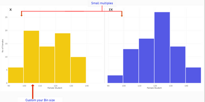
While DAX is a good workaround, it is limited in options- for e.g. changin bin sizes dynamically, using trellis/small multiple, etc.
There are custom visuals on appsource which have these features. The below visual for instance. Though, these are paid visuals and may cost a few dollars per user.
https://appsource.microsoft.com/en-us/product/power-bi-visuals/histogramstd
- Mark as New
- Bookmark
- Subscribe
- Mute
- Subscribe to RSS Feed
- Permalink
- Report Inappropriate Content
Hi senthil9324,
To achieve your requirement, create two calculate columns using DAX below:
Number of Order Created = CALCULATE(COUNT(Table1[Dealer]), ALLEXCEPT(Table1,Table1[Dealer]))

Number of Dealer = CALCULATE(DISTINCTCOUNT(Table1[Dealer]), ALLEXCEPT(Table1, Table1[Number of Order Created]))

Then create a stack column chart like this:

Regards,
Jimmy Tao
- Mark as New
- Bookmark
- Subscribe
- Mute
- Subscribe to RSS Feed
- Permalink
- Report Inappropriate Content
Hi Jimmy,
Thanks for the reply.
But I want to create histogram bucket wise, like sum of number of dealers falling under 1- 4,5-9,10-19 etc. number of order.
Thanks again.
- Mark as New
- Bookmark
- Subscribe
- Mute
- Subscribe to RSS Feed
- Permalink
- Report Inappropriate Content
Hi senthil9324,
You just need to add a calculate column:
Number of Order Created Modified = SWITCH(Table1[Number of Order Created], 1, "1~2", 2, "1~2", 3, "3~")

Regards,
Jimmy Tao
- Mark as New
- Bookmark
- Subscribe
- Mute
- Subscribe to RSS Feed
- Permalink
- Report Inappropriate Content
Hey @senthil9324
You easily create a histogram using an R visual. I made a quick video on this here:
https://www.youtube.com/watch?v=nePWIVgHobs
There are also a couple custom visuals for histograms that you can try.
Hope this helps,
Parker
- Mark as New
- Bookmark
- Subscribe
- Mute
- Subscribe to RSS Feed
- Permalink
- Report Inappropriate Content
The default R script that runs removes duplicate rows from the data, which defeats the purpose of a histogram. Any suggestions?
Helpful resources

Power BI Monthly Update - November 2025
Check out the November 2025 Power BI update to learn about new features.

Fabric Data Days
Advance your Data & AI career with 50 days of live learning, contests, hands-on challenges, study groups & certifications and more!


