FabCon is coming to Atlanta
Join us at FabCon Atlanta from March 16 - 20, 2026, for the ultimate Fabric, Power BI, AI and SQL community-led event. Save $200 with code FABCOMM.
Register now!- Power BI forums
- Get Help with Power BI
- Desktop
- Service
- Report Server
- Power Query
- Mobile Apps
- Developer
- DAX Commands and Tips
- Custom Visuals Development Discussion
- Health and Life Sciences
- Power BI Spanish forums
- Translated Spanish Desktop
- Training and Consulting
- Instructor Led Training
- Dashboard in a Day for Women, by Women
- Galleries
- Data Stories Gallery
- Themes Gallery
- Contests Gallery
- QuickViz Gallery
- Quick Measures Gallery
- Visual Calculations Gallery
- Notebook Gallery
- Translytical Task Flow Gallery
- TMDL Gallery
- R Script Showcase
- Webinars and Video Gallery
- Ideas
- Custom Visuals Ideas (read-only)
- Issues
- Issues
- Events
- Upcoming Events
The Power BI Data Visualization World Championships is back! Get ahead of the game and start preparing now! Learn more
- Power BI forums
- Forums
- Get Help with Power BI
- Desktop
- Multiples dates in one table
- Subscribe to RSS Feed
- Mark Topic as New
- Mark Topic as Read
- Float this Topic for Current User
- Bookmark
- Subscribe
- Printer Friendly Page
- Mark as New
- Bookmark
- Subscribe
- Mute
- Subscribe to RSS Feed
- Permalink
- Report Inappropriate Content
Multiples dates in one table
Hi
I have the following problem. I have a table with information of all the employees who are active and inactive of the company. In this table i have a date of admission and for those inactive employees date of leave. I want to have a visualization that shows de increase of employees through months. Example table information:
| ID | Employee | Date of admission | Date of leave | Active |
| 1 | Juan | 1/1/2019 | Yes | |
| 2 | Maria | 7/6/2003 | Yes | |
| 3 | Pedro | 6/5/2020 | 7/6/2022 | No |
| 4 | Ulises | 6/8/2018 | 8/5/2021 | No |
| 5 | Roberto | 7/9/2019 | Yes | |
| 6 | Lucia | 2/3/2015 | Yes |
Dax formula i used:
Historic Headcount=
When i show the visualization i realise that de cummulative headcount in time it is only counting for each mont employees that enter the company. So the number is always increasing. It doesent count in each month the employees which where active in a mont but now they are not active because they leave
Please Help
Thanks!
Solved! Go to Solution.
- Mark as New
- Bookmark
- Subscribe
- Mute
- Subscribe to RSS Feed
- Permalink
- Report Inappropriate Content
@Anonymous , Please refer to my blog or the attached files after signatures
- Mark as New
- Bookmark
- Subscribe
- Mute
- Subscribe to RSS Feed
- Permalink
- Report Inappropriate Content
Hi @Anonymous ,
According to your description, you want to show in the current Date from Date table, how many employees are there with active status. here's my solution.
1. Don't make any relationship between Empleados and Date table.
2. Create a measure.
Historic Headcount =
CALCULATE (
    DISTINCTCOUNT ( Empleados[Employee] ),
    FILTER (
        ALLSELECTED ( Empleados ),
        'Empleados'[Date of admission] <= MAX ( 'Date'[Date] )
            && (
                'Empleados'[Date of leave] = BLANK ()
                    || 'Empleados'[Date of leave] >= MAX ( 'Date'[Date] )
            )
    )
)
Get the correct result.
I attach my sample below for your reference.
Best Regards,
Community Support Team _ kalyj
If this post helps, then please consider Accept it as the solution to help the other members find it more quickly.
- Mark as New
- Bookmark
- Subscribe
- Mute
- Subscribe to RSS Feed
- Permalink
- Report Inappropriate Content
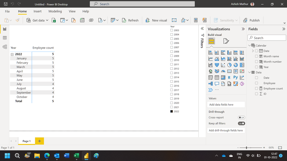
Hi,
You may download my PBI file from here.
Hope this helps.
Regards,
Ashish Mathur
http://www.ashishmathur.com
https://www.linkedin.com/in/excelenthusiasts/
- Mark as New
- Bookmark
- Subscribe
- Mute
- Subscribe to RSS Feed
- Permalink
- Report Inappropriate Content
@Anonymous , Please refer to my blog or the attached files after signatures
- Mark as New
- Bookmark
- Subscribe
- Mute
- Subscribe to RSS Feed
- Permalink
- Report Inappropriate Content
Thank uuu!
it solved my problem!
Helpful resources

Power BI Dataviz World Championships
The Power BI Data Visualization World Championships is back! Get ahead of the game and start preparing now!

| User | Count |
|---|---|
| 38 | |
| 36 | |
| 33 | |
| 32 | |
| 28 |
| User | Count |
|---|---|
| 129 | |
| 88 | |
| 79 | |
| 68 | |
| 63 |


