FabCon is coming to Atlanta
Join us at FabCon Atlanta from March 16 - 20, 2026, for the ultimate Fabric, Power BI, AI and SQL community-led event. Save $200 with code FABCOMM.
Register now!- Power BI forums
- Get Help with Power BI
- Desktop
- Service
- Report Server
- Power Query
- Mobile Apps
- Developer
- DAX Commands and Tips
- Custom Visuals Development Discussion
- Health and Life Sciences
- Power BI Spanish forums
- Translated Spanish Desktop
- Training and Consulting
- Instructor Led Training
- Dashboard in a Day for Women, by Women
- Galleries
- Data Stories Gallery
- Themes Gallery
- Contests Gallery
- QuickViz Gallery
- Quick Measures Gallery
- Visual Calculations Gallery
- Notebook Gallery
- Translytical Task Flow Gallery
- TMDL Gallery
- R Script Showcase
- Webinars and Video Gallery
- Ideas
- Custom Visuals Ideas (read-only)
- Issues
- Issues
- Events
- Upcoming Events
The Power BI Data Visualization World Championships is back! Get ahead of the game and start preparing now! Learn more
- Power BI forums
- Forums
- Get Help with Power BI
- Desktop
- Multiple type counts in bar chart
- Subscribe to RSS Feed
- Mark Topic as New
- Mark Topic as Read
- Float this Topic for Current User
- Bookmark
- Subscribe
- Printer Friendly Page
- Mark as New
- Bookmark
- Subscribe
- Mute
- Subscribe to RSS Feed
- Permalink
- Report Inappropriate Content
Multiple type counts in bar chart
I feel like this should be easy to achieve and maybe I'm trying too early in the AM. 🙂
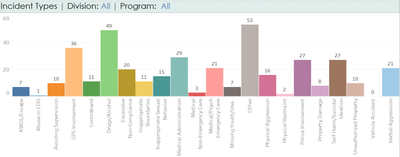
I have about 10000 records of incident reports. Each incident report contains multiple incident types. I want to be able to create a bar chart like the one below (which was done in Tableau using Measure Names and Measure Values). Can't figure out the equivalent in Power BI. A simple count of how many times a type shows up on incident reports. The types are represented as 0 = False and 1 = True.
My types are measures:
Solved! Go to Solution.
- Mark as New
- Bookmark
- Subscribe
- Mute
- Subscribe to RSS Feed
- Permalink
- Report Inappropriate Content
Hi @pbrainard ,
Currently, measures can be dragged to value or tooltips field, but can’t be dragged to legend or X-axis field in a bar chart.
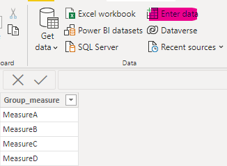
You can create a table, the content of the column is the name of the measure, and put this column into it to display.
Here are the steps you can follow:
1. Use Enter data to create a table.
2. Create measure.
Measure =
SWITCH(
    TRUE(),
    MAX('Table2'[Group_measure])="MeasureA",[MeasureA],
    MAX('Table2'[Group_measure])="MeasureB",[MeasureB],
    MAX('Table2'[Group_measure])="MeasureC",[MeasureC],
    MAX('Table2'[Group_measure])="MeasureD",[MeasureD])
3. Result:
Best Regards,
Liu Yang
If this post helps, then please consider Accept it as the solution to help the other members find it more quickly
Helpful resources

Power BI Dataviz World Championships
The Power BI Data Visualization World Championships is back! Get ahead of the game and start preparing now!

| User | Count |
|---|---|
| 38 | |
| 36 | |
| 33 | |
| 31 | |
| 28 |
| User | Count |
|---|---|
| 129 | |
| 88 | |
| 79 | |
| 68 | |
| 63 |


