FabCon is coming to Atlanta
Join us at FabCon Atlanta from March 16 - 20, 2026, for the ultimate Fabric, Power BI, AI and SQL community-led event. Save $200 with code FABCOMM.
Register now!- Power BI forums
- Get Help with Power BI
- Desktop
- Service
- Report Server
- Power Query
- Mobile Apps
- Developer
- DAX Commands and Tips
- Custom Visuals Development Discussion
- Health and Life Sciences
- Power BI Spanish forums
- Translated Spanish Desktop
- Training and Consulting
- Instructor Led Training
- Dashboard in a Day for Women, by Women
- Galleries
- Data Stories Gallery
- Themes Gallery
- Contests Gallery
- QuickViz Gallery
- Quick Measures Gallery
- Visual Calculations Gallery
- Notebook Gallery
- Translytical Task Flow Gallery
- TMDL Gallery
- R Script Showcase
- Webinars and Video Gallery
- Ideas
- Custom Visuals Ideas (read-only)
- Issues
- Issues
- Events
- Upcoming Events
The Power BI Data Visualization World Championships is back! Get ahead of the game and start preparing now! Learn more
- Power BI forums
- Forums
- Get Help with Power BI
- Desktop
- Multiple series line chart with conditional format...
- Subscribe to RSS Feed
- Mark Topic as New
- Mark Topic as Read
- Float this Topic for Current User
- Bookmark
- Subscribe
- Printer Friendly Page
- Mark as New
- Bookmark
- Subscribe
- Mute
- Subscribe to RSS Feed
- Permalink
- Report Inappropriate Content
Multiple series line chart with conditional formatting for line color
Hi All,
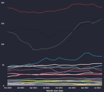
I'm trying to get multiple lines chart like with using column in legend (below) but I would like to have a freedom to use conditional formatting for changing series colors. In Tableau it is really easy to do it, as there there is seperate field for defining detial and color of plot.
I failed with getting what I want by using standard PBI line chart. Perhaps anyone ise familiar with a custom line chart which allows me to create desire
- Mark as New
- Bookmark
- Subscribe
- Mute
- Subscribe to RSS Feed
- Permalink
- Report Inappropriate Content
I failed with getting what I want by using standard PBI line chartCan you please elaborate - this is relatively standard functionality. What have you tried and where are you stuck?
- Mark as New
- Bookmark
- Subscribe
- Mute
- Subscribe to RSS Feed
- Permalink
- Report Inappropriate Content
Hi @lbendlin ,
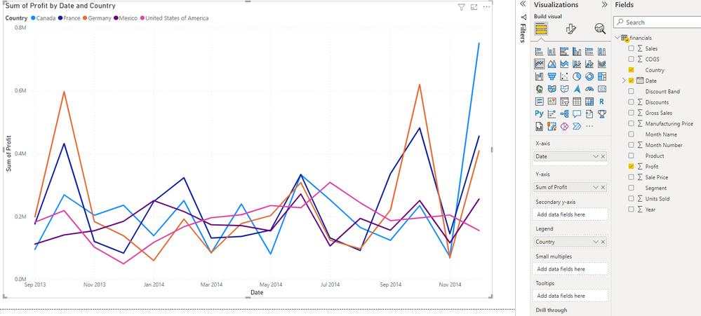
I have dragged and dropped column to the legend field to break down the chart tu multiple series (Attached image above). Now I would like to instead of relying of auto-generated line colors, define my own condition for coloring series.
- Mark as New
- Bookmark
- Subscribe
- Mute
- Subscribe to RSS Feed
- Permalink
- Report Inappropriate Content
Please provide sanitized sample data that fully covers your issue.
https://community.powerbi.com/t5/Community-Blog/How-to-provide-sample-data-in-the-Power-BI-Forum/ba-...
Please show the expected outcome based on the sample data you provided.
https://community.powerbi.com/t5/Desktop/How-to-Get-Your-Question-Answered-Quickly/m-p/1447523
- Mark as New
- Bookmark
- Subscribe
- Mute
- Subscribe to RSS Feed
- Permalink
- Report Inappropriate Content
Hi @lbendlin,
I have attached PBI report which is based on PBI's sample dataset Test report.
I would like to apply condition formatting to line coloring, and not change each line color indivually.
- Mark as New
- Bookmark
- Subscribe
- Mute
- Subscribe to RSS Feed
- Permalink
- Report Inappropriate Content
First step is to create a measure or calculated column to define the color. In your case a calculated column is sufficient.
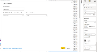
Color = SWITCH(financials[Country],"Canada","#118DFF","France","#12239E","Germany","#E66C37","Mexico","#6B007B","#E044A7")Then you can apply that field in your formatting. Well, you could if that feature would work. I was really sorprised that this is either not enabled or still broken from the implementation of the new formatting pane.
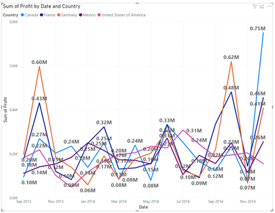
Ironically it makes it look like it works for the data labels. But when you apply the rule it will be ignored.
But when you apply the rule it will be ignored.
So yes, this is definitely broken. Sorry!
- Mark as New
- Bookmark
- Subscribe
- Mute
- Subscribe to RSS Feed
- Permalink
- Report Inappropriate Content
Hi @lbendlin ,
Thanks for your reply.
Yeah, this is what I was expcting.
Do ye remember if that option was available before they changed formatting pane?
Beacause if so, I could report that to MS.
BR
Zbigniew Porzych
- Mark as New
- Bookmark
- Subscribe
- Mute
- Subscribe to RSS Feed
- Permalink
- Report Inappropriate Content
Yes, I think this qualifies as an issue. You can raise it at https://issues.powerbi.com . If you have a Pro license you can consider raising a Pro ticket at https://powerbi.microsoft.com/en-us/support/pro/
- Mark as New
- Bookmark
- Subscribe
- Mute
- Subscribe to RSS Feed
- Permalink
- Report Inappropriate Content
Helpful resources

Power BI Dataviz World Championships
The Power BI Data Visualization World Championships is back! Get ahead of the game and start preparing now!

| User | Count |
|---|---|
| 60 | |
| 44 | |
| 40 | |
| 37 | |
| 21 |
| User | Count |
|---|---|
| 178 | |
| 127 | |
| 116 | |
| 77 | |
| 54 |


