FabCon is coming to Atlanta
Join us at FabCon Atlanta from March 16 - 20, 2026, for the ultimate Fabric, Power BI, AI and SQL community-led event. Save $200 with code FABCOMM.
Register now!- Power BI forums
- Get Help with Power BI
- Desktop
- Service
- Report Server
- Power Query
- Mobile Apps
- Developer
- DAX Commands and Tips
- Custom Visuals Development Discussion
- Health and Life Sciences
- Power BI Spanish forums
- Translated Spanish Desktop
- Training and Consulting
- Instructor Led Training
- Dashboard in a Day for Women, by Women
- Galleries
- Data Stories Gallery
- Themes Gallery
- Contests Gallery
- QuickViz Gallery
- Quick Measures Gallery
- Visual Calculations Gallery
- Notebook Gallery
- Translytical Task Flow Gallery
- TMDL Gallery
- R Script Showcase
- Webinars and Video Gallery
- Ideas
- Custom Visuals Ideas (read-only)
- Issues
- Issues
- Events
- Upcoming Events
View all the Fabric Data Days sessions on demand. View schedule
- Power BI forums
- Forums
- Get Help with Power BI
- Desktop
- Multiple lines with divergent points (date values)...
- Subscribe to RSS Feed
- Mark Topic as New
- Mark Topic as Read
- Float this Topic for Current User
- Bookmark
- Subscribe
- Printer Friendly Page
- Mark as New
- Bookmark
- Subscribe
- Mute
- Subscribe to RSS Feed
- Permalink
- Report Inappropriate Content
Multiple lines with divergent points (date values) in a line diagram
Hey guys,
I want to visualize the number of start and end dates (each point in time) in a line diagram. My problem is, that the columns "start date" and "end date" do not have the same points on the x-axis (dates), which is totally okay and wanted, but the x-axis needs both of them. So I just made a new table with a column, that contains the merged dates via CALENDARAUTO, but that does not work because this table needs to be related to the original table, which is impossible (there can only be one connection, but I have 2 columns to connect (start date and end date).
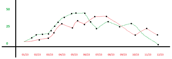
I have tried to viszualize the desired result:
I guess it can't be that difficult, it's possible in Excel, but I can't transform my thoughts about it from the cell-sight to the row-sight 😅
To make it easier, here are some sample data:
| Activity | Start Date | End Date |
| A1 | 21.04.2023 | 25.06.2023 |
| A2 | 21.04.2023 | 12.08.2023 |
| A3 | 01.02.2023 | 01.03.2023 |
| A4 | 17.10.2023 | 31.12.2024 |
| A5 | 21.04.2023 | 31.12.2024 |
| A6 | 01.02.2023 | 25.06.2023 |
I'm excited for your anwers and grateful for help.
Kind regards
Dennis
- Mark as New
- Bookmark
- Subscribe
- Mute
- Subscribe to RSS Feed
- Permalink
- Report Inappropriate Content
Hi @Denudi ,
If I understand correctly, it seems that you want to display the data of both start date and end date on X-axis. Am I rigth? If yes, you can refer the following thread to get it:
Solved: How to add data on a linear graph by two date - Microsoft Fabric Community
Best Regards
Helpful resources

Power BI Monthly Update - November 2025
Check out the November 2025 Power BI update to learn about new features.

Fabric Data Days
Advance your Data & AI career with 50 days of live learning, contests, hands-on challenges, study groups & certifications and more!


