FabCon is coming to Atlanta
Join us at FabCon Atlanta from March 16 - 20, 2026, for the ultimate Fabric, Power BI, AI and SQL community-led event. Save $200 with code FABCOMM.
Register now!- Power BI forums
- Get Help with Power BI
- Desktop
- Service
- Report Server
- Power Query
- Mobile Apps
- Developer
- DAX Commands and Tips
- Custom Visuals Development Discussion
- Health and Life Sciences
- Power BI Spanish forums
- Translated Spanish Desktop
- Training and Consulting
- Instructor Led Training
- Dashboard in a Day for Women, by Women
- Galleries
- Data Stories Gallery
- Themes Gallery
- Contests Gallery
- Quick Measures Gallery
- Notebook Gallery
- Translytical Task Flow Gallery
- TMDL Gallery
- R Script Showcase
- Webinars and Video Gallery
- Ideas
- Custom Visuals Ideas (read-only)
- Issues
- Issues
- Events
- Upcoming Events
To celebrate FabCon Vienna, we are offering 50% off select exams. Ends October 3rd. Request your discount now.
- Power BI forums
- Forums
- Get Help with Power BI
- Desktop
- Multiple line charts
- Subscribe to RSS Feed
- Mark Topic as New
- Mark Topic as Read
- Float this Topic for Current User
- Bookmark
- Subscribe
- Printer Friendly Page
- Mark as New
- Bookmark
- Subscribe
- Mute
- Subscribe to RSS Feed
- Permalink
- Report Inappropriate Content
Multiple line charts
So how do i generate multiple line charts based on each content of a particular table ie. when i select each row of the table automatically a line graph corresponding to the row should be generated and similarly if i select 2 rows of the table there should be 2 line charts and so on based on the number of selections made on the table .
Solved! Go to Solution.
- Mark as New
- Bookmark
- Subscribe
- Mute
- Subscribe to RSS Feed
- Permalink
- Report Inappropriate Content
Hi @Anonymous
In addition to amitchandak 's reply, if your data model is like my sample data, you may try to build an unrelated slicer table and use measure.
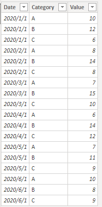
Sample Date:
Build a slicer table.
Category = VALUES('Table'[Category])Measure:
Measure =
VAR _SelectCategory = ALLSELECTED(Category[Category])
Return
IF(ISFILTERED(Category[Category]),SUMX(FILTER('Table','Table'[Category] in _SelectCategory),'Table'[Value]),BLANK())
Build a line chart and result is as below.
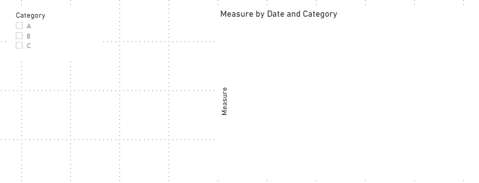
By default:
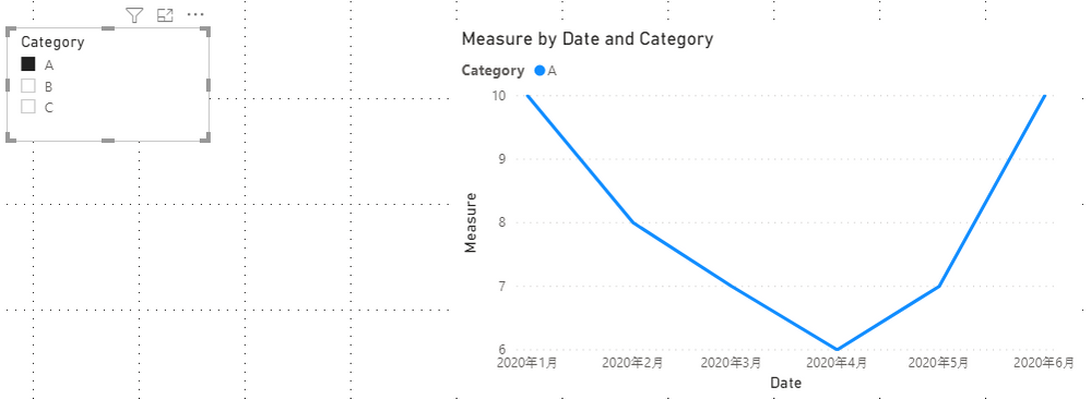
Select A:
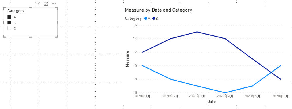
Select A & B:
If this reply still couldn't solve your problem, please show me your table and the result you want.
Or you can share your pbix file with me by Onedrive for Business.
You can download the pbix file from this link: Multiple line charts
Best Regards,
Rico Zhou
If this post helps, then please consider Accept it as the solution to help the other members find it more quickly.
- Mark as New
- Bookmark
- Subscribe
- Mute
- Subscribe to RSS Feed
- Permalink
- Report Inappropriate Content
I tried small multiple line chart visual in the market place but it didnt give me the required result
- Mark as New
- Bookmark
- Subscribe
- Mute
- Subscribe to RSS Feed
- Permalink
- Report Inappropriate Content
@Anonymous , I doubt any visual like that. If you use a legend line visual and the other table can filter legend. Each legend will create one line
- Mark as New
- Bookmark
- Subscribe
- Mute
- Subscribe to RSS Feed
- Permalink
- Report Inappropriate Content
Is there any market visual that can achieve this
Helpful resources
| User | Count |
|---|---|
| 98 | |
| 76 | |
| 74 | |
| 49 | |
| 26 |


