Join us at FabCon Vienna from September 15-18, 2025
The ultimate Fabric, Power BI, SQL, and AI community-led learning event. Save €200 with code FABCOMM.
Get registered- Power BI forums
- Get Help with Power BI
- Desktop
- Service
- Report Server
- Power Query
- Mobile Apps
- Developer
- DAX Commands and Tips
- Custom Visuals Development Discussion
- Health and Life Sciences
- Power BI Spanish forums
- Translated Spanish Desktop
- Training and Consulting
- Instructor Led Training
- Dashboard in a Day for Women, by Women
- Galleries
- Data Stories Gallery
- Themes Gallery
- Contests Gallery
- Quick Measures Gallery
- Notebook Gallery
- Translytical Task Flow Gallery
- TMDL Gallery
- R Script Showcase
- Webinars and Video Gallery
- Ideas
- Custom Visuals Ideas (read-only)
- Issues
- Issues
- Events
- Upcoming Events
Compete to become Power BI Data Viz World Champion! First round ends August 18th. Get started.
- Power BI forums
- Forums
- Get Help with Power BI
- Desktop
- Multiple Time Slicer
- Subscribe to RSS Feed
- Mark Topic as New
- Mark Topic as Read
- Float this Topic for Current User
- Bookmark
- Subscribe
- Printer Friendly Page
- Mark as New
- Bookmark
- Subscribe
- Mute
- Subscribe to RSS Feed
- Permalink
- Report Inappropriate Content
Multiple Time Slicer
Hi there,
I'm struggling with a case, where I need multiple time slicer for data comparisson.
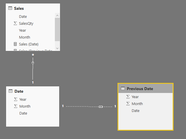
Currently I have the following (easy) data model:
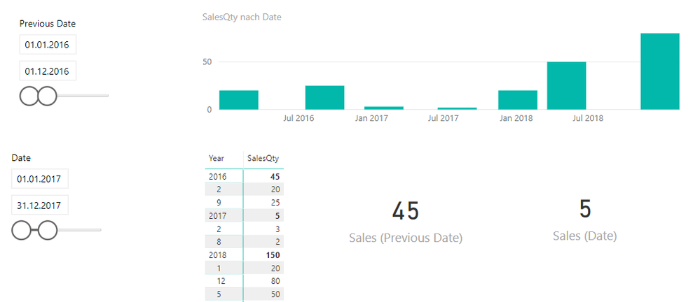
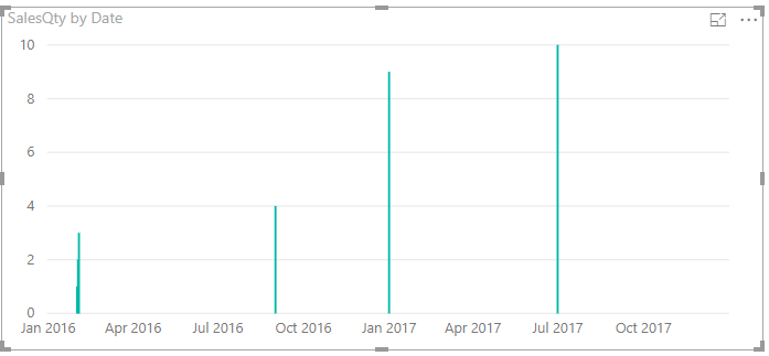
My requirement is to have two time slicer, where I can select individual time frames. The result should be shown as sum in two seperate cards and also visualized in a chart. The chart should show (not like in the picture below) a continous time, That means, if I compare the whole year for 2016 with 2018, but I have only data for 02.2016, 09.2016, 01.2018, 05.2018 and 09.2018, then I want to see the whole selected time on the x-axis with filled up zero sales periods in the visualization.
I know it is pretty complex and I've already tried to use functions like "USERELATIONSHIP" to calculate the figures in the cards. But then I still have the problem with visualization, which is not working.
Any ideas how one can solve it?
Thanks a lot for ideas
- Mark as New
- Bookmark
- Subscribe
- Mute
- Subscribe to RSS Feed
- Permalink
- Report Inappropriate Content
hi,@Tido
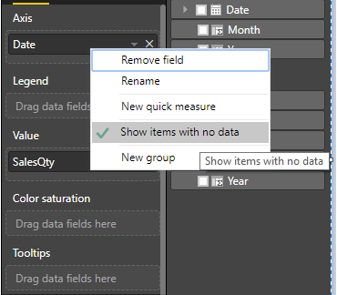
You can right click on the field date and select Show items with no data
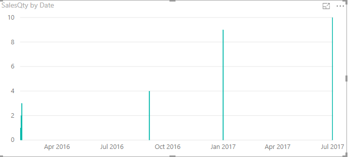
Result:
before
After
Best Regards,
Lin
If this post helps, then please consider Accept it as the solution to help the other members find it more quickly.
