FabCon is coming to Atlanta
Join us at FabCon Atlanta from March 16 - 20, 2026, for the ultimate Fabric, Power BI, AI and SQL community-led event. Save $200 with code FABCOMM.
Register now!- Power BI forums
- Get Help with Power BI
- Desktop
- Service
- Report Server
- Power Query
- Mobile Apps
- Developer
- DAX Commands and Tips
- Custom Visuals Development Discussion
- Health and Life Sciences
- Power BI Spanish forums
- Translated Spanish Desktop
- Training and Consulting
- Instructor Led Training
- Dashboard in a Day for Women, by Women
- Galleries
- Data Stories Gallery
- Themes Gallery
- Contests Gallery
- QuickViz Gallery
- Quick Measures Gallery
- Visual Calculations Gallery
- Notebook Gallery
- Translytical Task Flow Gallery
- TMDL Gallery
- R Script Showcase
- Webinars and Video Gallery
- Ideas
- Custom Visuals Ideas (read-only)
- Issues
- Issues
- Events
- Upcoming Events
The Power BI Data Visualization World Championships is back! Get ahead of the game and start preparing now! Learn more
- Power BI forums
- Forums
- Get Help with Power BI
- Desktop
- Multi-row card format question
- Subscribe to RSS Feed
- Mark Topic as New
- Mark Topic as Read
- Float this Topic for Current User
- Bookmark
- Subscribe
- Printer Friendly Page
- Mark as New
- Bookmark
- Subscribe
- Mute
- Subscribe to RSS Feed
- Permalink
- Report Inappropriate Content
Multi-row card format question
Greetings from Vancouver Island. I have a test Excel sheet with one row of data that I'm trying to display on a multi-row card. I'm having a problem with the category displaying on the bottom vs. on top of the item from the table. I've done a Loom video to show people the specific issue. The video is here.
Any help gratefully appreciated.
thx,
Rick Segal
Solved! Go to Solution.
- Mark as New
- Bookmark
- Subscribe
- Mute
- Subscribe to RSS Feed
- Permalink
- Report Inappropriate Content
Hi @Anonymous ,
You cannot set the category position on this visualization, it will always be under the values.
You can check if any of the cards on the appSource have that option:
https://appsource.microsoft.com/en-us/marketplace/apps?product=power-bi-visuals&search=card&page=1
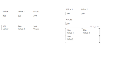
Or if you want to achieve a similar effect and I don't know if you want that look and feel of the Multi Row Card exactly. If you don't mind making it on a different way you can use a matrix visualization to look like the card, if you need to have with the 3 rows then you could use 3 matrix see result below:
You can play around with the lines and grid, also add a line to have a better insgith.
Just giving options.
Regards
Miguel Félix
Did I answer your question? Mark my post as a solution!
Proud to be a Super User!
Check out my blog: Power BI em Português- Mark as New
- Bookmark
- Subscribe
- Mute
- Subscribe to RSS Feed
- Permalink
- Report Inappropriate Content
@MFelix ,
Thank you! The matrix will work well for me. I appreciate your kind assistance, sir.
Obrigada,
Rick
Helpful resources

Power BI Dataviz World Championships
The Power BI Data Visualization World Championships is back! Get ahead of the game and start preparing now!

| User | Count |
|---|---|
| 61 | |
| 43 | |
| 40 | |
| 38 | |
| 22 |
| User | Count |
|---|---|
| 178 | |
| 125 | |
| 116 | |
| 77 | |
| 54 |


