FabCon is coming to Atlanta
Join us at FabCon Atlanta from March 16 - 20, 2026, for the ultimate Fabric, Power BI, AI and SQL community-led event. Save $200 with code FABCOMM.
Register now!- Power BI forums
- Get Help with Power BI
- Desktop
- Service
- Report Server
- Power Query
- Mobile Apps
- Developer
- DAX Commands and Tips
- Custom Visuals Development Discussion
- Health and Life Sciences
- Power BI Spanish forums
- Translated Spanish Desktop
- Training and Consulting
- Instructor Led Training
- Dashboard in a Day for Women, by Women
- Galleries
- Data Stories Gallery
- Themes Gallery
- Contests Gallery
- Quick Measures Gallery
- Notebook Gallery
- Translytical Task Flow Gallery
- TMDL Gallery
- R Script Showcase
- Webinars and Video Gallery
- Ideas
- Custom Visuals Ideas (read-only)
- Issues
- Issues
- Events
- Upcoming Events
Join the Fabric FabCon Global Hackathon—running virtually through Nov 3. Open to all skill levels. $10,000 in prizes! Register now.
- Power BI forums
- Forums
- Get Help with Power BI
- Desktop
- Monthly values on the same row into column chart
- Subscribe to RSS Feed
- Mark Topic as New
- Mark Topic as Read
- Float this Topic for Current User
- Bookmark
- Subscribe
- Printer Friendly Page
- Mark as New
- Bookmark
- Subscribe
- Mute
- Subscribe to RSS Feed
- Permalink
- Report Inappropriate Content
Monthly values on the same row into column chart
Excuse me for my limited knowledge.
I have a large dataset built as follows (simplified):
and I have been able to transfer this into a new presentation that looks like this by adding custom columns for each month;

by using the folowing formula:
= Table.AddColumn(#"Added Custom", "Jan", each if [Start] < #date(2019,1,5) and [End] > #date(2019,1,25) then [Resources] else null)
This works as I hoped it will, and even looks pretty when I add "conditional formatting"to the result.
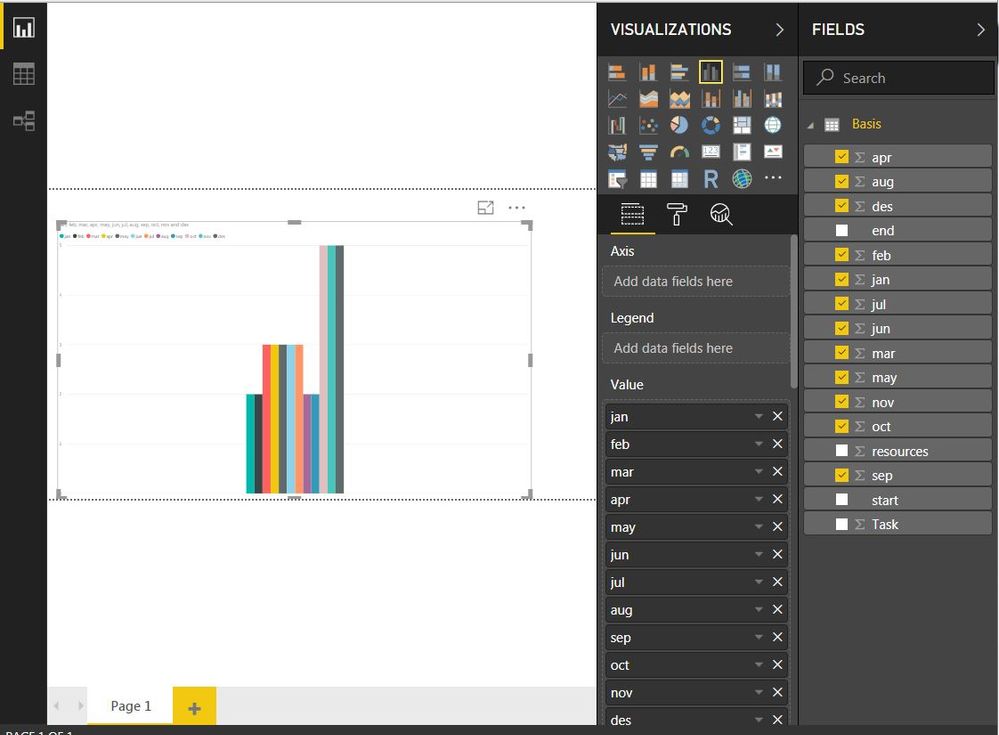
But I was also hoping to present this in a column chart like this:
I am able to do this in Power BI, but I dont have any customisation possibilities for the chart in the built-in visuals.
I have tried linking it to a date-range table (to use monthly as the axis), but as I understand this table can only be linked to start or end date, since the other columns only contains numbers.
Any suggestions what I sholud try next?
Solved! Go to Solution.
- Mark as New
- Bookmark
- Subscribe
- Mute
- Subscribe to RSS Feed
- Permalink
- Report Inappropriate Content
Hi @rog_bjo,
Based on my test, you could refer to below steps:
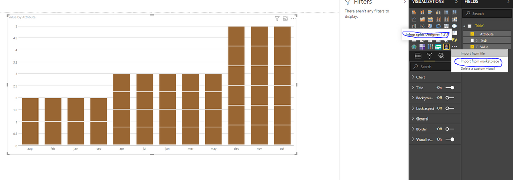
Unpivot all your month columns in query editor:
Import custom visual from market place and choose the Infographic designer:
Set below format:
You could also download the pbix file to have a view.
Regards,
Daniel He
If this post helps, then please consider Accept it as the solution to help the other members find it more quickly.
- Mark as New
- Bookmark
- Subscribe
- Mute
- Subscribe to RSS Feed
- Permalink
- Report Inappropriate Content
Hi,
Thank you! Unpivoting the months columns was the solution I was looking for. I have tested on the complete dataset and it is working.
rog_bjo


