Get Fabric certified for FREE!
Don't miss your chance to take the Fabric Data Engineer (DP-600) exam for FREE! Find out how by watching the DP-600 session on-demand now through April 28th.
Learn more- Power BI forums
- Get Help with Power BI
- Desktop
- Service
- Report Server
- Power Query
- Mobile Apps
- Developer
- DAX Commands and Tips
- Custom Visuals Development Discussion
- Health and Life Sciences
- Power BI Spanish forums
- Translated Spanish Desktop
- Training and Consulting
- Instructor Led Training
- Dashboard in a Day for Women, by Women
- Galleries
- Data Stories Gallery
- Themes Gallery
- Contests Gallery
- QuickViz Gallery
- Quick Measures Gallery
- Visual Calculations Gallery
- Notebook Gallery
- Translytical Task Flow Gallery
- TMDL Gallery
- R Script Showcase
- Webinars and Video Gallery
- Ideas
- Custom Visuals Ideas (read-only)
- Issues
- Issues
- Events
- Upcoming Events
Join the FabCon + SQLCon recap series. Up next: Power BI, Real-Time Intelligence, IQ and AI, and Data Factory take center stage. All sessions are available on-demand after the live show. Register now
- Power BI forums
- Forums
- Get Help with Power BI
- Desktop
- Modify Visualization
- Subscribe to RSS Feed
- Mark Topic as New
- Mark Topic as Read
- Float this Topic for Current User
- Bookmark
- Subscribe
- Printer Friendly Page
- Mark as New
- Bookmark
- Subscribe
- Mute
- Subscribe to RSS Feed
- Permalink
- Report Inappropriate Content
Modify Visualization
Hello,
Im new in Power BI and im wondering things for this vusualization
- How to include a table who summarize the number of transaction for each year next to my visualization ?
- Why some month are missing (january, april, june etc.). It seems like Power BI goes by every 2 month.
Thank you !
Solved! Go to Solution.
- Mark as New
- Bookmark
- Subscribe
- Mute
- Subscribe to RSS Feed
- Permalink
- Report Inappropriate Content
Hi @AudreyRene ,
Please see my answers below:
- How to include a table who summarize the number of transaction for each year next to my visualization ?
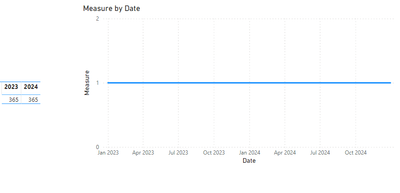
- Create a Matrix visualization with the year has column, and the sales has values this will give you the result you need
- Why some month are missing (january, april, june etc.). It seems like Power BI goes by every 2 month.
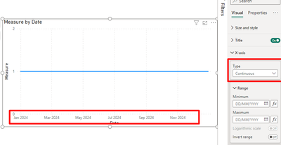
- The months are not missing this is an option on the x-axis since you are using a date column it does a continuous axis, if you want to show all the months then you need to change from a date column to a Year /month column that you need to add to your model
See the example below:
Regards
Miguel Félix
Did I answer your question? Mark my post as a solution!
Proud to be a Super User!
Check out my blog: Power BI em Português- Mark as New
- Bookmark
- Subscribe
- Mute
- Subscribe to RSS Feed
- Permalink
- Report Inappropriate Content
Welcome to Power BI! Let's address your queries one by one:
1. Including a Summary Table Next to Your Visualization:
- To create a summary table, you can use a "Table" or "Matrix" visual in Power BI.
- First, create a measure or use an existing one that sums the number of transactions per year.
- Then, add a new visual to your report canvas, and in the Fields pane, drag your 'Date' field into the "Rows" area and your transaction measure into the "Values" area.
- In the visualizations pane, format the table to only display the year part of your 'Date' field.
- Position this new table visual next to your line chart on the canvas for a side-by-side view.
2. Missing Months in the Line Chart:
- Power BI may show every other month on the axis to avoid cluttering, especially when there isn't enough space to display all labels.
- To fix this, you can adjust the x-axis properties:
- Click on the line chart visual.
- Go to the "Format" pane (the paintbrush icon).
- Scroll down to the "X-Axis" settings.
- Look for the "Type" property – if it's set to "Categorical", try changing it to "Continuous".
- Also, check the "Label density" slider to increase or decrease the number of labels shown.
- Make sure that the "Show" option for labels is turned on, and you may also adjust the text size to fit more labels if needed.
By adjusting these settings, you can include all months on the x-axis and display a summary table alongside your visual, offering a comprehensive view of the transaction data. If you still encounter issues with missing months, it may also be worth checking your data to ensure all months are present and properly formatted.
- Mark as New
- Bookmark
- Subscribe
- Mute
- Subscribe to RSS Feed
- Permalink
- Report Inappropriate Content
Hello,
Everything works ! Thanks to all of you 🙂
- Mark as New
- Bookmark
- Subscribe
- Mute
- Subscribe to RSS Feed
- Permalink
- Report Inappropriate Content
Hi @AudreyRene ,
Please see my answers below:
- How to include a table who summarize the number of transaction for each year next to my visualization ?
- Create a Matrix visualization with the year has column, and the sales has values this will give you the result you need
- Why some month are missing (january, april, june etc.). It seems like Power BI goes by every 2 month.
- The months are not missing this is an option on the x-axis since you are using a date column it does a continuous axis, if you want to show all the months then you need to change from a date column to a Year /month column that you need to add to your model
See the example below:
Regards
Miguel Félix
Did I answer your question? Mark my post as a solution!
Proud to be a Super User!
Check out my blog: Power BI em Português- Mark as New
- Bookmark
- Subscribe
- Mute
- Subscribe to RSS Feed
- Permalink
- Report Inappropriate Content
Hello,
- How to include a table who summarize the number of transaction for each year next to my visualization ?
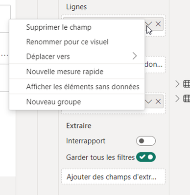
- I don't see how to choose the year only has column
- Why some month are missing (january, april, june etc.). It seems like Power BI goes by every 2 month.
- Thanks i didn't know !
Helpful resources

Power BI Monthly Update - April 2026
Check out the April 2026 Power BI update to learn about new features.

New to Fabric Survey
If you have recently started exploring Fabric, we'd love to hear how it's going. Your feedback can help with product improvements.

Power BI DataViz World Championships - June 2026
A new Power BI DataViz World Championship is coming this June! Don't miss out on submitting your entry.

| User | Count |
|---|---|
| 45 | |
| 38 | |
| 34 | |
| 21 | |
| 17 |
| User | Count |
|---|---|
| 66 | |
| 65 | |
| 31 | |
| 26 | |
| 26 |


