New Offer! Become a Certified Fabric Data Engineer
Check your eligibility for this 50% exam voucher offer and join us for free live learning sessions to get prepared for Exam DP-700.
Get Started- Power BI forums
- Get Help with Power BI
- Desktop
- Service
- Report Server
- Power Query
- Mobile Apps
- Developer
- DAX Commands and Tips
- Custom Visuals Development Discussion
- Health and Life Sciences
- Power BI Spanish forums
- Translated Spanish Desktop
- Training and Consulting
- Instructor Led Training
- Dashboard in a Day for Women, by Women
- Galleries
- Community Connections & How-To Videos
- COVID-19 Data Stories Gallery
- Themes Gallery
- Data Stories Gallery
- R Script Showcase
- Webinars and Video Gallery
- Quick Measures Gallery
- 2021 MSBizAppsSummit Gallery
- 2020 MSBizAppsSummit Gallery
- 2019 MSBizAppsSummit Gallery
- Events
- Ideas
- Custom Visuals Ideas
- Issues
- Issues
- Events
- Upcoming Events
Don't miss out! 2025 Microsoft Fabric Community Conference, March 31 - April 2, Las Vegas, Nevada. Use code MSCUST for a $150 discount. Prices go up February 11th. Register now.
- Power BI forums
- Forums
- Get Help with Power BI
- Desktop
- Merge/summing revenue from different datasets in o...
- Subscribe to RSS Feed
- Mark Topic as New
- Mark Topic as Read
- Float this Topic for Current User
- Bookmark
- Subscribe
- Printer Friendly Page
- Mark as New
- Bookmark
- Subscribe
- Mute
- Subscribe to RSS Feed
- Permalink
- Report Inappropriate Content
Merge/summing revenue from different datasets in one chart
Hi,
I have daily revenue from different businesses (each in a different table/dataset, imported in Power BI via a SQL query or based on Excel files) and I am trying to build a master chart showing the sum of the businesses selected by the end user. If I select two businesses making 100$ per day, don't want two lines at 100$, but one at 200$.
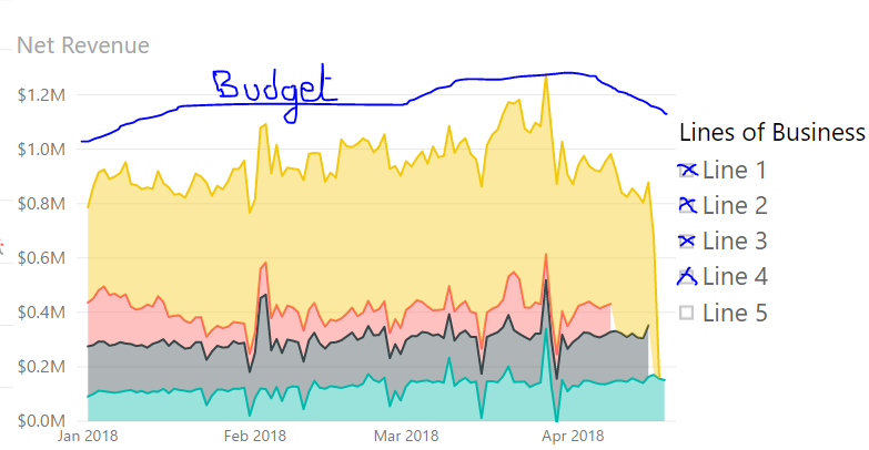
- A stacked area chart could do the job, if it is possible to create a slicer on the side like on the example [screenshot] below. Do you know a smart way to create a slicer that filters in or out a business when the businesses come from different datasets/tables?
- Additionnally, I would need to show the revenue budgeted for the selected Like badly drawn on my screenshot, 1 line on the chart that moves up and down depending on the businesses the end user includes in the chart.
If I can see some workarounds for my issue 1) above, I am totally stuck with the second one.
Thanks a lot in advance for your awesome ideas,
Fred
- Mark as New
- Bookmark
- Subscribe
- Mute
- Subscribe to RSS Feed
- Permalink
- Report Inappropriate Content
Maybe I'm missing your point but you could try to build a single table in power query when importing fom the different excel filse. Then when you have all the data in one table its easier to create a slicer.
Or when you have all the different tables in PQ, append all to one new table. Though my very unqualified quess is that the first way is probably better if you have lots of data. But don't quote me on it...
Cheers,
OscLar
- Mark as New
- Bookmark
- Subscribe
- Mute
- Subscribe to RSS Feed
- Permalink
- Report Inappropriate Content
Thanks for your reply OscLar. Actually the tables are all very different, only Daily Revenue is a common metric, and come from very various sources (different Data Warehouses, Excel files,...). And we are talking about millions of rows. But yes, I agree, that's one of the workarounds I am considering.
My main problem though is the second one. Can I create a measure that sums up whatever is selected in the slicer, like the Budget line in my screenshot...?
If budget for line 1 is 100$, budget for line 2 is 50$ and budget for line 3 is 1$, by selecting 1 and 3 I would have a budget line at 103$ in addition to the stacked area with the revenue actuals.
Thank you so much
Fred
Helpful resources

Join us at the Microsoft Fabric Community Conference
March 31 - April 2, 2025, in Las Vegas, Nevada. Use code MSCUST for a $150 discount! Prices go up Feb. 11th.

Power BI Monthly Update - January 2025
Check out the January 2025 Power BI update to learn about new features in Reporting, Modeling, and Data Connectivity.

| User | Count |
|---|---|
| 145 | |
| 87 | |
| 66 | |
| 52 | |
| 45 |
| User | Count |
|---|---|
| 215 | |
| 90 | |
| 83 | |
| 66 | |
| 58 |

