Join us at the 2025 Microsoft Fabric Community Conference
Microsoft Fabric Community Conference 2025, March 31 - April 2, Las Vegas, Nevada. Use code FABINSIDER for a $400 discount.
Register now- Power BI forums
- Get Help with Power BI
- Desktop
- Service
- Report Server
- Power Query
- Mobile Apps
- Developer
- DAX Commands and Tips
- Custom Visuals Development Discussion
- Health and Life Sciences
- Power BI Spanish forums
- Translated Spanish Desktop
- Training and Consulting
- Instructor Led Training
- Dashboard in a Day for Women, by Women
- Galleries
- Webinars and Video Gallery
- Data Stories Gallery
- Themes Gallery
- Power BI DataViz World Championships Gallery
- Quick Measures Gallery
- R Script Showcase
- COVID-19 Data Stories Gallery
- Community Connections & How-To Videos
- 2021 MSBizAppsSummit Gallery
- 2020 MSBizAppsSummit Gallery
- 2019 MSBizAppsSummit Gallery
- Events
- Ideas
- Custom Visuals Ideas (read-only)
- Issues
- Issues
- Events
- Upcoming Events
The Power BI DataViz World Championships are on! With four chances to enter, you could win a spot in the LIVE Grand Finale in Las Vegas. Show off your skills.
- Power BI forums
- Forums
- Get Help with Power BI
- Desktop
- Measure Shows Blank Values When Slicer Should Remo...
- Subscribe to RSS Feed
- Mark Topic as New
- Mark Topic as Read
- Float this Topic for Current User
- Bookmark
- Subscribe
- Printer Friendly Page
- Mark as New
- Bookmark
- Subscribe
- Mute
- Subscribe to RSS Feed
- Permalink
- Report Inappropriate Content
Measure Shows Blank Values When Slicer Should Remove Lines
Hello,
I'm having trouble with a measure showing values in a table when I expect the slicer to remove the line in the table. Instead, when I select the slicer value, I was hoping the entire row would be removed from the visual table, and I don't know how.
To set up an example, I have a data table that has people and the projects they're working on like so:
| Person | Project |
| Person1 | ProjectA |
| Person1 | ProjectB |
| Person2 | ProjectC |
| Person2 | ProjectD |
| Person2 | ProjectE |
I wanted to show a visual table in the report that demonstrates bandwidth. So, I made a measure. My measure calculates bandwidth based on project count. So, when the project count = 2, the person is "Properly Loaded." When the count is 3, they are "Overloaded."
My resulting visual table with the measure looks like this:
| Person | Project Count | Bandwidth |
| Person1 | 2 | Properly Loaded |
| Person2 | 3 | Overloaded |
I wanted to add another data table that mapped Team to the person so that Teams could view just their own team when looking at the report, so I made another data table that mapped like so:
| Person | Team |
| Person1 | Team Red |
| Person2 | Team Blue |
This is connected to the original data table by Person, with this Team mapping table having a 1 to many relationship and filtering the projects table.
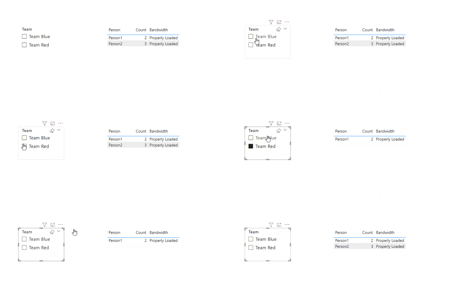
When I made a slicer that just shows the Team Name (Red, Blue) and select one team, the other person still shows in the table. So, if I select Red, this is what shows in the visual table:
| Person | Count | Bandwidth |
| Person1 | 2 | Properly Loaded |
| Person2 | Overloaded |
I would think that selecting Team Red would remove the line for Person 2 entirely, but they still show. Just the count is removed, but not the measure.
How can I design the measure to remove those rows?
Here's the measure code I used for my real data:
Solved! Go to Solution.
- Mark as New
- Bookmark
- Subscribe
- Mute
- Subscribe to RSS Feed
- Permalink
- Report Inappropriate Content
Hi @Anonymous ,
Please try to create measure with below dax formula:
Count = COUNTROWS('Table')Bandwidth =
VAR _a = [Count]
VAR _result =
SWITCH (
_a,
2, "Properly Loaded",
3, "Properly Loaded",
4, "Slight Overload",
5, "Overloaded"
)
RETURN
_result

Best regards,
Community Support Team_Binbin Yu
If this post helps, then please consider Accept it as the solution to help the other members find it more quickly.
- Mark as New
- Bookmark
- Subscribe
- Mute
- Subscribe to RSS Feed
- Permalink
- Report Inappropriate Content
Hi @Anonymous ,
Please try to create measure with below dax formula:
Count = COUNTROWS('Table')Bandwidth =
VAR _a = [Count]
VAR _result =
SWITCH (
_a,
2, "Properly Loaded",
3, "Properly Loaded",
4, "Slight Overload",
5, "Overloaded"
)
RETURN
_result

Best regards,
Community Support Team_Binbin Yu
If this post helps, then please consider Accept it as the solution to help the other members find it more quickly.
- Mark as New
- Bookmark
- Subscribe
- Mute
- Subscribe to RSS Feed
- Permalink
- Report Inappropriate Content
Hey, this is great and it totally works.
Could I bother you for a more detailed explanation of how this works compared to my original attempt?
Helpful resources

Join us at the Microsoft Fabric Community Conference
March 31 - April 2, 2025, in Las Vegas, Nevada. Use code MSCUST for a $150 discount!

Power BI Monthly Update - February 2025
Check out the February 2025 Power BI update to learn about new features.

| User | Count |
|---|---|
| 86 | |
| 80 | |
| 53 | |
| 39 | |
| 39 |
| User | Count |
|---|---|
| 104 | |
| 85 | |
| 47 | |
| 44 | |
| 43 |
