Join us at the 2025 Microsoft Fabric Community Conference
Microsoft Fabric Community Conference 2025, March 31 - April 2, Las Vegas, Nevada. Use code FABINSIDER for a $400 discount.
Register now- Power BI forums
- Get Help with Power BI
- Desktop
- Service
- Report Server
- Power Query
- Mobile Apps
- Developer
- DAX Commands and Tips
- Custom Visuals Development Discussion
- Health and Life Sciences
- Power BI Spanish forums
- Translated Spanish Desktop
- Training and Consulting
- Instructor Led Training
- Dashboard in a Day for Women, by Women
- Galleries
- Webinars and Video Gallery
- Data Stories Gallery
- Themes Gallery
- Power BI DataViz World Championships Gallery
- Quick Measures Gallery
- R Script Showcase
- COVID-19 Data Stories Gallery
- Community Connections & How-To Videos
- 2021 MSBizAppsSummit Gallery
- 2020 MSBizAppsSummit Gallery
- 2019 MSBizAppsSummit Gallery
- Events
- Ideas
- Custom Visuals Ideas (read-only)
- Issues
- Issues
- Events
- Upcoming Events
The Power BI DataViz World Championships are on! With four chances to enter, you could win a spot in the LIVE Grand Finale in Las Vegas. Show off your skills.
- Power BI forums
- Forums
- Get Help with Power BI
- Desktop
- Matrix table with row percentages
- Subscribe to RSS Feed
- Mark Topic as New
- Mark Topic as Read
- Float this Topic for Current User
- Bookmark
- Subscribe
- Printer Friendly Page
- Mark as New
- Bookmark
- Subscribe
- Mute
- Subscribe to RSS Feed
- Permalink
- Report Inappropriate Content
Matrix table with row percentages
Hi everyone,
I need some help with a problem regarding the matrix table visual.
What I need is a visual that ranks my data from high counts to low as you can see in my example. (See screenshot below)
And that shows the percentage values for each row of the filtered data:
In the example in the screenshot above it all looks great because I didn't touch the date slicer yet.
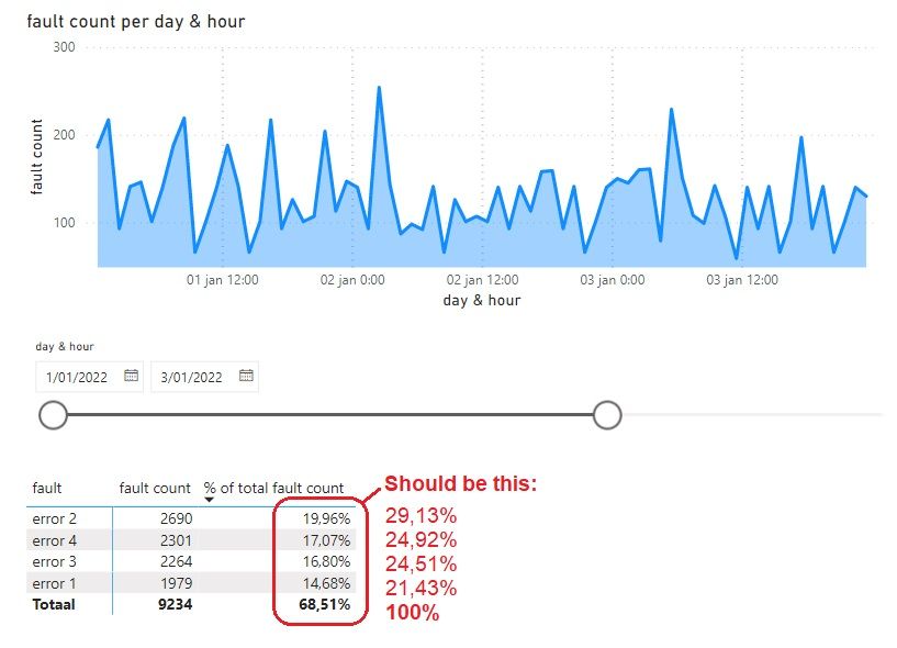
As you can see in the next picture, the percentage values are not correct anymore once I start moving it away from the max:
Also, I have a tooltip wherein I want to put the same visual but here it doesn't work either as it doesn't respond well to the time filter:
It's something that looks so simple, but I've been trying for so long now...
Please be aware on that it's important that the "error xx" fault count rows are ranked from high to low dynamically.
You can find the dataset here:
https://docs.google.com/spreadsheets/d/1u2zBIDsTHsWeMhx9ACDh_cOwdJEDIkwD/edit?usp=sharing&ouid=10978...
And the Power BI file here:
https://drive.google.com/file/d/1gOFk_qjoM4lut2veHG-ltKFl3eOW8OJl/view?usp=sharing
Thanks in advance for your help!
Solved! Go to Solution.
- Mark as New
- Bookmark
- Subscribe
- Mute
- Subscribe to RSS Feed
- Permalink
- Report Inappropriate Content
You used a calculated column. These are immutable and do not react to filter changes. Use a measure (either implicit or explicit). See attached for an example of an implicit measure.
- Mark as New
- Bookmark
- Subscribe
- Mute
- Subscribe to RSS Feed
- Permalink
- Report Inappropriate Content
- Mark as New
- Bookmark
- Subscribe
- Mute
- Subscribe to RSS Feed
- Permalink
- Report Inappropriate Content
Helpful resources

Join us at the Microsoft Fabric Community Conference
March 31 - April 2, 2025, in Las Vegas, Nevada. Use code MSCUST for a $150 discount!

Power BI Monthly Update - February 2025
Check out the February 2025 Power BI update to learn about new features.

| User | Count |
|---|---|
| 85 | |
| 78 | |
| 53 | |
| 38 | |
| 36 |
| User | Count |
|---|---|
| 100 | |
| 85 | |
| 47 | |
| 45 | |
| 44 |


