FabCon is coming to Atlanta
Join us at FabCon Atlanta from March 16 - 20, 2026, for the ultimate Fabric, Power BI, AI and SQL community-led event. Save $200 with code FABCOMM.
Register now!- Power BI forums
- Get Help with Power BI
- Desktop
- Service
- Report Server
- Power Query
- Mobile Apps
- Developer
- DAX Commands and Tips
- Custom Visuals Development Discussion
- Health and Life Sciences
- Power BI Spanish forums
- Translated Spanish Desktop
- Training and Consulting
- Instructor Led Training
- Dashboard in a Day for Women, by Women
- Galleries
- Data Stories Gallery
- Themes Gallery
- Contests Gallery
- QuickViz Gallery
- Quick Measures Gallery
- Visual Calculations Gallery
- Notebook Gallery
- Translytical Task Flow Gallery
- TMDL Gallery
- R Script Showcase
- Webinars and Video Gallery
- Ideas
- Custom Visuals Ideas (read-only)
- Issues
- Issues
- Events
- Upcoming Events
Learn from the best! Meet the four finalists headed to the FINALS of the Power BI Dataviz World Championships! Register now
- Power BI forums
- Forums
- Get Help with Power BI
- Desktop
- Matrix-like 'poster' visualisation
- Subscribe to RSS Feed
- Mark Topic as New
- Mark Topic as Read
- Float this Topic for Current User
- Bookmark
- Subscribe
- Printer Friendly Page
- Mark as New
- Bookmark
- Subscribe
- Mute
- Subscribe to RSS Feed
- Permalink
- Report Inappropriate Content
Matrix-like 'poster' visualisation
Something that on the face of it is quite simple...but perhaps not.
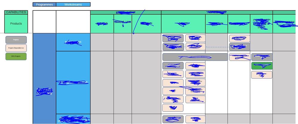
This is a mock up in Excel of project shapes (the grey and pink round-edged rectangles) placed on the intersection of multi-dimensional rows and columns. Its a bit like a pivot table or matrix except for the shapes.
Any ideas what might come close to drawing this in PBI?
Data would be
Program, Workstream,Capability, Product, Project Name.
Added complication is you could have several projects in the same intersection.
Solved! Go to Solution.
- Mark as New
- Bookmark
- Subscribe
- Mute
- Subscribe to RSS Feed
- Permalink
- Report Inappropriate Content
@ghdunn Maybe an SVG measure I am thinking or maybe a custom third-party visual. See list below:
- You could check for third-party visuals.
- Also, you could check if R visuals might suffice - https://community.powerbi.com/t5/R-Script-Showcase/bd-p/RVisuals
- Also, there are Python visuals.
- There are also SVG visuals you can create - https://community.powerbi.com/t5/forums/searchpage/tab/message?advanced=false&allow_punctuation=fals... down on that page)
- You could create your own custom visual - https://powerbi.microsoft.com/en-us/developers/custom-visualization/
Also, https://charts.powerbi.tips/ - Finally, last but not least you could try the Charticulator! - https://charticulator.com/
Follow on LinkedIn
@ me in replies or I'll lose your thread!!!
Instead of a Kudo, please vote for this idea
Become an expert!: Enterprise DNA
External Tools: MSHGQM
YouTube Channel!: Microsoft Hates Greg
Latest book!: DAX For Humans
DAX is easy, CALCULATE makes DAX hard...
Helpful resources

Join our Fabric User Panel
Share feedback directly with Fabric product managers, participate in targeted research studies and influence the Fabric roadmap.

Power BI Monthly Update - February 2026
Check out the February 2026 Power BI update to learn about new features.

| User | Count |
|---|---|
| 50 | |
| 49 | |
| 35 | |
| 15 | |
| 14 |
| User | Count |
|---|---|
| 92 | |
| 75 | |
| 41 | |
| 26 | |
| 25 |

