New Offer! Become a Certified Fabric Data Engineer
Check your eligibility for this 50% exam voucher offer and join us for free live learning sessions to get prepared for Exam DP-700.
Get Started- Power BI forums
- Get Help with Power BI
- Desktop
- Service
- Report Server
- Power Query
- Mobile Apps
- Developer
- DAX Commands and Tips
- Custom Visuals Development Discussion
- Health and Life Sciences
- Power BI Spanish forums
- Translated Spanish Desktop
- Training and Consulting
- Instructor Led Training
- Dashboard in a Day for Women, by Women
- Galleries
- Community Connections & How-To Videos
- COVID-19 Data Stories Gallery
- Themes Gallery
- Data Stories Gallery
- R Script Showcase
- Webinars and Video Gallery
- Quick Measures Gallery
- 2021 MSBizAppsSummit Gallery
- 2020 MSBizAppsSummit Gallery
- 2019 MSBizAppsSummit Gallery
- Events
- Ideas
- Custom Visuals Ideas
- Issues
- Issues
- Events
- Upcoming Events
Don't miss out! 2025 Microsoft Fabric Community Conference, March 31 - April 2, Las Vegas, Nevada. Use code MSCUST for a $150 discount. Prices go up February 11th. Register now.
- Power BI forums
- Forums
- Get Help with Power BI
- Desktop
- Re: Matrix formatting in 2018 september demo
- Subscribe to RSS Feed
- Mark Topic as New
- Mark Topic as Read
- Float this Topic for Current User
- Bookmark
- Subscribe
- Printer Friendly Page
- Mark as New
- Bookmark
- Subscribe
- Mute
- Subscribe to RSS Feed
- Permalink
- Report Inappropriate Content
Matrix formatting in 2018 september demo
Does anyone know how they made the matrix table shown in the 2018 september demo? https://powerbi.microsoft.com/sv-se/blog/power-bi-desktop-august-2018-feature-summary/
Specifically how value rows are a different background color from the subtotal rows (when drilled down you can see that the category is white and the subcategories are grey).
I downloaded the pbix and have been trying to get it to work in my own reports. I can make the values change bg color but not the row headers (checking "apply to label" for example does nothing).
Solved! Go to Solution.
- Mark as New
- Bookmark
- Subscribe
- Mute
- Subscribe to RSS Feed
- Permalink
- Report Inappropriate Content
Hi @hammerblue,
Please refer to the snapshot below. Set the 1 and 2 Grey and the 3 White.
Best Regards,
Dale
If this post helps, then please consider Accept it as the solution to help the other members find it more quickly.
- Mark as New
- Bookmark
- Subscribe
- Mute
- Subscribe to RSS Feed
- Permalink
- Report Inappropriate Content
Hi @hammerblue,
I didn't see anything like that in the link. Can you make it more clear, please?
I think it's better to leave the subtotals alone. Because they belong to the different levels. It will be misleading if we apply the color to the lower levels. For example, if the values are the redder the higher, the subtotal will be very red. But it should be compared with the lower levels.
Best Regards,
Dale
If this post helps, then please consider Accept it as the solution to help the other members find it more quickly.
- Mark as New
- Bookmark
- Subscribe
- Mute
- Subscribe to RSS Feed
- Permalink
- Report Inappropriate Content
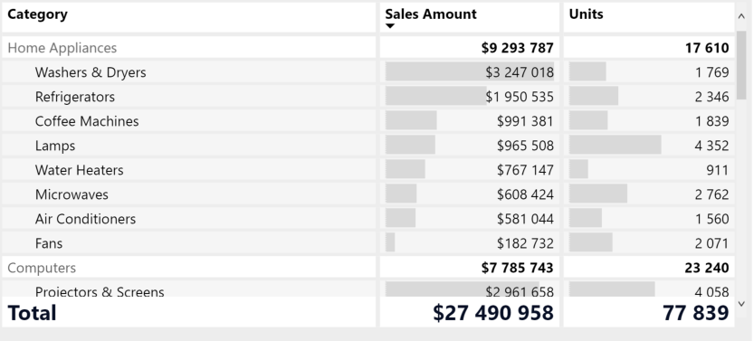
Sorry, i was having trouble inserting an image when I made the post. this is what the table looks like:
Notice that the labels for the subtotals "Home Appliances" and "Computers" are white while the other rows are grey. This is what i'm trying to replicate in my report.
- Mark as New
- Bookmark
- Subscribe
- Mute
- Subscribe to RSS Feed
- Permalink
- Report Inappropriate Content
Hi @hammerblue,
Please refer to the snapshot below. Set the 1 and 2 Grey and the 3 White.
Best Regards,
Dale
If this post helps, then please consider Accept it as the solution to help the other members find it more quickly.
- Mark as New
- Bookmark
- Subscribe
- Mute
- Subscribe to RSS Feed
- Permalink
- Report Inappropriate Content
I'm gonna accept this as the solution because it is indeed how you do it, but it still doesn't work for me.. When set the background and alternate background color for values to the same color value it defaults back to white for the row headers for some reason, but not the values... i suspect it's a bug having to do with the fact i'm using a custom theme.
I've set the background and alternate background colors to the same gray as the values, yet they turn white.
- Mark as New
- Bookmark
- Subscribe
- Mute
- Subscribe to RSS Feed
- Permalink
- Report Inappropriate Content
Hi @hammerblue,
Can it work when you set up the Row headers in the settings?
Best Regards,
Dale
If this post helps, then please consider Accept it as the solution to help the other members find it more quickly.
- Mark as New
- Bookmark
- Subscribe
- Mute
- Subscribe to RSS Feed
- Permalink
- Report Inappropriate Content
No, that turns the entire column of row headers into that color.
- Mark as New
- Bookmark
- Subscribe
- Mute
- Subscribe to RSS Feed
- Permalink
- Report Inappropriate Content
Helpful resources
| User | Count |
|---|---|
| 117 | |
| 74 | |
| 62 | |
| 50 | |
| 46 |
| User | Count |
|---|---|
| 174 | |
| 125 | |
| 60 | |
| 60 | |
| 57 |


