New Offer! Become a Certified Fabric Data Engineer
Check your eligibility for this 50% exam voucher offer and join us for free live learning sessions to get prepared for Exam DP-700.
Get Started- Power BI forums
- Get Help with Power BI
- Desktop
- Service
- Report Server
- Power Query
- Mobile Apps
- Developer
- DAX Commands and Tips
- Custom Visuals Development Discussion
- Health and Life Sciences
- Power BI Spanish forums
- Translated Spanish Desktop
- Training and Consulting
- Instructor Led Training
- Dashboard in a Day for Women, by Women
- Galleries
- Community Connections & How-To Videos
- COVID-19 Data Stories Gallery
- Themes Gallery
- Data Stories Gallery
- R Script Showcase
- Webinars and Video Gallery
- Quick Measures Gallery
- 2021 MSBizAppsSummit Gallery
- 2020 MSBizAppsSummit Gallery
- 2019 MSBizAppsSummit Gallery
- Events
- Ideas
- Custom Visuals Ideas
- Issues
- Issues
- Events
- Upcoming Events
Don't miss out! 2025 Microsoft Fabric Community Conference, March 31 - April 2, Las Vegas, Nevada. Use code MSCUST for a $150 discount. Prices go up February 11th. Register now.
- Power BI forums
- Forums
- Get Help with Power BI
- Desktop
- Re: Mapbox visualization has no 'don't summarize' ...
- Subscribe to RSS Feed
- Mark Topic as New
- Mark Topic as Read
- Float this Topic for Current User
- Bookmark
- Subscribe
- Printer Friendly Page
- Mark as New
- Bookmark
- Subscribe
- Mute
- Subscribe to RSS Feed
- Permalink
- Report Inappropriate Content
Mapbox visualization has no 'don't summarize' option comparable to ArcGis. Is there a work-around?
Hello,
I am having a problem with my Mapbox visualization; it seems to force me to summarize my data. I can achieve what I want with the ArcGIS, but I want to use Mapbox accross all my reports.
As an example in ArcGIS I can choose this 'Don't summarize' option which give me a nice color coded image of the reasons customers returned their product.
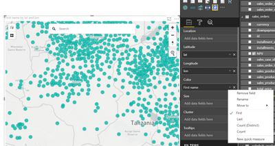
Which is perfect. But when I try and create the same visualization in Mapbox. I don't get the same option.
Seems like it should be easy to fix and/or a common problem. But I can't see anyone else online with this problem. Guess I made an easy mistake.
Anyone able to help me? Thanks in advance
Solved! Go to Solution.
- Mark as New
- Bookmark
- Subscribe
- Mute
- Subscribe to RSS Feed
- Permalink
- Report Inappropriate Content
Solution:
It worked when I also had something in the 'Location' part of the visualisation rather than using only latitude and longitude.
- Mark as New
- Bookmark
- Subscribe
- Mute
- Subscribe to RSS Feed
- Permalink
- Report Inappropriate Content
i have the same issue. i have two tables related by a column. i want the color of the map bubbles to be the values in the related column. however, it only allows me to aggregate the column and set all bubbles to the same color. the proposed solution did not work for me (i'm using a country code for location, not lat/long).
- Mark as New
- Bookmark
- Subscribe
- Mute
- Subscribe to RSS Feed
- Permalink
- Report Inappropriate Content
Solution:
It worked when I also had something in the 'Location' part of the visualisation rather than using only latitude and longitude.
- Mark as New
- Bookmark
- Subscribe
- Mute
- Subscribe to RSS Feed
- Permalink
- Report Inappropriate Content
Hello,
I am having the same issue. But even with something in the 'Location' part, I could not solve the problem. Does anyone has an idea why?
Helpful resources
| User | Count |
|---|---|
| 117 | |
| 75 | |
| 62 | |
| 50 | |
| 44 |
| User | Count |
|---|---|
| 174 | |
| 125 | |
| 60 | |
| 60 | |
| 57 |


