FabCon is coming to Atlanta
Join us at FabCon Atlanta from March 16 - 20, 2026, for the ultimate Fabric, Power BI, AI and SQL community-led event. Save $200 with code FABCOMM.
Register now!- Power BI forums
- Get Help with Power BI
- Desktop
- Service
- Report Server
- Power Query
- Mobile Apps
- Developer
- DAX Commands and Tips
- Custom Visuals Development Discussion
- Health and Life Sciences
- Power BI Spanish forums
- Translated Spanish Desktop
- Training and Consulting
- Instructor Led Training
- Dashboard in a Day for Women, by Women
- Galleries
- Data Stories Gallery
- Themes Gallery
- Contests Gallery
- QuickViz Gallery
- Quick Measures Gallery
- Visual Calculations Gallery
- Notebook Gallery
- Translytical Task Flow Gallery
- TMDL Gallery
- R Script Showcase
- Webinars and Video Gallery
- Ideas
- Custom Visuals Ideas (read-only)
- Issues
- Issues
- Events
- Upcoming Events
The Power BI Data Visualization World Championships is back! Get ahead of the game and start preparing now! Learn more
- Power BI forums
- Forums
- Get Help with Power BI
- Desktop
- Map visual: preventing piechart and showing data i...
- Subscribe to RSS Feed
- Mark Topic as New
- Mark Topic as Read
- Float this Topic for Current User
- Bookmark
- Subscribe
- Printer Friendly Page
- Mark as New
- Bookmark
- Subscribe
- Mute
- Subscribe to RSS Feed
- Permalink
- Report Inappropriate Content
Map visual: preventing piechart and showing data in tooltip
Hi all,
I have a table with partner companies which has the following columns (among others, that are irrelevant for this visual)
- painterName
- Phone number
- location (Zip Code (PLZ), in Germany)
- Status (e.g. "Active", "Interested", "Blacklist", etc.)
I would like to plot these partners on a map, where each partner company is depicted by a single bubble. The color of the bubble should indicate the status. Further, i would like the tooltip to show the Company name and phone number for each individual bubble.
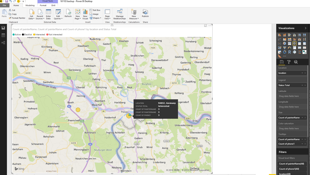
I created the map (see below), but two things are going wrong:
- Not every partner company is depicted by a single bubble, but some bubbles represent multiple partners. See the tooltip in the example. There are 4 painters at this location of which 3 are interested (yellow) and one is active (green). This is depicted as one pie chart which is 75% yellow and 25% green.
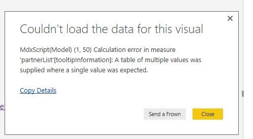
--> is it possible to depict this as four individual bubbles, each with their own color? - The tooltip is showing the count of paintername and phone, but not the actual value. I looked into this topic, which suggests a solution by creating a Measure with the VALUES function to display the relevant data in the tooltip. However, when i do this, i get an error (see second pic below), as the VALUES function returns a column of 4 values in one tooltip, rather than four tooltips with one value each. I think this problem will automatically be solved when each of the painters is depicted by a single bubble (question 1), but i might be off.
--> Any idea how to solve this?
Thanks a lot in advance!


Solved! Go to Solution.
- Mark as New
- Bookmark
- Subscribe
- Mute
- Subscribe to RSS Feed
- Permalink
- Report Inappropriate Content
Create a new column
partnersData = Table1[PartnerName] & "-" & Table1[Status] & "-" & Table1[phone]
Next create a measure:
PartnersInfo = CONCATENATEX(Table1,Table1[partnersData],"|")
Use this measure in tooltip area.
Lima - Peru
- Mark as New
- Bookmark
- Subscribe
- Mute
- Subscribe to RSS Feed
- Permalink
- Report Inappropriate Content
Hi david2,
Well, as the Map visual identify the location based on the postal code, so currently I don't think having the 3 people in the same location displayed in 3 bubbles.
For Question 2, I could think out a way to deal with that, which would need to know how the data table you stored for the locations and the partners.
For example, if the data table is somehow the structure below:
| Location | People |
| A | 1 |
| A | 2 |
| B | 3 |
| C | 4 |
| C | 5 |
Then we may write a measure to show the names, when location contains more than one partner value, we concatenate the name string into one, with this the visual should be able to display the 3 partner names.
Partnername = CONCATENATEX(VALUES('Table'[Partner]),'Table'[Partner],",")
Put this measure into Tooltips.
If this is not working, please share your data model, and we will help to check.
Regards
- Mark as New
- Bookmark
- Subscribe
- Mute
- Subscribe to RSS Feed
- Permalink
- Report Inappropriate Content
Hi @v-micsh-msft,
Thanks for the quick reply. I was already afraid that plotting 3 bubbles on the same location would not be possible, since 3they would overlap. I guess we'll have to start collecting a more detailed address of our partners anyway.
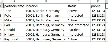
Regarding your answer on question 2, my table is structured as follows (simplified example):
Ideally, i would like the bubble on location 10001 to show something like "John - Active - 12313123; Pete - Interested - 12313123; Mike - Active - 12313123".
Any idea how to achieve that?
Best,
David
- Mark as New
- Bookmark
- Subscribe
- Mute
- Subscribe to RSS Feed
- Permalink
- Report Inappropriate Content
Create a new column
partnersData = Table1[PartnerName] & "-" & Table1[Status] & "-" & Table1[phone]
Next create a measure:
PartnersInfo = CONCATENATEX(Table1,Table1[partnersData],"|")
Use this measure in tooltip area.
Lima - Peru
- Mark as New
- Bookmark
- Subscribe
- Mute
- Subscribe to RSS Feed
- Permalink
- Report Inappropriate Content
Helpful resources

Power BI Monthly Update - November 2025
Check out the November 2025 Power BI update to learn about new features.

Fabric Data Days
Advance your Data & AI career with 50 days of live learning, contests, hands-on challenges, study groups & certifications and more!

| User | Count |
|---|---|
| 57 | |
| 43 | |
| 41 | |
| 21 | |
| 17 |
| User | Count |
|---|---|
| 183 | |
| 114 | |
| 93 | |
| 62 | |
| 45 |


