FabCon is coming to Atlanta
Join us at FabCon Atlanta from March 16 - 20, 2026, for the ultimate Fabric, Power BI, AI and SQL community-led event. Save $200 with code FABCOMM.
Register now!- Power BI forums
- Get Help with Power BI
- Desktop
- Service
- Report Server
- Power Query
- Mobile Apps
- Developer
- DAX Commands and Tips
- Custom Visuals Development Discussion
- Health and Life Sciences
- Power BI Spanish forums
- Translated Spanish Desktop
- Training and Consulting
- Instructor Led Training
- Dashboard in a Day for Women, by Women
- Galleries
- Data Stories Gallery
- Themes Gallery
- Contests Gallery
- QuickViz Gallery
- Quick Measures Gallery
- Visual Calculations Gallery
- Notebook Gallery
- Translytical Task Flow Gallery
- TMDL Gallery
- R Script Showcase
- Webinars and Video Gallery
- Ideas
- Custom Visuals Ideas (read-only)
- Issues
- Issues
- Events
- Upcoming Events
The Power BI Data Visualization World Championships is back! Get ahead of the game and start preparing now! Learn more
- Power BI forums
- Forums
- Get Help with Power BI
- Desktop
- Map showing incorrect count but table is correct
- Subscribe to RSS Feed
- Mark Topic as New
- Mark Topic as Read
- Float this Topic for Current User
- Bookmark
- Subscribe
- Printer Friendly Page
- Mark as New
- Bookmark
- Subscribe
- Mute
- Subscribe to RSS Feed
- Permalink
- Report Inappropriate Content
Map showing incorrect count but table is correct
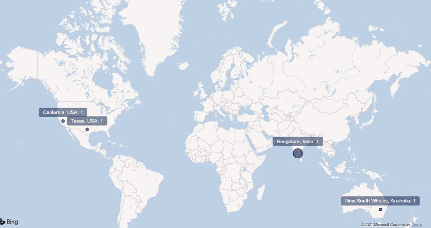
I have a map that should show the number of issues per location for the selected time frame. I have the following measure:


- Mark as New
- Bookmark
- Subscribe
- Mute
- Subscribe to RSS Feed
- Permalink
- Report Inappropriate Content
Hi,
What result do you get with this
P1P2s by Location = 'Incidents'[Short Location] & ": " & [P1P2 Count]
Regards,
Ashish Mathur
http://www.ashishmathur.com
https://www.linkedin.com/in/excelenthusiasts/
- Mark as New
- Bookmark
- Subscribe
- Mute
- Subscribe to RSS Feed
- Permalink
- Report Inappropriate Content
Ashish,
I got the same result as shown in the original screenshots (so, if there is no difference, the simple formula is best) but it still is not correct.
Please keep trying.
- Mark as New
- Bookmark
- Subscribe
- Mute
- Subscribe to RSS Feed
- Permalink
- Report Inappropriate Content
I will need to see your file then. Share the download link and clearly show the problem there.
Regards,
Ashish Mathur
http://www.ashishmathur.com
https://www.linkedin.com/in/excelenthusiasts/
- Mark as New
- Bookmark
- Subscribe
- Mute
- Subscribe to RSS Feed
- Permalink
- Report Inappropriate Content
Sorry for the delay...was out of the office. Dumb question: How do I attach the pbix? I don't know where I should save it so that it can be accessed.
- Mark as New
- Bookmark
- Subscribe
- Mute
- Subscribe to RSS Feed
- Permalink
- Report Inappropriate Content
Store it on Google Drive and then share the download link here.
Regards,
Ashish Mathur
http://www.ashishmathur.com
https://www.linkedin.com/in/excelenthusiasts/
- Mark as New
- Bookmark
- Subscribe
- Mute
- Subscribe to RSS Feed
- Permalink
- Report Inappropriate Content
@Ashish_Mathur Yeah, that's what I was afraid of. We aren't allowed to upload files to Google drive (security policy). Is there a way to send the file to you (via email or something)?
- Mark as New
- Bookmark
- Subscribe
- Mute
- Subscribe to RSS Feed
- Permalink
- Report Inappropriate Content
Hi @Anonymous
it may have something to do with CALCULATE([P1P2 Count],ALLEXCEPT('Incidents','Incidents'[Short Location],'Incidents'[Created])).
what's the content of [P1P2 Count]? and could you share sample of related sheets?
Best Regards,
Community Support Team _Tang
If this post helps, please consider Accept it as the solution to help the other members find it more quickly.
- Mark as New
- Bookmark
- Subscribe
- Mute
- Subscribe to RSS Feed
- Permalink
- Report Inappropriate Content
The first pink formula shows how I got the value of P1P2 Count. The second formula seems to be counting the distinct Short Locations (thus, each location is counted once). What I need it to do is show the count of P1P2s for each location like it does in the table.
So, since there were 5 separate incident tickets created for Bangalore, the map label should read "Bangalore, India: 5".
I'm not sure what sheets you are asking for.
- Mark as New
- Bookmark
- Subscribe
- Mute
- Subscribe to RSS Feed
- Permalink
- Report Inappropriate Content
Hi @Anonymous
I mean, could you share your sample data or sample file? tks
besides,
P1P2s by Location = 'Incidents'[Short Location] & ": " & CALCULATE([P1P2 Count],ALLEXCEPT('Incidents','Incidents'[Short Location],'Incidents'[Created]))

The problem is my map is showing a count of 1 for each location (at least one of the locations has 5).  When I click Show as Table, I get the proper counts.
not sure how you put the measure into Category label, in my test, I can only put column into it.
Looking forward to receiving your reply.
Best Regards,
Community Support Team _Tang
If this post helps, please consider Accept it as the solution to help the other members find it more quickly.
- Mark as New
- Bookmark
- Subscribe
- Mute
- Subscribe to RSS Feed
- Permalink
- Report Inappropriate Content
Xiaotang,
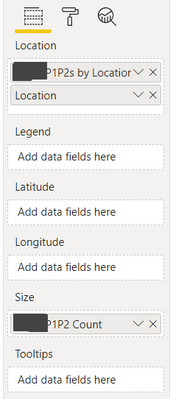
The category label is the "P1P2s by Location" field which is a column calculation. So it serves a dual purpose: To identify the locations themselves and what the label should read.
I learned this from Mitchell Pearson's video titled "How to add Data Labels to Maps in Power BI! Tips and Tricks":
https://www.youtube.com/watch?v=4ZOanVP1PS0
- Mark as New
- Bookmark
- Subscribe
- Mute
- Subscribe to RSS Feed
- Permalink
- Report Inappropriate Content
@Anonymous Your India location is showing 5 represented by the larger circle size.
Follow on LinkedIn
@ me in replies or I'll lose your thread!!!
Instead of a Kudo, please vote for this idea
Become an expert!: Enterprise DNA
External Tools: MSHGQM
YouTube Channel!: Microsoft Hates Greg
Latest book!: DAX For Humans
DAX is easy, CALCULATE makes DAX hard...
- Mark as New
- Bookmark
- Subscribe
- Mute
- Subscribe to RSS Feed
- Permalink
- Report Inappropriate Content
Right but the label is showing Bangalore, India: 1
- Mark as New
- Bookmark
- Subscribe
- Mute
- Subscribe to RSS Feed
- Permalink
- Report Inappropriate Content
Did you ever figure this out? I am experiencing the same issue
Helpful resources

Power BI Dataviz World Championships
The Power BI Data Visualization World Championships is back! Get ahead of the game and start preparing now!

| User | Count |
|---|---|
| 67 | |
| 45 | |
| 43 | |
| 36 | |
| 23 |
| User | Count |
|---|---|
| 191 | |
| 127 | |
| 106 | |
| 78 | |
| 53 |


