Join us at the 2025 Microsoft Fabric Community Conference
March 31 - April 2, 2025, in Las Vegas, Nevada. Use code MSCUST for a $150 discount! Early bird discount ends December 31.
Register Now- Power BI forums
- Get Help with Power BI
- Desktop
- Service
- Report Server
- Power Query
- Mobile Apps
- Developer
- DAX Commands and Tips
- Custom Visuals Development Discussion
- Health and Life Sciences
- Power BI Spanish forums
- Translated Spanish Desktop
- Training and Consulting
- Instructor Led Training
- Dashboard in a Day for Women, by Women
- Galleries
- Community Connections & How-To Videos
- COVID-19 Data Stories Gallery
- Themes Gallery
- Data Stories Gallery
- R Script Showcase
- Webinars and Video Gallery
- Quick Measures Gallery
- 2021 MSBizAppsSummit Gallery
- 2020 MSBizAppsSummit Gallery
- 2019 MSBizAppsSummit Gallery
- Events
- Ideas
- Custom Visuals Ideas
- Issues
- Issues
- Events
- Upcoming Events
Be one of the first to start using Fabric Databases. View on-demand sessions with database experts and the Microsoft product team to learn just how easy it is to get started. Watch now
- Power BI forums
- Forums
- Get Help with Power BI
- Desktop
- Re: Map legende issue
- Subscribe to RSS Feed
- Mark Topic as New
- Mark Topic as Read
- Float this Topic for Current User
- Bookmark
- Subscribe
- Printer Friendly Page
- Mark as New
- Bookmark
- Subscribe
- Mute
- Subscribe to RSS Feed
- Permalink
- Report Inappropriate Content
Map legende issue
Hi,
I have an issue with map legendes.
My first column is "Countries" and categorised as so.
My fourth column is "Colour".
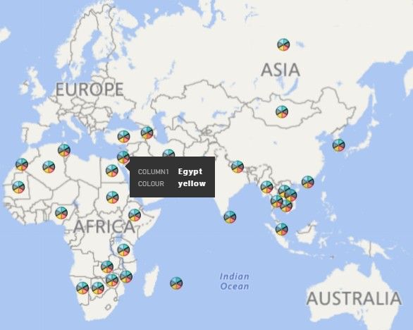
When I create a map, all the countries get the same circle, with colour subsets. It's not what should be!
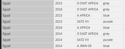
In the screen shot below, which is a 2014-year filtered map, Egypt should appear with only three colours (grey, purple, blue). Actually, it appears (as all the other countries) with all the colours possibilities. For instance, "Yellow" should not appear...
I failed to find out how to fix this issue.
Would really appreciate your help.
Hoping my English is clear enough, since I'm French ;)...
Kind regards,
C


- Mark as New
- Bookmark
- Subscribe
- Mute
- Subscribe to RSS Feed
- Permalink
- Report Inappropriate Content
It seems to work fine on my machine, please check again.
Table =
FILTER ( Table1, Table1[Column1] = "Egypt" && Table1[Year] = 2014 )
If this post helps, then please consider Accept it as the solution to help the other members find it more quickly.
- Mark as New
- Bookmark
- Subscribe
- Mute
- Subscribe to RSS Feed
- Permalink
- Report Inappropriate Content
Hi,
thank you for your answer.
As I am a rookie at Power BI, I hardly understand where I have to enter this formula :(...
Moreover, does it mean that I have to do that for all my table ? Each country, each year ?...
My aim is to get a map where each country has its relevant circle with the relevant colours inside the circle.
Thanks again.
C
- Mark as New
- Bookmark
- Subscribe
- Mute
- Subscribe to RSS Feed
- Permalink
- Report Inappropriate Content
Start your learning journey through Power BI.
https://powerbi.microsoft.com/en-us/guided-learning/powerbi-learning-2-6-create-calculated-tables/
https://powerbi.microsoft.com/en-us/guided-learning/powerbi-learning-3-4-create-slicers/
If this post helps, then please consider Accept it as the solution to help the other members find it more quickly.
Helpful resources

Join us at the Microsoft Fabric Community Conference
March 31 - April 2, 2025, in Las Vegas, Nevada. Use code MSCUST for a $150 discount!

We want your feedback!
Your insights matter. That’s why we created a quick survey to learn about your experience finding answers to technical questions.

Microsoft Fabric Community Conference 2025
Arun Ulag shares exciting details about the Microsoft Fabric Conference 2025, which will be held in Las Vegas, NV.

| User | Count |
|---|---|
| 124 | |
| 89 | |
| 84 | |
| 70 | |
| 51 |
| User | Count |
|---|---|
| 206 | |
| 143 | |
| 97 | |
| 79 | |
| 68 |
