A new Data Days event is coming soon!
This time we’re going bigger than ever. Fabric, Power BI, SQL, AI and more. We're covering it all. You won't want to miss it.
Learn more- Power BI forums
- Get Help with Power BI
- Desktop
- Service
- Report Server
- Power Query
- Mobile Apps
- Developer
- DAX Commands and Tips
- Custom Visuals Development Discussion
- Health and Life Sciences
- Power BI Spanish forums
- Translated Spanish Desktop
- Training and Consulting
- Instructor Led Training
- Dashboard in a Day for Women, by Women
- Galleries
- Data Stories Gallery
- Themes Gallery
- Contests Gallery
- QuickViz Gallery
- Quick Measures Gallery
- Visual Calculations Gallery
- Notebook Gallery
- Translytical Task Flow Gallery
- TMDL Gallery
- R Script Showcase
- Webinars and Video Gallery
- Ideas
- Custom Visuals Ideas (read-only)
- Issues
- Issues
- Events
- Upcoming Events
Level up your Power BI skills this month - build one visual each week and tell better stories with data! Get started
- Power BI forums
- Forums
- Get Help with Power BI
- Desktop
- Map Visualization Formatting
- Subscribe to RSS Feed
- Mark Topic as New
- Mark Topic as Read
- Float this Topic for Current User
- Bookmark
- Subscribe
- Printer Friendly Page
- Mark as New
- Bookmark
- Subscribe
- Mute
- Subscribe to RSS Feed
- Permalink
- Report Inappropriate Content
Map Visualization Formatting
Hi,
When I use the map visualisation to display my data, it is very hard to understand the map because there are thousands of individual datapoints on the map - I want the map to combine the datapoints which are close together to form a larger bubble on the map, rather than many individual bubbles.
Is this possible?
Thanks,
Greg
- Mark as New
- Bookmark
- Subscribe
- Mute
- Subscribe to RSS Feed
- Permalink
- Report Inappropriate Content
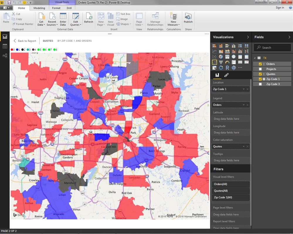
Have you tried the Filled Map option?
This allows you to group all of the "bubbles" into a larger defined space. You can define the space by Country, State, or even Zip Code if you want to.
- Mark as New
- Bookmark
- Subscribe
- Mute
- Subscribe to RSS Feed
- Permalink
- Report Inappropriate Content
Thank you for your reply.
I have tried this, but the problem is that the data is localised mainly within addresses of 1 country, so it is very difficult to see any of the city names due to the dark shading of the areas. Also, some of the areas it groups the addresses in are very large, so the shading does not represent the locations very well because it shades a very large area.
Any other ideas?
Thanks
- Mark as New
- Bookmark
- Subscribe
- Mute
- Subscribe to RSS Feed
- Permalink
- Report Inappropriate Content
I think the Filled Map may work for you - but you may have to re-align the area size you wish to view in the report. As an exmple, I am also interested in what is going on in a given area, but in my case I have broken the areas out to be individual US States. That way when I look at the areas, all of my Sales Activity is linked to an individual Zip Code....
.....You stated, you are looking at "1 Country". Is there a way you could break it out into smaller regional sections so the above would work for you?
-Marcus
Helpful resources

Power BI Monthly Update - April 2026
Check out the April 2026 Power BI update to learn about new features.

Data Days 2026 coming soon!
Sign up to receive a private message when registration opens and key events begin.

New to Fabric Survey
If you have recently started exploring Fabric, we'd love to hear how it's going. Your feedback can help with product improvements.

| User | Count |
|---|---|
| 38 | |
| 29 | |
| 28 | |
| 20 | |
| 18 |
| User | Count |
|---|---|
| 66 | |
| 36 | |
| 30 | |
| 25 | |
| 24 |

