FabCon is coming to Atlanta
Join us at FabCon Atlanta from March 16 - 20, 2026, for the ultimate Fabric, Power BI, AI and SQL community-led event. Save $200 with code FABCOMM.
Register now!- Power BI forums
- Get Help with Power BI
- Desktop
- Service
- Report Server
- Power Query
- Mobile Apps
- Developer
- DAX Commands and Tips
- Custom Visuals Development Discussion
- Health and Life Sciences
- Power BI Spanish forums
- Translated Spanish Desktop
- Training and Consulting
- Instructor Led Training
- Dashboard in a Day for Women, by Women
- Galleries
- Data Stories Gallery
- Themes Gallery
- Contests Gallery
- Quick Measures Gallery
- Notebook Gallery
- Translytical Task Flow Gallery
- TMDL Gallery
- R Script Showcase
- Webinars and Video Gallery
- Ideas
- Custom Visuals Ideas (read-only)
- Issues
- Issues
- Events
- Upcoming Events
To celebrate FabCon Vienna, we are offering 50% off select exams. Ends October 3rd. Request your discount now.
- Power BI forums
- Forums
- Get Help with Power BI
- Desktop
- Making the x axis range the same for multiple visu...
- Subscribe to RSS Feed
- Mark Topic as New
- Mark Topic as Read
- Float this Topic for Current User
- Bookmark
- Subscribe
- Printer Friendly Page
- Mark as New
- Bookmark
- Subscribe
- Mute
- Subscribe to RSS Feed
- Permalink
- Report Inappropriate Content
Making the x axis range the same for multiple visuals - different data densities/frequency
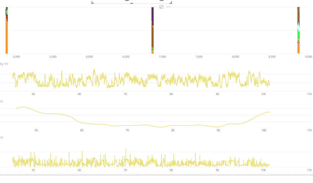
Basically i have 3 line charts and one stacked bar chart. All three come from the same table and use the same variable for the x-axis. The stacked bar chart is displaying data with a different density (there are more points in the line chart data), and so there is a different start/end ranges for the x-axis due to dynamic ranging. I would like them to all be the same. I dont want to have to chage the start/end range for all 4 charts every time i load new data, or to zoom in on a particular range. Is there a way a slicer can be linked to the chart start / end ranges or something similar?
Example data set of what i am dealing with
Thanks!
Solved! Go to Solution.
- Mark as New
- Bookmark
- Subscribe
- Mute
- Subscribe to RSS Feed
- Permalink
- Report Inappropriate Content
Hey - I found a way to get around this issue and wanted to share it in case anyone else is looking for it.
The problem is that there are no values in cells for the lower frequency data. Basically there needs to be equal number of rows for each chart that you are making, and instead of those rows without data being blank, they need to have zero's as values. The Dynamic ranging will then include those data in the range displayed for all charts.
- Mark as New
- Bookmark
- Subscribe
- Mute
- Subscribe to RSS Feed
- Permalink
- Report Inappropriate Content
I'm thinking maybe a "Between" slicer?
Follow on LinkedIn
@ me in replies or I'll lose your thread!!!
Instead of a Kudo, please vote for this idea
Become an expert!: Enterprise DNA
External Tools: MSHGQM
YouTube Channel!: Microsoft Hates Greg
Latest book!: DAX For Humans
DAX is easy, CALCULATE makes DAX hard...
- Mark as New
- Bookmark
- Subscribe
- Mute
- Subscribe to RSS Feed
- Permalink
- Report Inappropriate Content
Unfortunately the between sliders dont work for what i need 😞
- Mark as New
- Bookmark
- Subscribe
- Mute
- Subscribe to RSS Feed
- Permalink
- Report Inappropriate Content
Sounds like maybe you have to handle it in some DAX calculations. Can you provide source data? Please see this post regarding How to Get Your Question Answered Quickly: https://community.powerbi.com/t5/Community-Blog/How-to-Get-Your-Question-Answered-Quickly/ba-p/38490
Follow on LinkedIn
@ me in replies or I'll lose your thread!!!
Instead of a Kudo, please vote for this idea
Become an expert!: Enterprise DNA
External Tools: MSHGQM
YouTube Channel!: Microsoft Hates Greg
Latest book!: DAX For Humans
DAX is easy, CALCULATE makes DAX hard...
- Mark as New
- Bookmark
- Subscribe
- Mute
- Subscribe to RSS Feed
- Permalink
- Report Inappropriate Content
- Mark as New
- Bookmark
- Subscribe
- Mute
- Subscribe to RSS Feed
- Permalink
- Report Inappropriate Content
Hey - I found a way to get around this issue and wanted to share it in case anyone else is looking for it.
The problem is that there are no values in cells for the lower frequency data. Basically there needs to be equal number of rows for each chart that you are making, and instead of those rows without data being blank, they need to have zero's as values. The Dynamic ranging will then include those data in the range displayed for all charts.
Helpful resources
| User | Count |
|---|---|
| 97 | |
| 73 | |
| 69 | |
| 43 | |
| 23 |


