Fabric Data Days starts November 4th!
Advance your Data & AI career with 50 days of live learning, dataviz contests, hands-on challenges, study groups & certifications and more!
Get registered- Power BI forums
- Get Help with Power BI
- Desktop
- Service
- Report Server
- Power Query
- Mobile Apps
- Developer
- DAX Commands and Tips
- Custom Visuals Development Discussion
- Health and Life Sciences
- Power BI Spanish forums
- Translated Spanish Desktop
- Training and Consulting
- Instructor Led Training
- Dashboard in a Day for Women, by Women
- Galleries
- Data Stories Gallery
- Themes Gallery
- Contests Gallery
- QuickViz Gallery
- Quick Measures Gallery
- Visual Calculations Gallery
- Notebook Gallery
- Translytical Task Flow Gallery
- TMDL Gallery
- R Script Showcase
- Webinars and Video Gallery
- Ideas
- Custom Visuals Ideas (read-only)
- Issues
- Issues
- Events
- Upcoming Events
Get Fabric Certified for FREE during Fabric Data Days. Don't miss your chance! Request now
- Power BI forums
- Forums
- Get Help with Power BI
- Desktop
- Making shadowed stacked column chart with slicers
- Subscribe to RSS Feed
- Mark Topic as New
- Mark Topic as Read
- Float this Topic for Current User
- Bookmark
- Subscribe
- Printer Friendly Page
- Mark as New
- Bookmark
- Subscribe
- Mute
- Subscribe to RSS Feed
- Permalink
- Report Inappropriate Content
Making shadowed stacked column chart with slicers
Hello guys,
I am trying to figure out how to create a stacked column chart reflecting a shadow connected dynamically with slicers ? I've seen it in the Gartner Life Expectancy dashboard which is as below. Any idea how to create this kind of dynamic column chart without using selection pane ?
Link as follows (Gartner Analytics and BI Virtual Bake-Off 2020: world population health analysis with Power BI - You...)
Thank you.
Solved! Go to Solution.
- Mark as New
- Bookmark
- Subscribe
- Mute
- Subscribe to RSS Feed
- Permalink
- Report Inappropriate Content
Hi @GrimReaperX ,
You can apply different colors on the chart based on your condition, for example in my sample, I modify the color formula like this:
Measure =
IF (
    MAX ( 'Table'[Column1] ) >= MAX ( 'Table 2'[Column1] ),
    "Grey",
    IF (
        MAX ( 'Table'[Column1] )
            >= MAX ( 'Table 2'[Column1] ) - 5,
        "Orange",
        "Blue"
    )
)
Get the result. But in the slicer, the text can't be hided, it's by design.
I attach my sample below for reference.
Best Regards,
Community Support Team _ kalyj
If this post helps, then please consider Accept it as the solution to help the other members find it more quickly.
- Mark as New
- Bookmark
- Subscribe
- Mute
- Subscribe to RSS Feed
- Permalink
- Report Inappropriate Content
Hi @GrimReaperX ,
According to your description, I create a sample.
In the column chart, Column1 is in the Axis. Here's my solution.
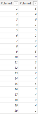
1.Create a new table, don't make relationship between the two tables.
Table 2 = VALUES('Table'[Column1])
2.Create a measure.
Measure = IF(MAX('Table'[Column1])>= MAX('Table 2'[Column1]),"Grey","Blue")
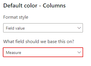
3.In the column chart formatting pane>Columns>Colors, click the fx button.
Select the new measure in the color formatting based on field.
4.Put the column from the new table in a slicer, get the result.
I attach my sample below for reference.
Best Regards,
Community Support Team _ kalyj
If this post helps, then please consider Accept it as the solution to help the other members find it more quickly.
- Mark as New
- Bookmark
- Subscribe
- Mute
- Subscribe to RSS Feed
- Permalink
- Report Inappropriate Content
Hi @v-yanjiang-msft ,
Thanks for your answer, i greatly appreciate that. Is it also possible to apply different colors on the chart based on different buckets? As you can see from the picture that i shared in first post, there is different colors for specific range.
Moreover, is it possible to hide section below in the slicer? I just want to have slicer itself without any text.
Thank you very much.
- Mark as New
- Bookmark
- Subscribe
- Mute
- Subscribe to RSS Feed
- Permalink
- Report Inappropriate Content
Hi @GrimReaperX ,
You can apply different colors on the chart based on your condition, for example in my sample, I modify the color formula like this:
Measure =
IF (
    MAX ( 'Table'[Column1] ) >= MAX ( 'Table 2'[Column1] ),
    "Grey",
    IF (
        MAX ( 'Table'[Column1] )
            >= MAX ( 'Table 2'[Column1] ) - 5,
        "Orange",
        "Blue"
    )
)
Get the result. But in the slicer, the text can't be hided, it's by design.
I attach my sample below for reference.
Best Regards,
Community Support Team _ kalyj
If this post helps, then please consider Accept it as the solution to help the other members find it more quickly.
Helpful resources

Fabric Data Days
Advance your Data & AI career with 50 days of live learning, contests, hands-on challenges, study groups & certifications and more!

Power BI Monthly Update - October 2025
Check out the October 2025 Power BI update to learn about new features.


