- Power BI forums
- Updates
- News & Announcements
- Get Help with Power BI
- Desktop
- Service
- Report Server
- Power Query
- Mobile Apps
- Developer
- DAX Commands and Tips
- Custom Visuals Development Discussion
- Health and Life Sciences
- Power BI Spanish forums
- Translated Spanish Desktop
- Power Platform Integration - Better Together!
- Power Platform Integrations (Read-only)
- Power Platform and Dynamics 365 Integrations (Read-only)
- Training and Consulting
- Instructor Led Training
- Dashboard in a Day for Women, by Women
- Galleries
- Community Connections & How-To Videos
- COVID-19 Data Stories Gallery
- Themes Gallery
- Data Stories Gallery
- R Script Showcase
- Webinars and Video Gallery
- Quick Measures Gallery
- 2021 MSBizAppsSummit Gallery
- 2020 MSBizAppsSummit Gallery
- 2019 MSBizAppsSummit Gallery
- Events
- Ideas
- Custom Visuals Ideas
- Issues
- Issues
- Events
- Upcoming Events
- Community Blog
- Power BI Community Blog
- Custom Visuals Community Blog
- Community Support
- Community Accounts & Registration
- Using the Community
- Community Feedback
Register now to learn Fabric in free live sessions led by the best Microsoft experts. From Apr 16 to May 9, in English and Spanish.
- Power BI forums
- Forums
- Get Help with Power BI
- Desktop
- Re: Making High/Low balls green-red on the line ch...
- Subscribe to RSS Feed
- Mark Topic as New
- Mark Topic as Read
- Float this Topic for Current User
- Bookmark
- Subscribe
- Printer Friendly Page
- Mark as New
- Bookmark
- Subscribe
- Mute
- Subscribe to RSS Feed
- Permalink
- Report Inappropriate Content
Making High/Low balls green-red on the line chart.
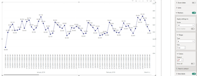
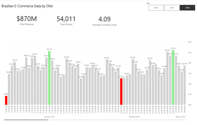
How can I make a graphical representation of any KPI to be selected on the line chart where total orders values are displayed monthly, in a way that makes the highest value within the months green, the lowest value red and the remaining gray?
my pbix : https://drive.google.com/file/d/1Vn8KcHdnDxxv70hCMcUU5BCHtNwzqYxV/view?usp=drive_link
Solved! Go to Solution.
- Mark as New
- Bookmark
- Subscribe
- Mute
- Subscribe to RSS Feed
- Permalink
- Report Inappropriate Content
Bar color =
var a = CALCULATETABLE(SUMMARIZECOLUMNS(DimDate[YearMonth],DimDate[YearMonthNumber]),allselected())
var b = FILTER(ADDCOLUMNS(a,"sm", [Total Revenue]),[sm]>0)
var t = [Total Revenue]
return switch(TRUE(),
t = MINX(b,[sm]),"red",
t = maxx(b,[sm]),"lightgreen",
"lightgrey")- Mark as New
- Bookmark
- Subscribe
- Mute
- Subscribe to RSS Feed
- Permalink
- Report Inappropriate Content
I could swear this was possible before but somehow the marker colors are no longer dynamic. No idea what is happening here.
It works with columns
Bar color =
var a = CALCULATETABLE(SUMMARIZECOLUMNS(DimDate[Date]),REMOVEFILTERS(DimDate[Date]))
var b = ADDCOLUMNS(a,"sm", CALCULATE([Total Revenue]))
var t = [Total Revenue]
return switch(TRUE(),
t = MINX(b,[sm]),"red",
t = maxx(b,[sm]),"lightgreen",
"lightgrey")- Mark as New
- Bookmark
- Subscribe
- Mute
- Subscribe to RSS Feed
- Permalink
- Report Inappropriate Content
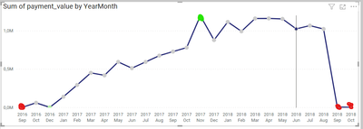
hi , I want to show my chart month-year. (Sep 18, Sep 19 etc. ) When all years are selected, the column in the month with the maximum value will be red.
I want to show my chart month-year. When all years are selected, the column in the month with the maximum value will be red.
I also have to do this in markers on the line chart. Making a column first and then turning it into a line sometimes works (conditional formatting)
- Mark as New
- Bookmark
- Subscribe
- Mute
- Subscribe to RSS Feed
- Permalink
- Report Inappropriate Content
That seems to differ from the previous requirements. Please clarify.
- Mark as New
- Bookmark
- Subscribe
- Mute
- Subscribe to RSS Feed
- Permalink
- Report Inappropriate Content
Your chart is daily. I want to show monthly (as sep 18) and mark the highest value among these months. By the way, I use the order_purchase_timestamp field as the date field.
ex: When the year filter 2018 is selected, let's mark the value in the highest month; when no year is selected, let's mark the highest month in all years.
- Mark as New
- Bookmark
- Subscribe
- Mute
- Subscribe to RSS Feed
- Permalink
- Report Inappropriate Content
Those are all different scenarios. You would need to use ISINSCOPE to figure out which scenario you are in and even then you can have mixed situations where the users expand one year but not the others etc.
- Mark as New
- Bookmark
- Subscribe
- Mute
- Subscribe to RSS Feed
- Permalink
- Report Inappropriate Content
I don't think it's a complicated situation. I only want this.
- Mark as New
- Bookmark
- Subscribe
- Mute
- Subscribe to RSS Feed
- Permalink
- Report Inappropriate Content
Bar color =
var a = CALCULATETABLE(SUMMARIZECOLUMNS(DimDate[YearMonth],DimDate[YearMonthNumber]),allselected())
var b = FILTER(ADDCOLUMNS(a,"sm", [Total Revenue]),[sm]>0)
var t = [Total Revenue]
return switch(TRUE(),
t = MINX(b,[sm]),"red",
t = maxx(b,[sm]),"lightgreen",
"lightgrey")- Mark as New
- Bookmark
- Subscribe
- Mute
- Subscribe to RSS Feed
- Permalink
- Report Inappropriate Content
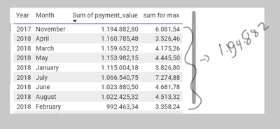
Right now, just finding the max value is enough for me. max value = 1.194.883 ( november 2017)
Helpful resources

Microsoft Fabric Learn Together
Covering the world! 9:00-10:30 AM Sydney, 4:00-5:30 PM CET (Paris/Berlin), 7:00-8:30 PM Mexico City

Power BI Monthly Update - April 2024
Check out the April 2024 Power BI update to learn about new features.

| User | Count |
|---|---|
| 95 | |
| 94 | |
| 80 | |
| 71 | |
| 64 |
| User | Count |
|---|---|
| 115 | |
| 106 | |
| 96 | |
| 81 | |
| 72 |


