Join the #PBI10 DataViz contest
Power BI is turning 10, and we’re marking the occasion with a special community challenge. Use your creativity to tell a story, uncover trends, or highlight something unexpected.
Get started- Power BI forums
- Get Help with Power BI
- Desktop
- Service
- Report Server
- Power Query
- Mobile Apps
- Developer
- DAX Commands and Tips
- Custom Visuals Development Discussion
- Health and Life Sciences
- Power BI Spanish forums
- Translated Spanish Desktop
- Training and Consulting
- Instructor Led Training
- Dashboard in a Day for Women, by Women
- Galleries
- Webinars and Video Gallery
- Data Stories Gallery
- Themes Gallery
- Contests Gallery
- Quick Measures Gallery
- Notebook Gallery
- Translytical Task Flow Gallery
- R Script Showcase
- Ideas
- Custom Visuals Ideas (read-only)
- Issues
- Issues
- Events
- Upcoming Events
Join us for an expert-led overview of the tools and concepts you'll need to become a Certified Power BI Data Analyst and pass exam PL-300. Register now.
- Power BI forums
- Forums
- Get Help with Power BI
- Desktop
- Line graph with summation values
- Subscribe to RSS Feed
- Mark Topic as New
- Mark Topic as Read
- Float this Topic for Current User
- Bookmark
- Subscribe
- Printer Friendly Page
- Mark as New
- Bookmark
- Subscribe
- Mute
- Subscribe to RSS Feed
- Permalink
- Report Inappropriate Content
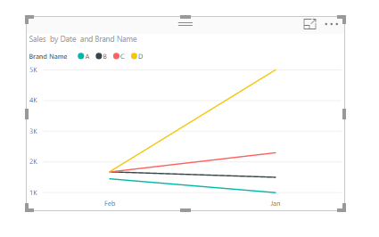
Line graph with summation values

| Type | Brand Name | Sales | Date |
| Mobile | A | 1000 | Jan |
| Mobile | B | 1500 | Jan |
| Mobile | C | 2300 | Jan |
| Mobile | D | 5000 | Jan |
| Mobile | A | 1450 | Feb |
| Mobile | B | 1678 | Feb |
| Mobile | C | 1674 | Feb |
| Mobile | D | 1683 | Feb |
- Mark as New
- Bookmark
- Subscribe
- Mute
- Subscribe to RSS Feed
- Permalink
- Report Inappropriate Content
try this
Total = CALCULATE(SUM(Table[Sales]), ALL(Table[Brand Name]))
Thank you for the kudos 🙂
- Mark as New
- Bookmark
- Subscribe
- Mute
- Subscribe to RSS Feed
- Permalink
- Report Inappropriate Content
If I create a total measure, how can i include that in the existing graph?
- Mark as New
- Bookmark
- Subscribe
- Mute
- Subscribe to RSS Feed
- Permalink
- Report Inappropriate Content
I thought that you can use multiple measures with a legend but that's not the case
you would need to remove the Brand Name from the legend, and create set of measures per Brand, e.g.
A = CALCULATE(SUM('Table'[Sales]), 'Table'[Brand Name]="A") then you can have multiple measures in a visual, but I imagine that's lot of effort with multiple brands
Thank you for the kudos 🙂
- Mark as New
- Bookmark
- Subscribe
- Mute
- Subscribe to RSS Feed
- Permalink
- Report Inappropriate Content
I think If I add an extra custom row with the summation of the total, then,I can use it in the graph. Can you help me how can i create such custom row?
- Mark as New
- Bookmark
- Subscribe
- Mute
- Subscribe to RSS Feed
- Permalink
- Report Inappropriate Content
Hi @bvsaicharitha,
I'm afraid that we may not add custom rows in power bi.
Actually, I'm a little confused about your requirement.
If it is convenient, could you share your desired output so that we could help further on it?
Best Regards,
Cherry
If this post helps, then please consider Accept it as the solution to help the other members find it more quickly.
- Mark as New
- Bookmark
- Subscribe
- Mute
- Subscribe to RSS Feed
- Permalink
- Report Inappropriate Content
Hi,
This is the similar output that I am interested .
Example ,the top green one is the summation of all the brand sales and the rest colors are the individual brands . Ideally, when I create the line graph, I will only get the individual ones by setting legend. I am interested to see the total as well in the same graph. Now the green graph is total of all sales over period
Helpful resources

Join our Fabric User Panel
This is your chance to engage directly with the engineering team behind Fabric and Power BI. Share your experiences and shape the future.

Power BI Monthly Update - June 2025
Check out the June 2025 Power BI update to learn about new features.

| User | Count |
|---|---|
| 55 | |
| 55 | |
| 54 | |
| 37 | |
| 29 |
| User | Count |
|---|---|
| 77 | |
| 62 | |
| 45 | |
| 40 | |
| 40 |

