Get Fabric certified for FREE!
Don't miss your chance to take the Fabric Data Engineer (DP-600) exam for FREE! Find out how by attending the DP-600 session on April 23rd (pacific time), live or on-demand.
Learn more- Power BI forums
- Get Help with Power BI
- Desktop
- Service
- Report Server
- Power Query
- Mobile Apps
- Developer
- DAX Commands and Tips
- Custom Visuals Development Discussion
- Health and Life Sciences
- Power BI Spanish forums
- Translated Spanish Desktop
- Training and Consulting
- Instructor Led Training
- Dashboard in a Day for Women, by Women
- Galleries
- Data Stories Gallery
- Themes Gallery
- Contests Gallery
- QuickViz Gallery
- Quick Measures Gallery
- Visual Calculations Gallery
- Notebook Gallery
- Translytical Task Flow Gallery
- TMDL Gallery
- R Script Showcase
- Webinars and Video Gallery
- Ideas
- Custom Visuals Ideas (read-only)
- Issues
- Issues
- Events
- Upcoming Events
Join the FabCon + SQLCon recap series. Up next: Power BI, Real-Time Intelligence, IQ and AI, and Data Factory take center stage. All sessions are available on-demand after the live show. Register now
- Power BI forums
- Forums
- Get Help with Power BI
- Desktop
- Line chart without scroll bar
- Subscribe to RSS Feed
- Mark Topic as New
- Mark Topic as Read
- Float this Topic for Current User
- Bookmark
- Subscribe
- Printer Friendly Page
- Mark as New
- Bookmark
- Subscribe
- Mute
- Subscribe to RSS Feed
- Permalink
- Report Inappropriate Content
Line chart without scroll bar
Hi,
I'd like to visualize headcount using the daily or monthly filed on X-axis in line chart instead of just yearly movements but when I use smaller granularity fields (such as mmm-yyyy) on x-axis, the line chart only shows part of the visual and the rest has to be scrolled using scroll bar to see the whole picture. Is there a way to express the entire picture of detailed line chart without scroll bar for smaller granularity information on X-axis? I don't need to see each label on X-axis but I need the line chart to be able to express the movements at smaller granularity level.
Thanks a lot for your advice.
- Mark as New
- Bookmark
- Subscribe
- Mute
- Subscribe to RSS Feed
- Permalink
- Report Inappropriate Content
Hi @DataNinja_777
Can you please show what are you trying to achieve?
Rita Fainshtein | Microsoft MVP
https://www.linkedin.com/in/rita-fainshtein/
Blog : https://www.madeiradata.com/profile/ritaf/profile
- Mark as New
- Bookmark
- Subscribe
- Mute
- Subscribe to RSS Feed
- Permalink
- Report Inappropriate Content
Hi,
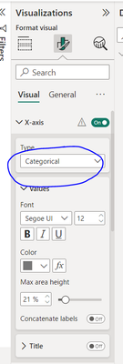
I am trying to get rid of the scroll bar in my line chart which has many data points on X-axis. I read in this community setting the X-axis as "Categorical" or "Continuous" will make this change, and this selection appears when year field is on X-axis, but when I put X-axis to a smaller granularity field such as yyyy-mm, the scroll bar automatically appears and I cannot get rid of it from the selection field above, which also has disappeared. The objective is to see the whole picture of smaller granularity data, without having to scroll which kind of loses the overall contect.
Helpful resources

Power BI Monthly Update - April 2026
Check out the April 2026 Power BI update to learn about new features.

New to Fabric Survey
If you have recently started exploring Fabric, we'd love to hear how it's going. Your feedback can help with product improvements.

Power BI DataViz World Championships - June 2026
A new Power BI DataViz World Championship is coming this June! Don't miss out on submitting your entry.

| User | Count |
|---|---|
| 48 | |
| 40 | |
| 37 | |
| 20 | |
| 16 |
| User | Count |
|---|---|
| 68 | |
| 67 | |
| 30 | |
| 26 | |
| 26 |

