FabCon is coming to Atlanta
Join us at FabCon Atlanta from March 16 - 20, 2026, for the ultimate Fabric, Power BI, AI and SQL community-led event. Save $200 with code FABCOMM.
Register now!- Power BI forums
- Get Help with Power BI
- Desktop
- Service
- Report Server
- Power Query
- Mobile Apps
- Developer
- DAX Commands and Tips
- Custom Visuals Development Discussion
- Health and Life Sciences
- Power BI Spanish forums
- Translated Spanish Desktop
- Training and Consulting
- Instructor Led Training
- Dashboard in a Day for Women, by Women
- Galleries
- Data Stories Gallery
- Themes Gallery
- Contests Gallery
- Quick Measures Gallery
- Notebook Gallery
- Translytical Task Flow Gallery
- TMDL Gallery
- R Script Showcase
- Webinars and Video Gallery
- Ideas
- Custom Visuals Ideas (read-only)
- Issues
- Issues
- Events
- Upcoming Events
Join the Fabric FabCon Global Hackathon—running virtually through Nov 3. Open to all skill levels. $10,000 in prizes! Register now.
- Power BI forums
- Forums
- Get Help with Power BI
- Desktop
- Line chart with different colours
- Subscribe to RSS Feed
- Mark Topic as New
- Mark Topic as Read
- Float this Topic for Current User
- Bookmark
- Subscribe
- Printer Friendly Page
- Mark as New
- Bookmark
- Subscribe
- Mute
- Subscribe to RSS Feed
- Permalink
- Report Inappropriate Content
Line chart with different colours
Hi,
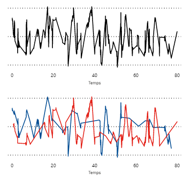
It is possible to have a line that changes color according to a categorical variable? I have 3 columns (Time, Value and TeamId). I wish to have the line which is the color of the team at this time. The problem is that when I put TeamId in legend it creates two curves, one for each team like the image below
Any ideas ?
- Mark as New
- Bookmark
- Subscribe
- Mute
- Subscribe to RSS Feed
- Permalink
- Report Inappropriate Content
Hi @Jeremy19 ,
Currently Power BI does not support this feature, you can raise a new idea and add your comments there to make this feature coming sooner. Or you can refer the solution in the following thread as workaround.
Line Chart: Conditional Formatting
Best Regards
Rena
Community Support Team _ Rena Ruan
If this post helps, then please consider Accept it as the solution to help the other members find it more.
- Mark as New
- Bookmark
- Subscribe
- Mute
- Subscribe to RSS Feed
- Permalink
- Report Inappropriate Content
Nice tip but it doesn't give exactly what I want. It displays the markers that I cannot remove and the curve remains only blue. In fact, the line should keep the color of the previous point.
- Mark as New
- Bookmark
- Subscribe
- Mute
- Subscribe to RSS Feed
- Permalink
- Report Inappropriate Content
You can make a measure like this that you can use as the data color.
Line Color = SWITCH(MIN(Table[TeamID]), "Team A", "Red", "Team B", "Blue", "Black")
Then here's the trick that Reid Havens has a video about here - https://www.youtube.com/watch?v=2_2rGxA6PKQ
First make it a bar chart, use this measure in the fx button for the data color, then switch the chart to a line chart. The line chart by default doesn't have the option to use a color measure but this is a workaround.
Regards,
Pat
Did I answer your question? Mark my post as a solution! Kudos are also appreciated!
To learn more about Power BI, follow me on Twitter or subscribe on YouTube.
@mahoneypa HoosierBI on YouTube


