Fabric Data Days starts November 4th!
Advance your Data & AI career with 50 days of live learning, dataviz contests, hands-on challenges, study groups & certifications and more!
Get registered- Power BI forums
- Get Help with Power BI
- Desktop
- Service
- Report Server
- Power Query
- Mobile Apps
- Developer
- DAX Commands and Tips
- Custom Visuals Development Discussion
- Health and Life Sciences
- Power BI Spanish forums
- Translated Spanish Desktop
- Training and Consulting
- Instructor Led Training
- Dashboard in a Day for Women, by Women
- Galleries
- Data Stories Gallery
- Themes Gallery
- Contests Gallery
- QuickViz Gallery
- Quick Measures Gallery
- Visual Calculations Gallery
- Notebook Gallery
- Translytical Task Flow Gallery
- TMDL Gallery
- R Script Showcase
- Webinars and Video Gallery
- Ideas
- Custom Visuals Ideas (read-only)
- Issues
- Issues
- Events
- Upcoming Events
Get Fabric Certified for FREE during Fabric Data Days. Don't miss your chance! Request now
- Power BI forums
- Forums
- Get Help with Power BI
- Desktop
- Re: Line chart with Legend and additional measure
- Subscribe to RSS Feed
- Mark Topic as New
- Mark Topic as Read
- Float this Topic for Current User
- Bookmark
- Subscribe
- Printer Friendly Page
- Mark as New
- Bookmark
- Subscribe
- Mute
- Subscribe to RSS Feed
- Permalink
- Report Inappropriate Content
Line chart with Legend and additional measure
Hi,
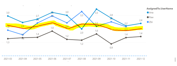
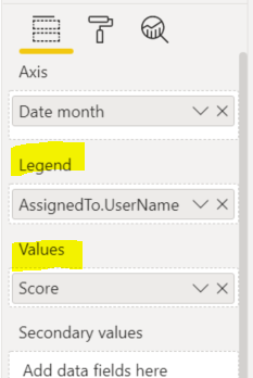
we have a dashboard with standard Line chart where Axis are months, Legend is UserAssigned and Values – some measure Score.
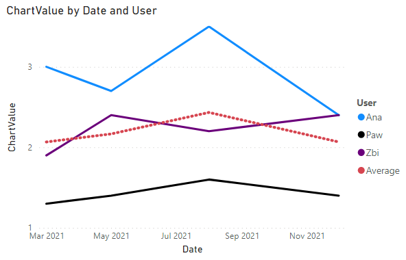
What we need to do is to place additional measure which will be displaying average value of Scores. Something like here:
In PowerBI Line chart when you specify a field in a Legend section you cannot have more than one measure in Values section.
We thought about workaround - adding “virtual” User assigned to the list of users and calculate average score measure for this “virtual” item. But due to a specific reason we cannot do this.
Maybe someone knows the solution? Maybe some custom line chart visual is available?
Solved! Go to Solution.
- Mark as New
- Bookmark
- Subscribe
- Mute
- Subscribe to RSS Feed
- Permalink
- Report Inappropriate Content
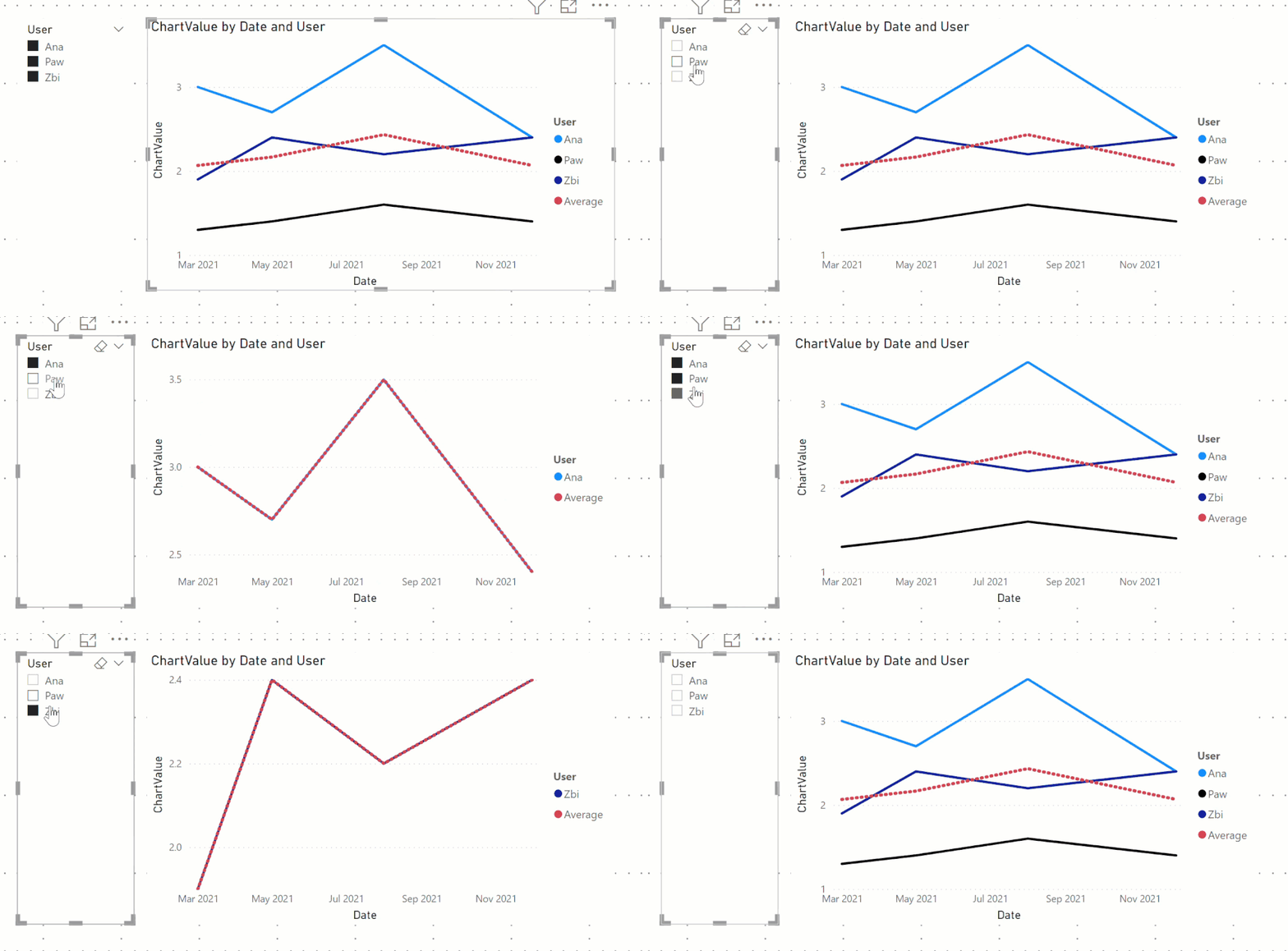
@RafalMonka and here is the output:
Subscribe to the @PowerBIHowTo YT channel for an upcoming video on List and Record functions in Power Query!!
Learn Power BI and Fabric - subscribe to our YT channel - Click here: @PowerBIHowTo
If my solution proved useful, I'd be delighted to receive Kudos. When you put effort into asking a question, it's equally thoughtful to acknowledge and give Kudos to the individual who helped you solve the problem. It's a small gesture that shows appreciation and encouragement! ❤
Did I answer your question? Mark my post as a solution. Proud to be a Super User! Appreciate your Kudos 🙂
Feel free to email me with any of your BI needs.
- Mark as New
- Bookmark
- Subscribe
- Mute
- Subscribe to RSS Feed
- Permalink
- Report Inappropriate Content
@AlexisOlson I see, yes, then it would work. Sorry I missed that part.
Subscribe to the @PowerBIHowTo YT channel for an upcoming video on List and Record functions in Power Query!!
Learn Power BI and Fabric - subscribe to our YT channel - Click here: @PowerBIHowTo
If my solution proved useful, I'd be delighted to receive Kudos. When you put effort into asking a question, it's equally thoughtful to acknowledge and give Kudos to the individual who helped you solve the problem. It's a small gesture that shows appreciation and encouragement! ❤
Did I answer your question? Mark my post as a solution. Proud to be a Super User! Appreciate your Kudos 🙂
Feel free to email me with any of your BI needs.
- Mark as New
- Bookmark
- Subscribe
- Mute
- Subscribe to RSS Feed
- Permalink
- Report Inappropriate Content
@AlexisOlson Unfortunately that will not work, FYI
Subscribe to the @PowerBIHowTo YT channel for an upcoming video on List and Record functions in Power Query!!
Learn Power BI and Fabric - subscribe to our YT channel - Click here: @PowerBIHowTo
If my solution proved useful, I'd be delighted to receive Kudos. When you put effort into asking a question, it's equally thoughtful to acknowledge and give Kudos to the individual who helped you solve the problem. It's a small gesture that shows appreciation and encouragement! ❤
Did I answer your question? Mark my post as a solution. Proud to be a Super User! Appreciate your Kudos 🙂
Feel free to email me with any of your BI needs.
- Mark as New
- Bookmark
- Subscribe
- Mute
- Subscribe to RSS Feed
- Permalink
- Report Inappropriate Content
Can you elaborate? It appears to work for me.
Note: The slicer is on Table1[User].
- Mark as New
- Bookmark
- Subscribe
- Mute
- Subscribe to RSS Feed
- Permalink
- Report Inappropriate Content
@RafalMonka and here is the output:
Subscribe to the @PowerBIHowTo YT channel for an upcoming video on List and Record functions in Power Query!!
Learn Power BI and Fabric - subscribe to our YT channel - Click here: @PowerBIHowTo
If my solution proved useful, I'd be delighted to receive Kudos. When you put effort into asking a question, it's equally thoughtful to acknowledge and give Kudos to the individual who helped you solve the problem. It's a small gesture that shows appreciation and encouragement! ❤
Did I answer your question? Mark my post as a solution. Proud to be a Super User! Appreciate your Kudos 🙂
Feel free to email me with any of your BI needs.
- Mark as New
- Bookmark
- Subscribe
- Mute
- Subscribe to RSS Feed
- Permalink
- Report Inappropriate Content
You're great! Now it works perfectly. Thank you very much.
- Mark as New
- Bookmark
- Subscribe
- Mute
- Subscribe to RSS Feed
- Permalink
- Report Inappropriate Content
@RafalMonka I see, change the measure to this:
ChartValue =
VAR __users = INTERSECT ( VALUES ( Legend[User] ), VALUES ( Table1[User] ) )
RETURN
IF (
    SELECTEDVALUE ( Legend[User] ) = "Average",
    AVERAGEX ( VALUES ( Table1[User] ), CALCULATE ( SUM ( Table1[Value] ) ) ),
    CALCULATE (
        SUM ( Table1[Value] ),
        TREATAS ( __users, Table1[User] )
        // TREATAS ( VALUES ( Legend[User] ), Table1[User] )
    )
)
✨ Follow us on LinkedIn and subscribe to our YouTube channel
Learn about conditional formatting at Microsoft Reactor
My latest blog post The Power of Using Calculation Groups with Inactive Relationships (Part 1) (perytus.com) I would ❤ Kudos if my solution helped. 👉 If you can spend time posting the question, you can also make efforts to give Kudos to whoever helped to solve your problem. It is a token of appreciation!
⚡ Visit us at https://perytus.com, your one-stop-shop for Power BI-related projects/training/consultancy.⚡
Subscribe to the @PowerBIHowTo YT channel for an upcoming video on List and Record functions in Power Query!!
Learn Power BI and Fabric - subscribe to our YT channel - Click here: @PowerBIHowTo
If my solution proved useful, I'd be delighted to receive Kudos. When you put effort into asking a question, it's equally thoughtful to acknowledge and give Kudos to the individual who helped you solve the problem. It's a small gesture that shows appreciation and encouragement! ❤
Did I answer your question? Mark my post as a solution. Proud to be a Super User! Appreciate your Kudos 🙂
Feel free to email me with any of your BI needs.
- Mark as New
- Bookmark
- Subscribe
- Mute
- Subscribe to RSS Feed
- Permalink
- Report Inappropriate Content
@RafalMonka Don't you have another filter directly filter the table1, if those are then the solution provided by @AlexisOlson should work, let's say you have a table1 filter on a project and only two users are associated with that project, in the solution, it will show only two users, not other users. Seems like you need to tweak your data model if this is not working as expected but the solution provided @AlexisOlson is the way to go.
✨ Follow us on LinkedIn and subscribe to our YouTube channel
Learn about conditional formatting at Microsoft Reactor
My latest blog post The Power of Using Calculation Groups with Inactive Relationships (Part 1) (perytus.com) I would ❤ Kudos if my solution helped. 👉 If you can spend time posting the question, you can also make efforts to give Kudos to whoever helped to solve your problem. It is a token of appreciation!
⚡ Visit us at https://perytus.com, your one-stop-shop for Power BI-related projects/training/consultancy.⚡
Subscribe to the @PowerBIHowTo YT channel for an upcoming video on List and Record functions in Power Query!!
Learn Power BI and Fabric - subscribe to our YT channel - Click here: @PowerBIHowTo
If my solution proved useful, I'd be delighted to receive Kudos. When you put effort into asking a question, it's equally thoughtful to acknowledge and give Kudos to the individual who helped you solve the problem. It's a small gesture that shows appreciation and encouragement! ❤
Did I answer your question? Mark my post as a solution. Proud to be a Super User! Appreciate your Kudos 🙂
Feel free to email me with any of your BI needs.
- Mark as New
- Bookmark
- Subscribe
- Mute
- Subscribe to RSS Feed
- Permalink
- Report Inappropriate Content
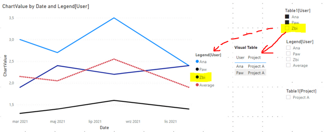
Hi,
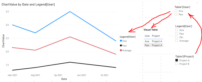
we have worked on Alexis's example, by adding visual filter Table1[User] and column Table1[Project].
When filtering by Project everything works very well.
However, when you try to select users on visual filter Table1[User], the changes are not reflected on Legend[User].
As you can see - user "Zbi" is deselected in visual filter but it still appears in Legend.
Modification of model is not possible.
Is it possible to modify code in order to include in chart Legend only items selected on visual filter Table1[User]?
- Mark as New
- Bookmark
- Subscribe
- Mute
- Subscribe to RSS Feed
- Permalink
- Report Inappropriate Content
Try using KEEPFILTERS.
ChartValue =
IF (
    SELECTEDVALUE ( Legend[User] ) = "Average",
    AVERAGEX ( VALUES ( Table1[User] ), CALCULATE ( SUM ( Table1[Value] ) ) ),
    CALCULATE (
        SUM ( Table1[Value] ),
        KEEPFILTERS ( TREATAS ( VALUES ( Legend[User] ), Table1[User] ) )
    )
)- Mark as New
- Bookmark
- Subscribe
- Mute
- Subscribe to RSS Feed
- Permalink
- Report Inappropriate Content
Hi Alexis,
many thanks for code, but take into account that Legend table should have relationship with Table1.
The reason is that we have multiple filters on dashboard, for instance to limit list of users to certain projects, teams.
So we cannot display all the users from Legend table on a chart.
- Mark as New
- Bookmark
- Subscribe
- Mute
- Subscribe to RSS Feed
- Permalink
- Report Inappropriate Content
@parry2k's suggestion should work. Create a new table to use for the legend
Legend = UNION ( VALUES ( Table1[User] ), { "Average" } )
Then define a measure to use in the line chart. (Edited to include KEEPFILTERS.)
ChartValue =
IF (
    SELECTEDVALUE ( Legend[User] ) = "Average",
    AVERAGEX ( VALUES ( Table1[User] ), CALCULATE ( SUM ( Table1[Value] ) ) ),
    CALCULATE (
        SUM ( Table1[Value] ),
        KEEPFILTERS ( TREATAS ( VALUES ( Legend[User] ), Table1[User] ) )
    )
)
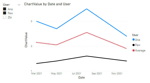
Result:
See attached .pbix.
You may want to vote for this Idea:
Line Chart with multiple values fields and legends
- Mark as New
- Bookmark
- Subscribe
- Mute
- Subscribe to RSS Feed
- Permalink
- Report Inappropriate Content
@aj1973, in that case, he has to create measure for every single assigned to user name and not sure it is a scalable solution. Just my 2 cents.
Subscribe to the @PowerBIHowTo YT channel for an upcoming video on List and Record functions in Power Query!!
Learn Power BI and Fabric - subscribe to our YT channel - Click here: @PowerBIHowTo
If my solution proved useful, I'd be delighted to receive Kudos. When you put effort into asking a question, it's equally thoughtful to acknowledge and give Kudos to the individual who helped you solve the problem. It's a small gesture that shows appreciation and encouragement! ❤
Did I answer your question? Mark my post as a solution. Proud to be a Super User! Appreciate your Kudos 🙂
Feel free to email me with any of your BI needs.
- Mark as New
- Bookmark
- Subscribe
- Mute
- Subscribe to RSS Feed
- Permalink
- Report Inappropriate Content
@parry2k Indeed
Regards
Amine Jerbi
If I answered your question, please mark this thread as accepted
and you can follow me on
My Website, LinkedIn and Facebook
- Mark as New
- Bookmark
- Subscribe
- Mute
- Subscribe to RSS Feed
- Permalink
- Report Inappropriate Content
@RafalMonka not sure about the custom visual but you are on right track, maybe not to add a virtual user in your main user table but create a disconnect user table, add a virtual user in that one and then use that in the visuals, ofcourse it will require to write a new measure to use the disconnected user table.
✨ Follow us on LinkedIn
Learn about conditional formatting at Microsoft Reactor
My latest blog post The Power of Using Calculation Groups with Inactive Relationships (Part 1) (perytus.com) I would ❤ Kudos if my solution helped. 👉 If you can spend time posting the question, you can also make efforts to give Kudos to whoever helped to solve your problem. It is a token of appreciation!
⚡ Visit us at https://perytus.com, your one-stop-shop for Power BI-related projects/training/consultancy.⚡
Subscribe to the @PowerBIHowTo YT channel for an upcoming video on List and Record functions in Power Query!!
Learn Power BI and Fabric - subscribe to our YT channel - Click here: @PowerBIHowTo
If my solution proved useful, I'd be delighted to receive Kudos. When you put effort into asking a question, it's equally thoughtful to acknowledge and give Kudos to the individual who helped you solve the problem. It's a small gesture that shows appreciation and encouragement! ❤
Did I answer your question? Mark my post as a solution. Proud to be a Super User! Appreciate your Kudos 🙂
Feel free to email me with any of your BI needs.
- Mark as New
- Bookmark
- Subscribe
- Mute
- Subscribe to RSS Feed
- Permalink
- Report Inappropriate Content
Yes, we have. But we have only obtained straight line (average for the whole period).
Average line is based on the measure used in Values field.
We need average per certain months, as we have shown on the previous screen.
- Mark as New
- Bookmark
- Subscribe
- Mute
- Subscribe to RSS Feed
- Permalink
- Report Inappropriate Content
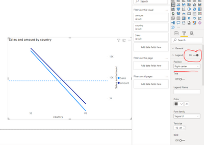
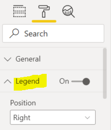
You can add as many as you want of measures in Values field, just go to format and turn on the Legend
Regards
Amine Jerbi
If I answered your question, please mark this thread as accepted
and you can follow me on
My Website, LinkedIn and Facebook
- Mark as New
- Bookmark
- Subscribe
- Mute
- Subscribe to RSS Feed
- Permalink
- Report Inappropriate Content
Don't udenrstand - what do you mean by "turn on the Legend"?
When we have a field in Legend section, then we cannot use more than one measure in Values section.
Format pane - Legend is On.
- Mark as New
- Bookmark
- Subscribe
- Mute
- Subscribe to RSS Feed
- Permalink
- Report Inappropriate Content
Hi @RafalMonka
Have you tried adding an Average line here
Regards
Amine Jerbi
If I answered your question, please mark this thread as accepted
and you can follow me on
My Website, LinkedIn and Facebook
Helpful resources

Fabric Data Days
Advance your Data & AI career with 50 days of live learning, contests, hands-on challenges, study groups & certifications and more!

Power BI Monthly Update - October 2025
Check out the October 2025 Power BI update to learn about new features.


