FabCon is coming to Atlanta
Join us at FabCon Atlanta from March 16 - 20, 2026, for the ultimate Fabric, Power BI, AI and SQL community-led event. Save $200 with code FABCOMM.
Register now!- Power BI forums
- Get Help with Power BI
- Desktop
- Service
- Report Server
- Power Query
- Mobile Apps
- Developer
- DAX Commands and Tips
- Custom Visuals Development Discussion
- Health and Life Sciences
- Power BI Spanish forums
- Translated Spanish Desktop
- Training and Consulting
- Instructor Led Training
- Dashboard in a Day for Women, by Women
- Galleries
- Data Stories Gallery
- Themes Gallery
- Contests Gallery
- Quick Measures Gallery
- Notebook Gallery
- Translytical Task Flow Gallery
- TMDL Gallery
- R Script Showcase
- Webinars and Video Gallery
- Ideas
- Custom Visuals Ideas (read-only)
- Issues
- Issues
- Events
- Upcoming Events
To celebrate FabCon Vienna, we are offering 50% off select exams. Ends October 3rd. Request your discount now.
- Power BI forums
- Forums
- Get Help with Power BI
- Desktop
- Line chart Y-Axis is duplicating values
- Subscribe to RSS Feed
- Mark Topic as New
- Mark Topic as Read
- Float this Topic for Current User
- Bookmark
- Subscribe
- Printer Friendly Page
- Mark as New
- Bookmark
- Subscribe
- Mute
- Subscribe to RSS Feed
- Permalink
- Report Inappropriate Content
Line chart Y-Axis is duplicating values
I have this following measure :
Marge =
CALCULATE(DIVIDE (
SUM( FCTVentes[prix_vente] ),
SUM( FCTVentes[prix_achat]),0),
USERELATIONSHIP(dim_calendrier[id],FCTVentes[fk_date_vente]))
The result is a percentage formatted like below :
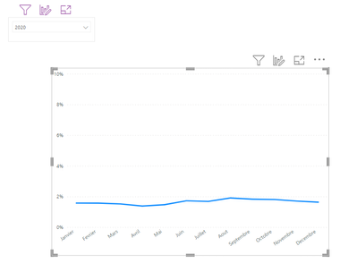
When I try to create to LineChart with a year filter like below :
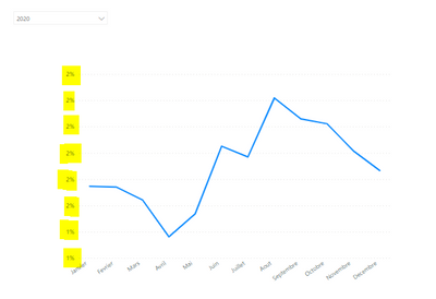
I see that the Y-axis is duplicating values when the 2020 year is selected.
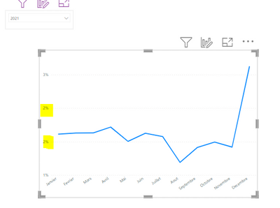
When selecting the year 2021 also, it is the same :
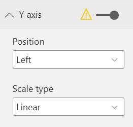
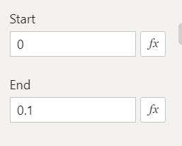
Also, I want that the Y-axis starts from 0 (the display), even if there is no data with 0%.
Proud to be a Power BI Super User !
Microsoft Community : https://docs.microsoft.com/en-us/users/AmiraBedhiafi
Linkedin : https://www.linkedin.com/in/amira-bedhiafi/
StackOverflow : https://stackoverflow.com/users/9517769/amira-bedhiafi
C-Sharp Corner : https://www.c-sharpcorner.com/members/amira-bedhiafi
Power BI Community :https://community.powerbi.com/t5/user/viewprofilepage/user-id/332696
Solved! Go to Solution.
- Mark as New
- Bookmark
- Subscribe
- Mute
- Subscribe to RSS Feed
- Permalink
- Report Inappropriate Content
Hello,
I tried to reproduce your work like below :
Full Stack Business Intelligence Consultant @Capgemini
- Mark as New
- Bookmark
- Subscribe
- Mute
- Subscribe to RSS Feed
- Permalink
- Report Inappropriate Content
Hello,
I tried to reproduce your work like below :
Full Stack Business Intelligence Consultant @Capgemini
- Mark as New
- Bookmark
- Subscribe
- Mute
- Subscribe to RSS Feed
- Permalink
- Report Inappropriate Content
Whats happening there is since the range is small and the values are low it is showing the round off values. If we simply increase the decimals for the axis values it will be fixed.

