FabCon is coming to Atlanta
Join us at FabCon Atlanta from March 16 - 20, 2026, for the ultimate Fabric, Power BI, AI and SQL community-led event. Save $200 with code FABCOMM.
Register now!- Power BI forums
- Get Help with Power BI
- Desktop
- Service
- Report Server
- Power Query
- Mobile Apps
- Developer
- DAX Commands and Tips
- Custom Visuals Development Discussion
- Health and Life Sciences
- Power BI Spanish forums
- Translated Spanish Desktop
- Training and Consulting
- Instructor Led Training
- Dashboard in a Day for Women, by Women
- Galleries
- Data Stories Gallery
- Themes Gallery
- Contests Gallery
- QuickViz Gallery
- Quick Measures Gallery
- Visual Calculations Gallery
- Notebook Gallery
- Translytical Task Flow Gallery
- TMDL Gallery
- R Script Showcase
- Webinars and Video Gallery
- Ideas
- Custom Visuals Ideas (read-only)
- Issues
- Issues
- Events
- Upcoming Events
Get Fabric Certified for FREE during Fabric Data Days. Don't miss your chance! Request now
- Power BI forums
- Forums
- Get Help with Power BI
- Desktop
- Line and bar graph; bar graph is okay, but line gr...
- Subscribe to RSS Feed
- Mark Topic as New
- Mark Topic as Read
- Float this Topic for Current User
- Bookmark
- Subscribe
- Printer Friendly Page
- Mark as New
- Bookmark
- Subscribe
- Mute
- Subscribe to RSS Feed
- Permalink
- Report Inappropriate Content
Line and bar graph; bar graph is okay, but line graph is showing one line only
Dear all,
I hope you can help me...
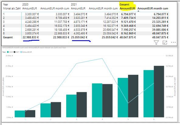
Below you do see my table and the related graph.
The bar chart, indicating the cumulated amount, is correct.
Unfortunately the line graph is not, as it shows the values of the column highlighted in yellow. However, I would have expected two lines illustrating the values of the column highlighted with blue.
In the end, this visual should show
two lines, comparing the results by month (incomlete)
two bars, comparing the cumulated results by month (completed)
Anybody here who could help me?
Solved! Go to Solution.
- Mark as New
- Bookmark
- Subscribe
- Mute
- Subscribe to RSS Feed
- Permalink
- Report Inappropriate Content
@Orstenpowers , As of now power bi does not split line based on legend in this visual.
Check for custom visual or log and Idea.
Or create measure for this year and last year
Power BI — Year on Year with or Without Time Intelligence
https://medium.com/@amitchandak.1978/power-bi-ytd-questions-time-intelligence-1-5-e3174b39f38a
https://www.youtube.com/watch?v=km41KfM_0uA
Helpful resources

Power BI Monthly Update - November 2025
Check out the November 2025 Power BI update to learn about new features.

Fabric Data Days
Advance your Data & AI career with 50 days of live learning, contests, hands-on challenges, study groups & certifications and more!


