FabCon is coming to Atlanta
Join us at FabCon Atlanta from March 16 - 20, 2026, for the ultimate Fabric, Power BI, AI and SQL community-led event. Save $200 with code FABCOMM.
Register now!- Power BI forums
- Get Help with Power BI
- Desktop
- Service
- Report Server
- Power Query
- Mobile Apps
- Developer
- DAX Commands and Tips
- Custom Visuals Development Discussion
- Health and Life Sciences
- Power BI Spanish forums
- Translated Spanish Desktop
- Training and Consulting
- Instructor Led Training
- Dashboard in a Day for Women, by Women
- Galleries
- Data Stories Gallery
- Themes Gallery
- Contests Gallery
- QuickViz Gallery
- Quick Measures Gallery
- Visual Calculations Gallery
- Notebook Gallery
- Translytical Task Flow Gallery
- TMDL Gallery
- R Script Showcase
- Webinars and Video Gallery
- Ideas
- Custom Visuals Ideas (read-only)
- Issues
- Issues
- Events
- Upcoming Events
The Power BI Data Visualization World Championships is back! Get ahead of the game and start preparing now! Learn more
- Power BI forums
- Forums
- Get Help with Power BI
- Desktop
- Line & Clustered Column Chart
- Subscribe to RSS Feed
- Mark Topic as New
- Mark Topic as Read
- Float this Topic for Current User
- Bookmark
- Subscribe
- Printer Friendly Page
- Mark as New
- Bookmark
- Subscribe
- Mute
- Subscribe to RSS Feed
- Permalink
- Report Inappropriate Content
Line & Clustered Column Chart
Hello Community -
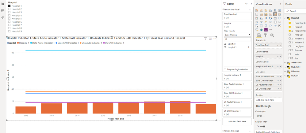
I am working on a line and clustered column chart. The x axis is fiscal year end and the Y axis are an indicator. The columns are an indicator for a hospital and I need to add 4 benchmark lines with differing values by year. I'm using a slicer to filter the hospital. I'm having trouble organizing the data to accomplish this...I have tried everything in 1 file and I'm currently trying to use the hospital file with 4 joined tables containing data for each benchmark type, indicator and year. Any suggestions on how to accomplish this?

Solved! Go to Solution.
- Mark as New
- Bookmark
- Subscribe
- Mute
- Subscribe to RSS Feed
- Permalink
- Report Inappropriate Content
Hi @v-lid-msft
I have tried the "cross filter direction" as both and it doesn't work. I will try the fiscal year column in another calendar table and let you know how it goes.
Regards -
- Mark as New
- Bookmark
- Subscribe
- Mute
- Subscribe to RSS Feed
- Permalink
- Report Inappropriate Content
Hi @ldenney ,
We can also use the following measures as line values to meet your requirement:
State Acute Indicator 1 =
CALCULATE (
    SUM ( 'State Acute'[State Acute Indicator 1] ),
    FILTER (
        ALLSELECTED ( 'State Acute' ),
        [fy_end_dt] IN FILTERS ( 'Hospital'[Fiscal Year End] )
    )
)
State CAH Indicator 1 =
CALCULATE (
    SUM ( 'State Acute'[State CAH Indicator 1] ),
    FILTER (
        ALLSELECTED ( 'State CAH' ),
        [fy_end_dt] IN FILTERS ( 'Hospital'[Fiscal Year End] )
    )
)
US Actue Indicator 1 =
CALCULATE (
    SUM ( 'US Actue'[US Actue Indicator 1] ),
    FILTER (
        ALLSELECTED ( 'US Actue' ),
        [fy_end_dt] IN FILTERS ( 'Hospital'[Fiscal Year End] )
    )
)
US CAH Indicator 1 =
CALCULATE (
    SUM ( 'State Acute'[US CAH Indicator 1] ),
    FILTER (
        ALLSELECTED ( 'State US' ),
        [fy_end_dt] IN FILTERS ( 'Hospital'[Fiscal Year End] )
    )
)
Best regards,
Community Support Team _ Dong Li
If this post helps, then please consider Accept it as the solution to help the other members find it more quickly.
If this post helps, then please consider Accept it as the solution to help the other members find it more quickly.
- Mark as New
- Bookmark
- Subscribe
- Mute
- Subscribe to RSS Feed
- Permalink
- Report Inappropriate Content
Hi @ldenney ,
We can try to set the "Cross Filter direction" as both for each benchmark table and hosptial table, or we can use a fiscal year column in another calendar table as the x-axis field.
Best regards,
Community Support Team _ Dong Li
If this post helps, then please consider Accept it as the solution to help the other members find it more quickly.
If this post helps, then please consider Accept it as the solution to help the other members find it more quickly.
- Mark as New
- Bookmark
- Subscribe
- Mute
- Subscribe to RSS Feed
- Permalink
- Report Inappropriate Content
Hi @v-lid-msft
I have tried the "cross filter direction" as both and it doesn't work. I will try the fiscal year column in another calendar table and let you know how it goes.
Regards -
- Mark as New
- Bookmark
- Subscribe
- Mute
- Subscribe to RSS Feed
- Permalink
- Report Inappropriate Content
Hi @v-lid-msft - I was able to get the visualization to work last night by using the fiscal year column in another table and linking everything to that table. Thanks so much for your help. I will keep your other suggestion in mind.
Thanks a million!
Helpful resources

Power BI Dataviz World Championships
The Power BI Data Visualization World Championships is back! Get ahead of the game and start preparing now!

| User | Count |
|---|---|
| 40 | |
| 35 | |
| 34 | |
| 31 | |
| 28 |
| User | Count |
|---|---|
| 136 | |
| 102 | |
| 68 | |
| 66 | |
| 58 |


