- Power BI forums
- Get Help with Power BI
- Desktop
- Service
- Report Server
- Power Query
- Mobile Apps
- Developer
- DAX Commands and Tips
- Custom Visuals Development Discussion
- Health and Life Sciences
- Power BI Spanish forums
- Translated Spanish Desktop
- Training and Consulting
- Instructor Led Training
- Dashboard in a Day for Women, by Women
- Galleries
- Data Stories Gallery
- Themes Gallery
- Contests Gallery
- QuickViz Gallery
- Quick Measures Gallery
- Visual Calculations Gallery
- Notebook Gallery
- Translytical Task Flow Gallery
- TMDL Gallery
- R Script Showcase
- Webinars and Video Gallery
- Ideas
- Custom Visuals Ideas (read-only)
- Issues
- Issues
- Events
- Upcoming Events
We've captured the moments from FabCon & SQLCon that everyone is talking about, and we are bringing them to the community, live and on-demand. Starts on April 14th. Register now
- Power BI forums
- Forums
- Get Help with Power BI
- Desktop
- Line Chart y axis
- Subscribe to RSS Feed
- Mark Topic as New
- Mark Topic as Read
- Float this Topic for Current User
- Bookmark
- Subscribe
- Printer Friendly Page
- Mark as New
- Bookmark
- Subscribe
- Mute
- Subscribe to RSS Feed
- Permalink
- Report Inappropriate Content
Line Chart y axis
HI,
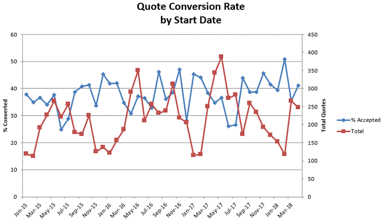
I need to create a chart that will have the following information on the x/y axes:
I need to have the % on the left side and Total quotes on the right side. Please see my exemple above
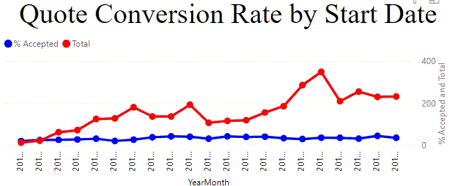
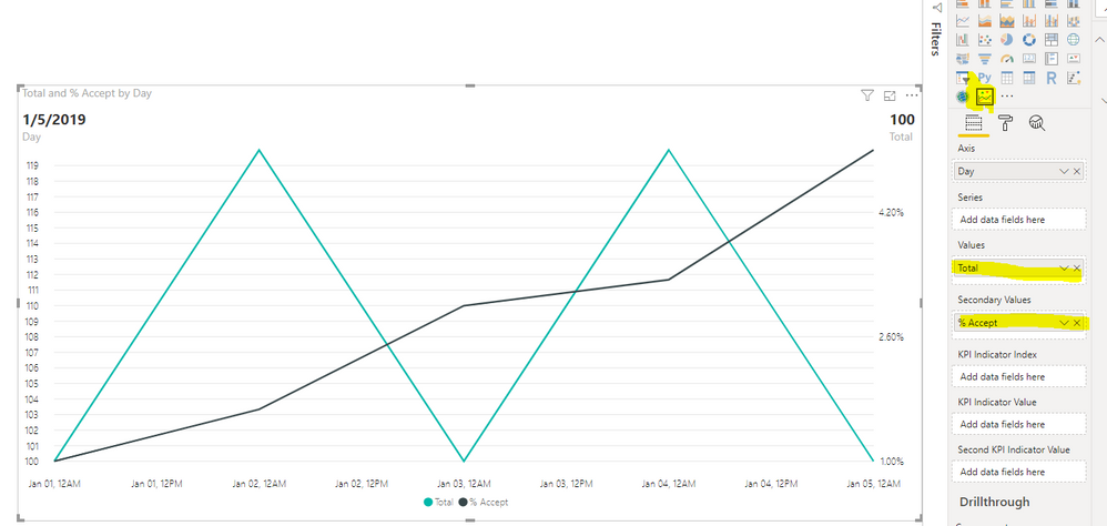
I am using the currect line chart that is part of Power BI and getting the following line chart:
Is there a way to move the %Accepted to the left side and keep the Totals to the right side?
Solved! Go to Solution.
- Mark as New
- Bookmark
- Subscribe
- Mute
- Subscribe to RSS Feed
- Permalink
- Report Inappropriate Content
Hi @TiaCamilian ,
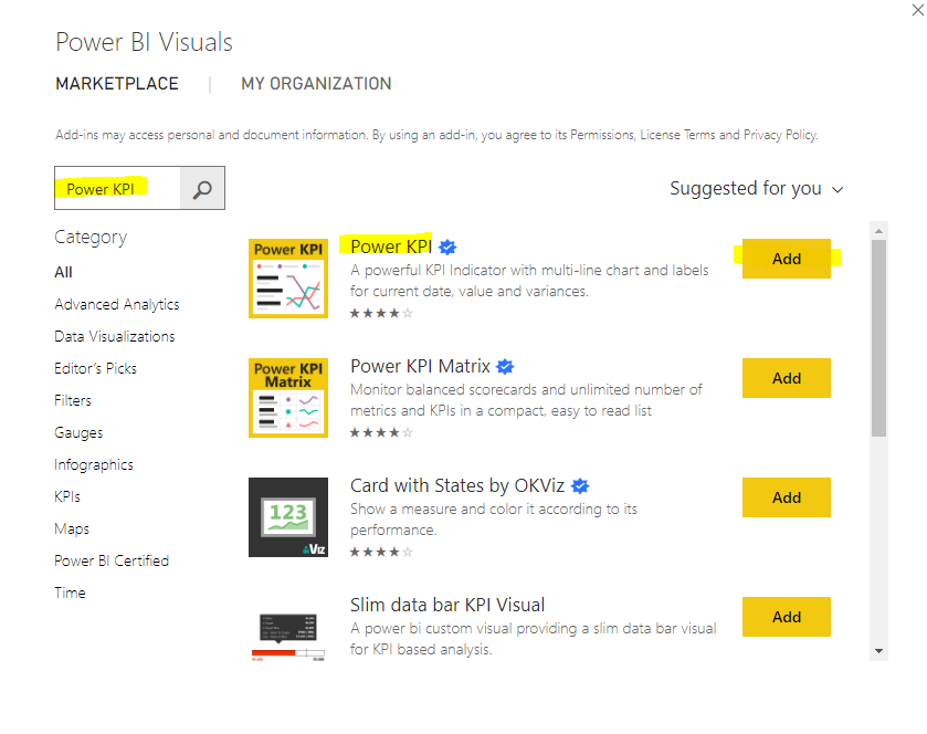
Power KPI is a PBI Certified Visual, you can get it from here: https://appsource.microsoft.com/en-us/product/power-bi-visuals/WA104381083?tab=Overview
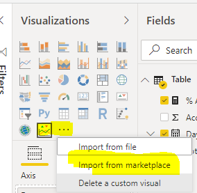
Or search from the market in Power BI Desktop.
Put the value into the Value field and second Value field
BTW, pbix as attached.
Best regards,
Community Support Team _ Dong Li
If this post helps, then please consider Accept it as the solution to help the other members find it more quickly.
If this post helps, then please consider Accept it as the solution to help the other members find it more quickly.
- Mark as New
- Bookmark
- Subscribe
- Mute
- Subscribe to RSS Feed
- Permalink
- Report Inappropriate Content
The last exaple is really good but I do not see a way to show markers in the chart.
My exaple has circle markets.
Do you know of a way to create markets?
- Mark as New
- Bookmark
- Subscribe
- Mute
- Subscribe to RSS Feed
- Permalink
- Report Inappropriate Content
With the base chart in power bi, I think it possible to have bar and line. Unless you use come chart from the market place.
https://docs.microsoft.com/en-us/power-bi/visuals/power-bi-visualization-combo-chart
- Mark as New
- Bookmark
- Subscribe
- Mute
- Subscribe to RSS Feed
- Permalink
- Report Inappropriate Content
Hi,
I see the folloing information:
Dual Y Axis is going to be supported in Power KPI 1.5.0.
This version will be avaialble for end-users on 06/26/2018.
What is Power KPI 1.5.0. Is this related to Power BI? Where can I get it?
I also dowloded the R scrip visual to my Power BI desktop but I don't know if the charts will show the same inforation in the Power BI desktop that is publish in the internet.
- Mark as New
- Bookmark
- Subscribe
- Mute
- Subscribe to RSS Feed
- Permalink
- Report Inappropriate Content
Hi @TiaCamilian ,
Power KPI is a PBI Certified Visual, you can get it from here: https://appsource.microsoft.com/en-us/product/power-bi-visuals/WA104381083?tab=Overview
Or search from the market in Power BI Desktop.
Put the value into the Value field and second Value field
BTW, pbix as attached.
Best regards,
Community Support Team _ Dong Li
If this post helps, then please consider Accept it as the solution to help the other members find it more quickly.
If this post helps, then please consider Accept it as the solution to help the other members find it more quickly.
- Mark as New
- Bookmark
- Subscribe
- Mute
- Subscribe to RSS Feed
- Permalink
- Report Inappropriate Content
The last exaple is really good but I do not see a way to show markers in the chart.
My exaple has circle markets.
Do you know of a way to create markets?
- Mark as New
- Bookmark
- Subscribe
- Mute
- Subscribe to RSS Feed
- Permalink
- Report Inappropriate Content
Hi @TiaCamilian ,
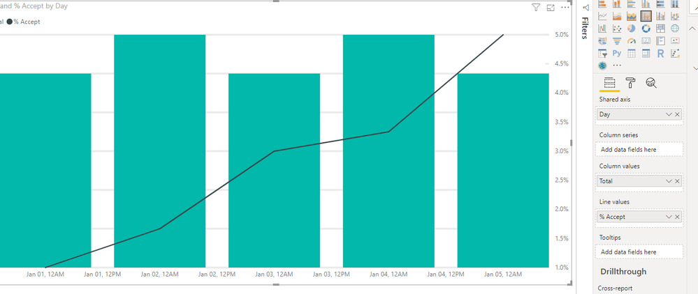
You can use the R Script to create Dual Y-Axis Line Chart, Please refer to the similar threads:
https://community.powerbi.com/t5/Desktop/2-Y-axes/td-p/302068
https://community.powerbi.com/t5/Desktop/Line-Chart-with-Dual-Y-Axis/td-p/614943
Or you can use the Line And Stacked Column Chart as a work around. Please read this document for more details: https://docs.microsoft.com/en-us/power-bi/visuals/power-bi-visualization-combo-chart#see-also
BTW, pbix as attached.
Best regards,
Community Support Team _ Dong Li
If this post helps, then please consider Accept it as the solution to help the other members find it more quickly.
If this post helps, then please consider Accept it as the solution to help the other members find it more quickly.
Helpful resources

New to Fabric Survey
If you have recently started exploring Fabric, we'd love to hear how it's going. Your feedback can help with product improvements.

Power BI DataViz World Championships - June 2026
A new Power BI DataViz World Championship is coming this June! Don't miss out on submitting your entry.

Join our Fabric User Panel
Share feedback directly with Fabric product managers, participate in targeted research studies and influence the Fabric roadmap.

| User | Count |
|---|---|
| 57 | |
| 38 | |
| 32 | |
| 18 | |
| 16 |
| User | Count |
|---|---|
| 66 | |
| 66 | |
| 40 | |
| 34 | |
| 25 |
